Lightroom Editing: Before and After - Dunes Portrait
RAW Photo. Lightroom Edit is shown below at the end of the article.
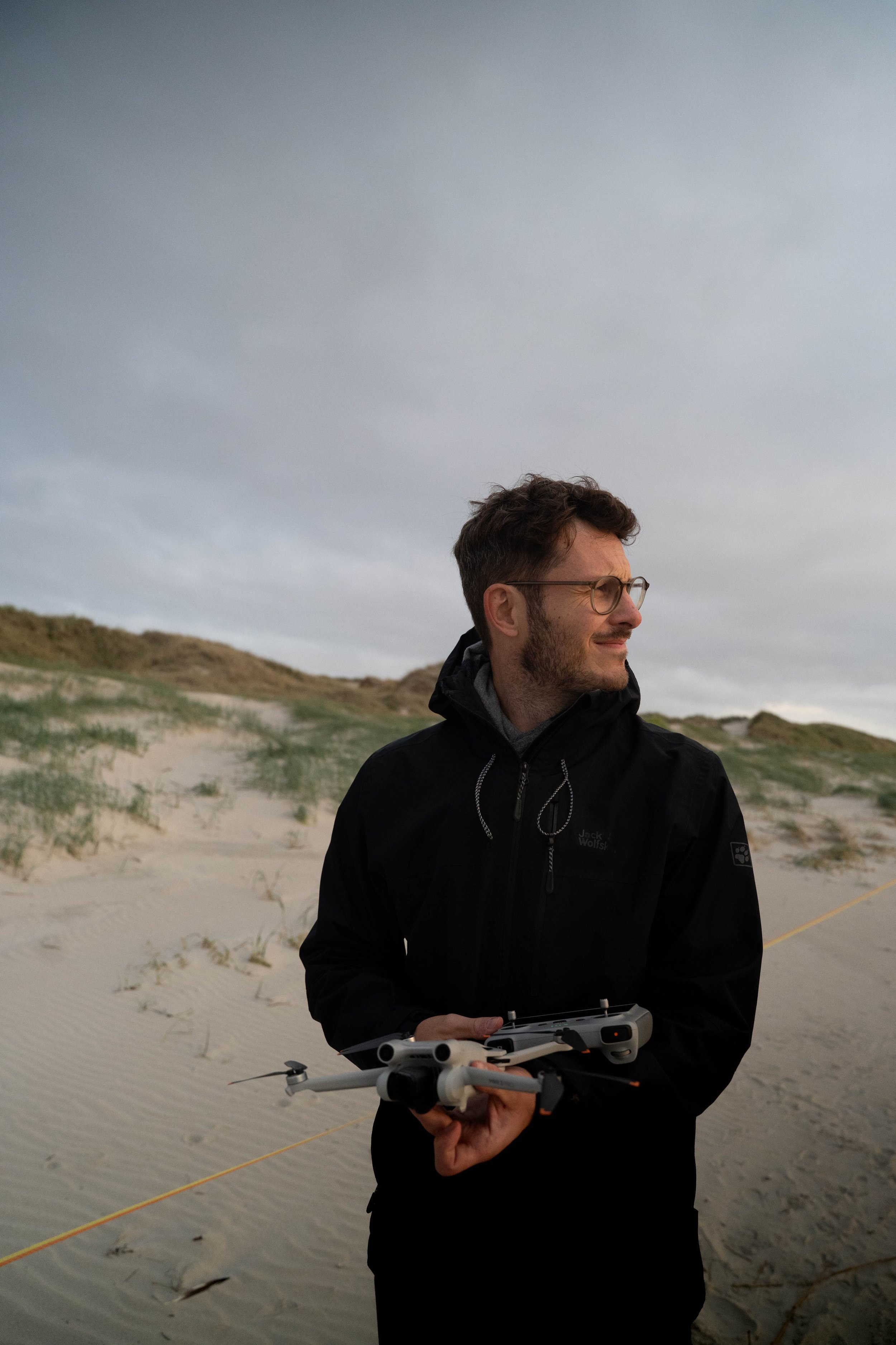
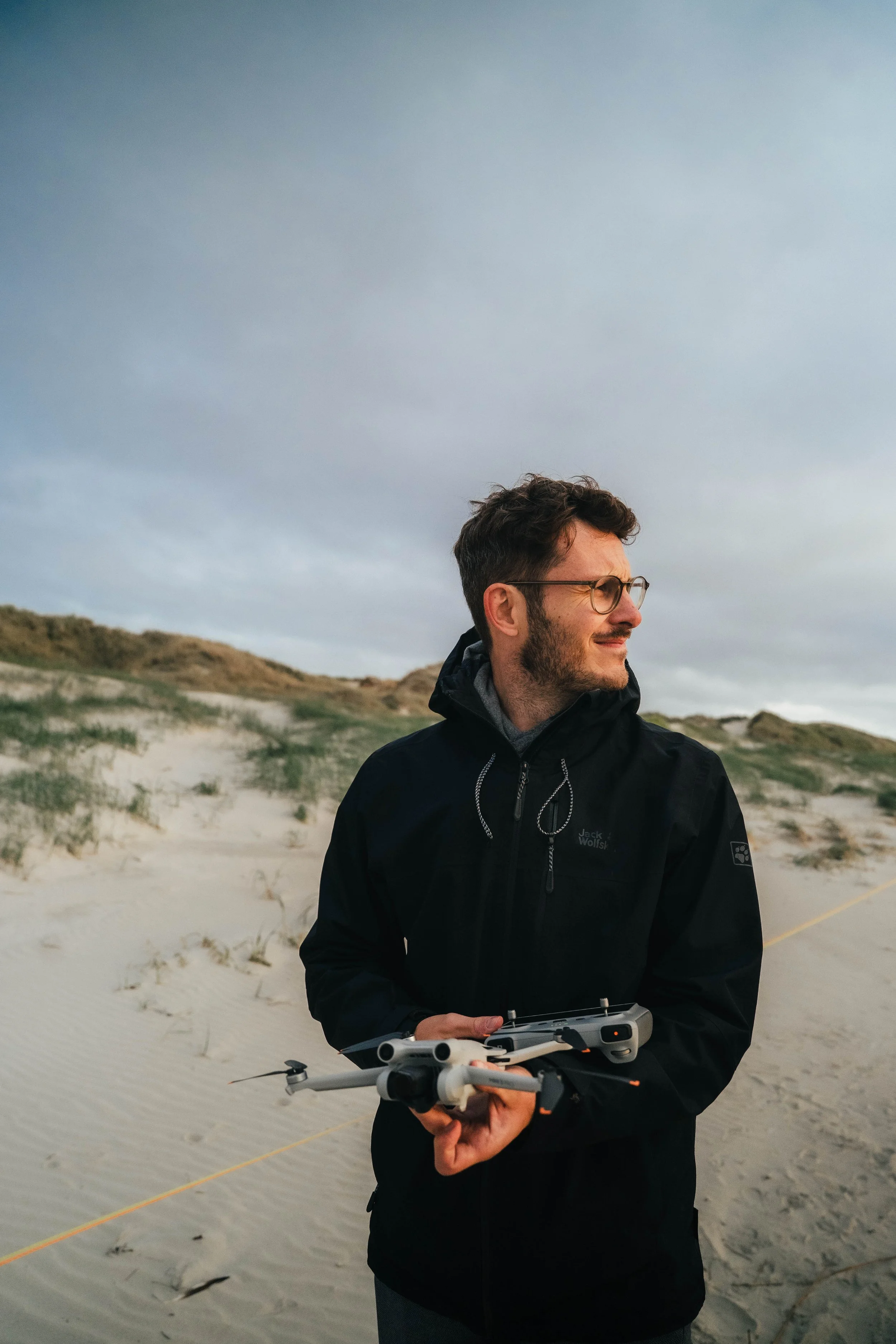
This portrait was taken in the dunes under an overcast sky. The light was soft and flattering, especially for skin tones. But the RAW file felt slightly flat. The sky was bright and dominant, the jacket merged visually with the background, and there was little tonal separation.
Nothing was technically wrong. But the image lacked structure.
The goal of this edit was not to create drama. It was to create hierarchy.
The Starting Point – Even Light Without Depth
The original image had balanced exposure, but everything lived on a similar brightness level. The dunes, the sky and the jacket shared comparable tonal weight. This creates softness — but also visual monotony. The subject was present, yet not clearly prioritized.
The edit needed to introduce separation without losing the calm atmosphere of the scene.
Exposure – rebalancing light
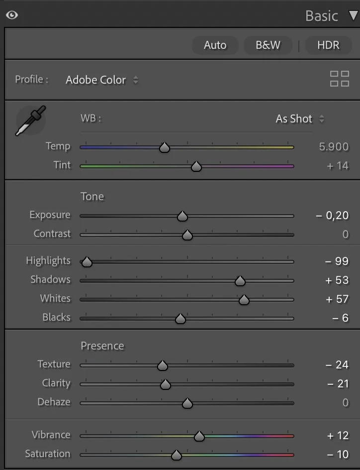
Basic Adjustments in Lightroom
I slightly reduced the overall exposure (–0.20) and strongly lowered the highlights (–99). This immediately brought structure back into the cloudy sky and prevented it from overpowering the frame.
At the same time, I lifted the shadows (+53) and increased the whites (+57). This combination opens the sand and subtly brightens the face while keeping depth in the darker areas.
Blacks were only slightly adjusted (–6). I wanted grounding, not heavy contrast.
The result is a more layered image without losing softness.
Tone Curve – Controlled Contrast
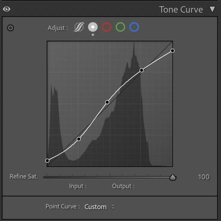
Tone curve in Lightroom
The tone curve follows a gentle S-shape. Shadows are slightly anchored, midtones carefully lifted, and highlights remain controlled.
This step adds definition to the jacket and subtle contrast in the dunes, while keeping smooth transitions in the skin and sky.
Contrast is present — but quiet.
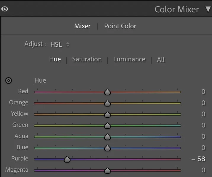
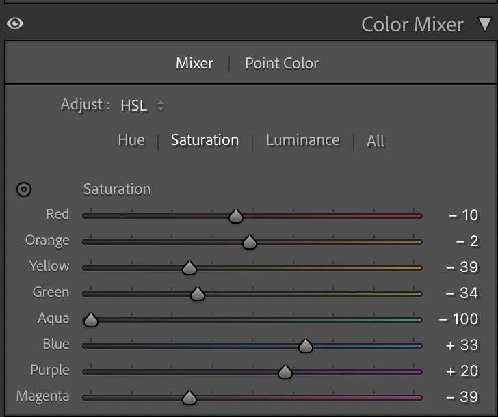
HSL – Color Decisions with Intention
Color adjustments were essential here. Greens (–34 saturation) and yellows (–39 saturation) were reduced to calm the dunes and prevent them from competing with the subject. Aqua was strongly reduced (–100 saturation) to remove unwanted cool color noise.
Blue was slightly increased (+33 saturation) to give the sky more presence and clarity.
For skin tones, I raised orange luminance (+25) and slightly reduced red luminance (–6). This brightens the face subtly and keeps it natural.
The overall palette becomes cleaner and more intentional.
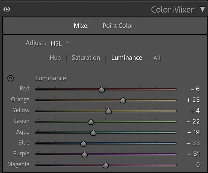
Luminance – Shaping the Background
Blue luminance was lowered (–33) to add depth to the sky. Green luminance was reduced (–22) to ground the dunes and prevent them from feeling too bright. At the same time, the brighter orange luminance keeps the subject visually forward. This creates separation without artificial masking.
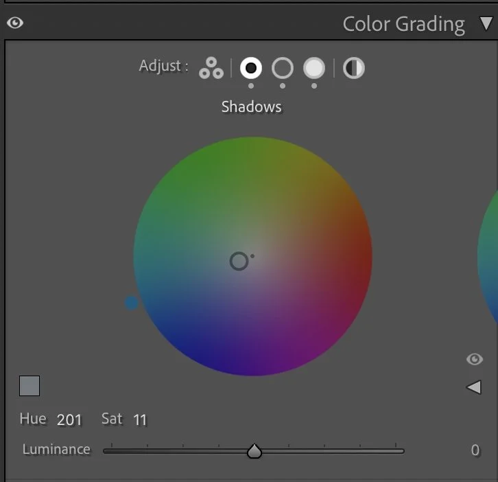
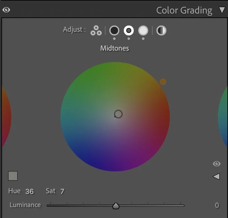
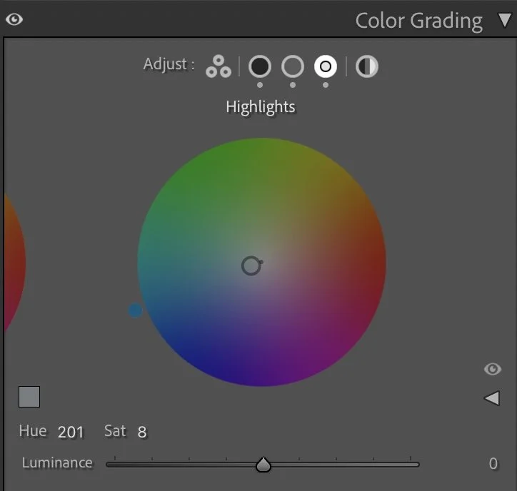
Color Grading – Subtle Warm–Cool Balance
Shadows were given a soft cool tone (Hue 201, Sat 11).
Midtones received a slight warmth (Hue 36, Sat 7).
Highlights stayed very subtle (Hue 201, Sat 8).
This warm–cool relationship creates balance between jacket, sky and skin without making the image stylized. The mood remains natural.
Final Result – Clarity Without Overprocessing
Before, the portrait was evenly lit but visually flat. After the edit, the subject stands out more clearly. The sky has structure. The dunes feel quieter and less dominant. Nothing dramatic was added. Only separation and direction.
Why This Matters
Soft light often tempts us to add strong contrast or heavy color grading. But that quickly destroys the calm of the scene. Instead of pushing intensity, I reduce visual noise first. Then I build structure carefully — through light control and color separation.
This is what I teach in my Lightroom course: Not how to make images louder. But how to make them clearer.
Framed Freedom means creating structure — without losing atmosphere. Further Before and After Articles can be found here.
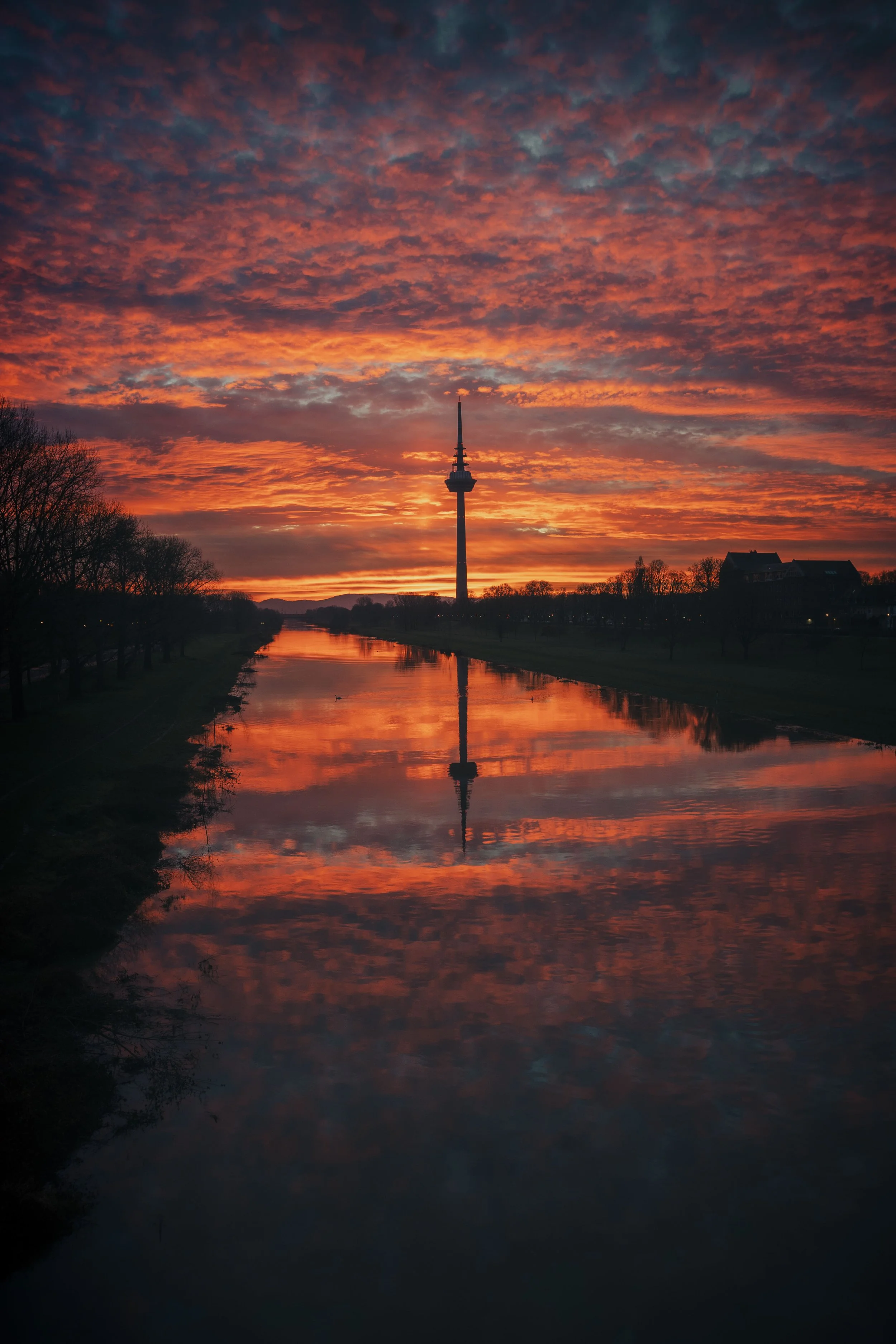
A more natural balance of light
When I edited this image earlier, my goal was mainly to brighten the scene and bring out more detail in the sand and the sky. The overall image became lighter, which made the portrait feel clear and visually open.
Looking at the photograph again today, my approach is slightly different.
In the current version, I allowed the darker tones in the sky and the surrounding landscape to remain deeper. This creates a stronger contrast between the subject and the environment, while keeping the light on the face soft and natural.
The colors are also a little more restrained, which helps the portrait feel calmer and less processed. Instead of brightening the entire scene, the image now relies more on the natural balance between light and shadow.
For me, this interpretation feels closer to the atmosphere of the moment on the beach, where the sky was darker and the light much softer than it appeared in the earlier edit.
Develop your own lightroom editing style
If you want to develop your own Lightroom workflow step by step – not based on presets, but on a conscious understanding of light, color and mood – you might enjoy my course.
In the course I explain how I approach editing decisions and how photographers can gradually develop their own visual style.
At first, starting a Lightroom edit in black and white may seem counterintuitive. After all, most of us care deeply about color. Yet removing color for a moment can reveal something more important: the light, balance and structure that hold an image together. In this article, I explain why I still begin many edits in black and white and how this simple approach changed both my editing workflow and the way I photograph.