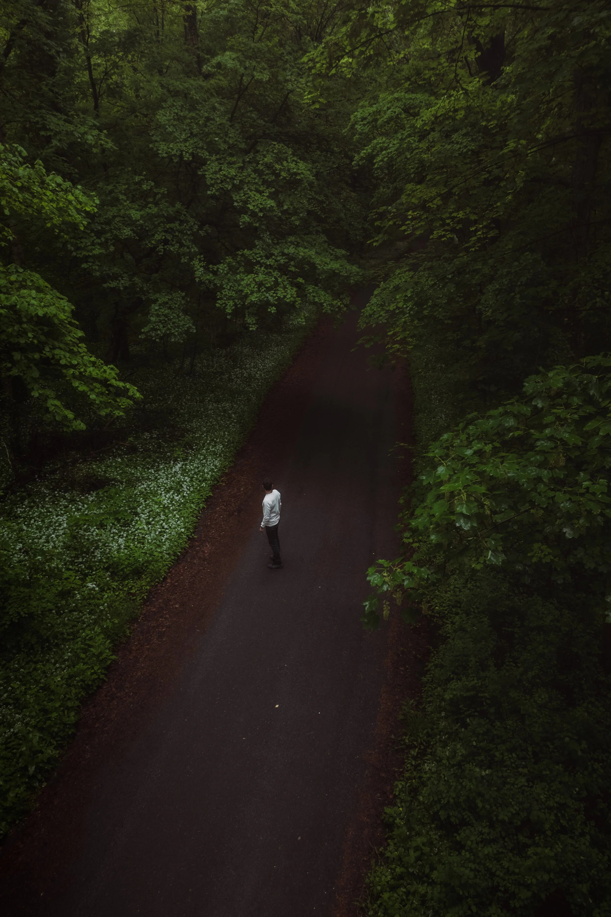
Lightroom Editing: Before and After - Quiet Spring Forest in Germany

RAW Photo. Lightroom Edit is shown below at the end of the article.
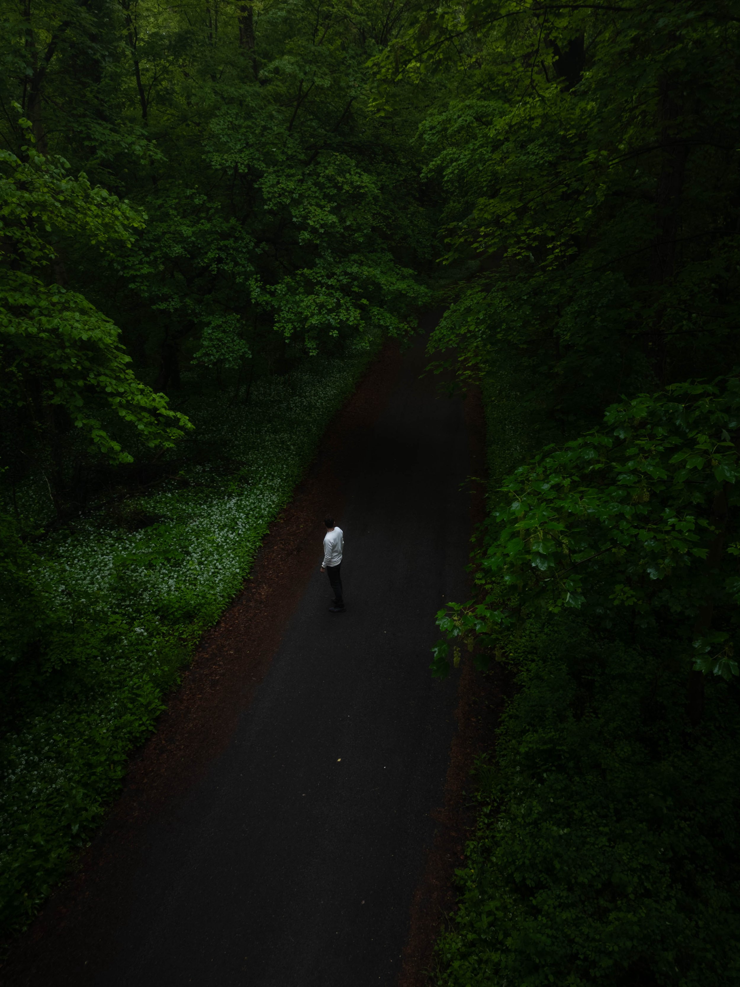
Starting point
Some photos are loud. Wide landscapes, strong sunsets, dramatic skies.
And some photos are the opposite.
They don’t try to impress you. They just feel calm. This image was taken during a quiet walk in a forest near Mannheim in early spring. Fresh green leaves, soft light, and a simple road cutting through the trees. From above, everything looks almost abstract – just shapes, textures, and one small person in the middle.
When I first opened the RAW file, the mood was there. But the image felt too dark and flat. The forest swallowed all the details. So my goal was not to create something spectacular.I simply wanted to reveal what was already there.
Exposure and basic adjustments - fixing the light
Basic Adjustments in Lightroom
The original image was clearly underexposed. Most shadows were too heavy, the greens looked muddy, and the path almost disappeared into the darkness. The scene felt compressed, like the forest was closing in instead of opening up.
Especially from a drone perspective, this is important: If shadows are too dark, you lose the structure of the canopy.
And without structure, the image loses depth. As always, I start with exposure only.
No colors yet. No style. Just light.I brightened the image carefully and opened the shadows to bring back the leaves and forest floor.
Basic adjustments:
Exposure +1.30
Highlights −90
Shadows +88
Whites +39
Blacks −38
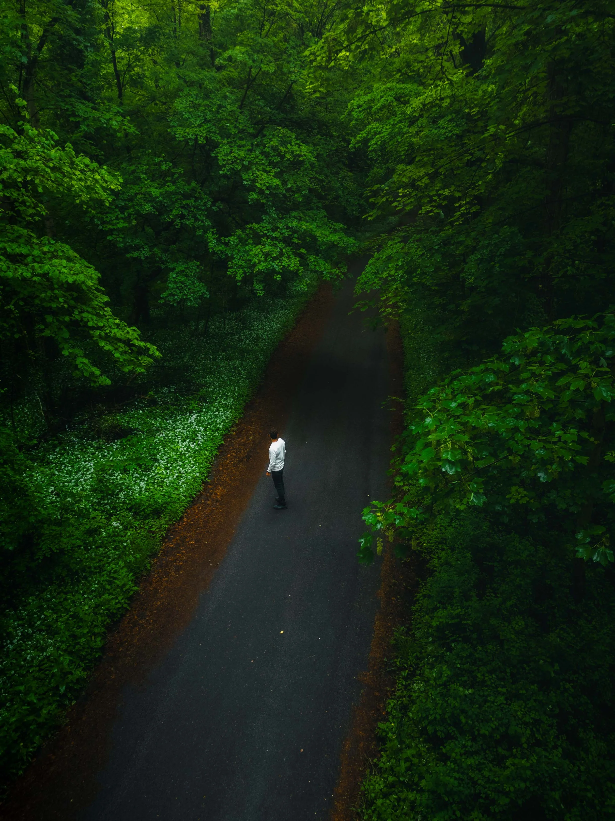
This alone changed everything.Suddenly the trees had layers. The path separated from the forest. The scene started to feel three-dimensional.
I also reduced micro-contrast to keep the mood soft:
Texture −24
Clarity −21
Dehaze 0
Too much clarity would have made the forest harsh and crunchy. But spring light should feel gentle, not aggressive.
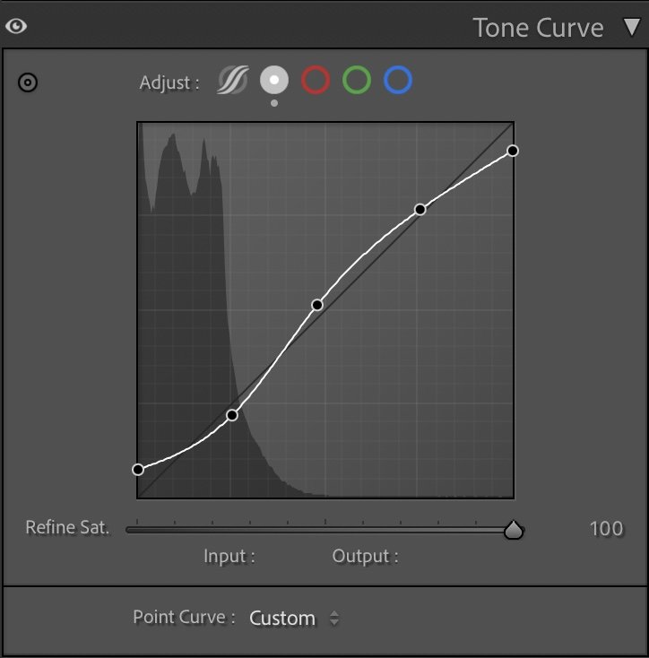
Tone curve in Lightroom
Tone curve — shaping contrast
Instead of pushing the contrast slider, I used the tone curve. A soft S-curve:
slightly lifted shadows
gentle midtone contrast
controlled highlights
This gives depth without destroying the calm atmosphere. For me, this step is always about balance: Enough contrast to create separation. Not so much that it feels dramatic.
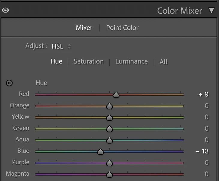
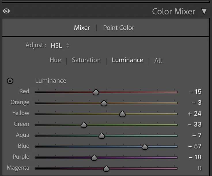
HSL Adjustments – working on the greens
Forests are always a bit tricky to edit. If you simply increase saturation, everything turns neon green very quickly. It starts to look artificial, almost like HDR. That’s the opposite of what I want.
So instead of pushing colors, I shape them slowly and deliberately. First, I adjusted the hue only slightly. Greens stayed mostly natural, but I shifted Blue a little towards teal (–13). This helps the darker areas feel cooler and deeper, especially in the shadows between the trees. A small Red shift (+9) subtly warms up the earthy tones on the path and the leaves that catch the light.
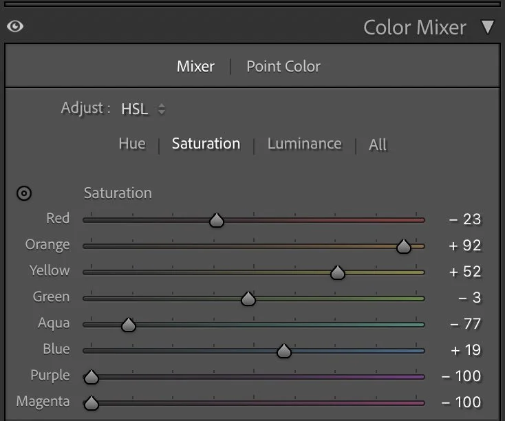
Then I worked on saturation — but very selectively.
Instead of boosting greens, I actually reduced the colder channels quite a lot. Aqua (–77) and Blue (–29) were pulled down strongly to avoid that digital, washed look in the shadows. Purple and Magenta were completely removed (–100 each), just to keep the palette clean.
At the same time, I allowed the warm tones to breathe a bit more. Orange (+92) and Yellow (+52) add life to the sunlit leaves and the ground, so the forest doesn’t feel flat or monochrome.
Finally, I shaped the depth with luminance.
Greens were darkened slightly (–33) to create density inside the forest, while Blues were lifted (+57) to brighten the path and add separation from the surroundings. Yellows were raised (+24) so that light areas feel softer and more open.
All these changes are subtle on their own. But together they turn the forest from a single green mass into something layered and alive. Not brighter. Just clearer.
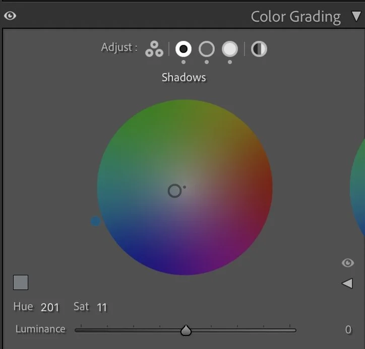
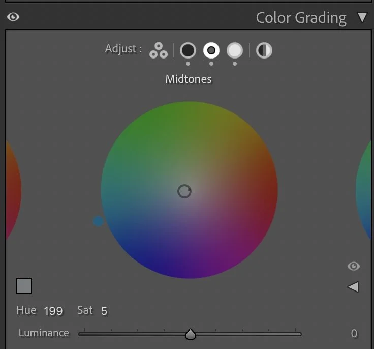
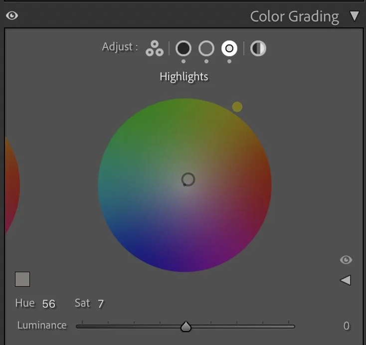
Color Grading – subtle color mood
At the very end, I added gentle color grading. Nothing extreme. Just small emotional shifts.
Shadows → cool blue (Hue 201 / Sat 11)
Midtones → soft cool touch (Hue 199 / Sat 5)
Highlights → warm sunlight (Hue 56 / Sat 7)
This creates a quiet warm–cool contrast: cool forest + warm path. It’s almost invisible. But it makes the image feel alive.
Final thoughts
The final image feels lighter, more open and more breathable but still quiet. Nothing screams for attention. The forest becomes a frame. The road becomes a line. The person becomes a small anchor point. That’s the kind of image I love most. Not dramatic. Not perfect. Just honest and calm. Sometimes editing is not about adding something. It’s simply about removing the weight so the photo can breathe. Further Before and After Articles can be found here.
A calmer interpretation of color and light
When I edited this image earlier, I was mainly focused on bringing out the vivid green tones of the forest. The leaves and plants became more saturated and the path appeared brighter, which made the image feel fresh and visually striking.
Over time, my editing approach has changed.
In the current version, I allowed the darker tones of the forest to remain deeper and reduced the intensity of the green colors slightly. This creates a more natural balance between the road, the vegetation and the person walking through the scene.
The darker tones also help guide the viewer’s attention more clearly toward the center of the image. The road becomes a stronger visual line through the forest, while the surrounding trees feel calmer and less dominant.
Instead of emphasizing bright colors, the focus is now more on atmosphere and depth. For me, this interpretation reflects the quiet mood of the forest much more accurately than the earlier edit.
Develop your own lightroom editing style
If you want to build your own Lightroom workflow step by step — not based on presets, but on a conscious and individual editing approach — take a look at my course.
In the course, I explain how photographers can develop their own editing style and gradually build a consistent visual look.
At first, starting a Lightroom edit in black and white may seem counterintuitive. After all, most of us care deeply about color. Yet removing color for a moment can reveal something more important: the light, balance and structure that hold an image together. In this article, I explain why I still begin many edits in black and white and how this simple approach changed both my editing workflow and the way I photograph.