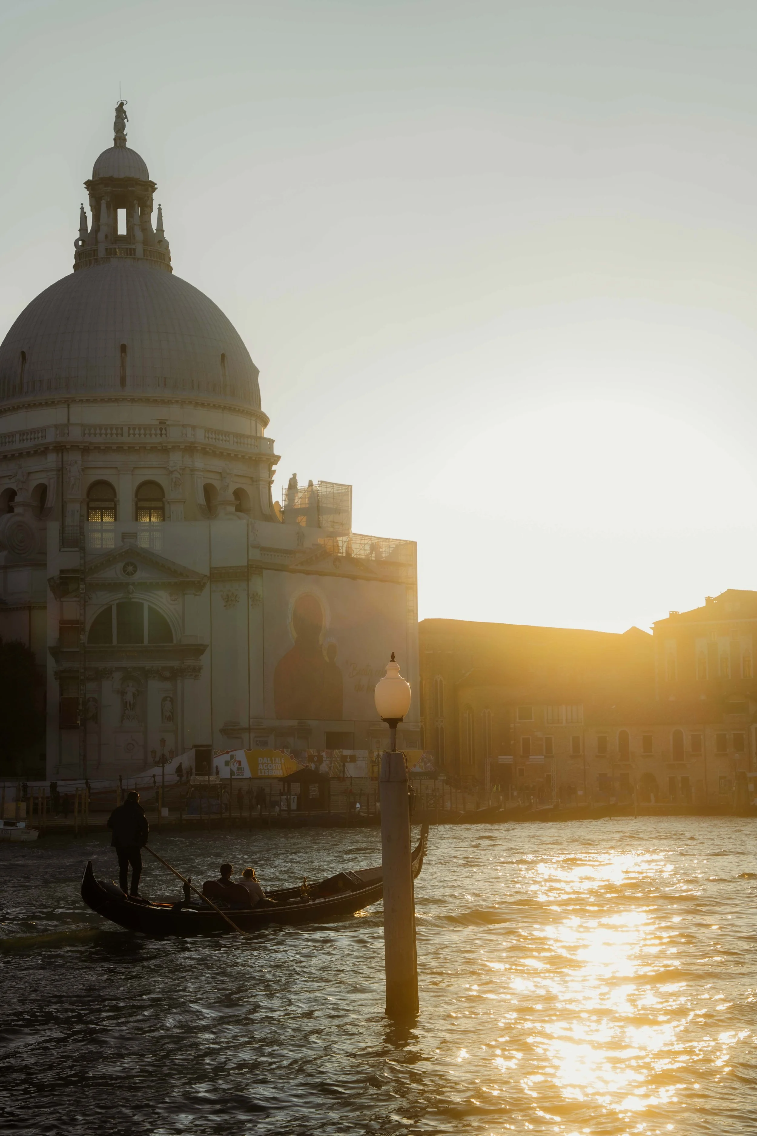
Lightroom Editing: Before and After - Santa Maria Della Salute, Venice, Italy
RAW Photo. Lightroom Edit is shown below at the end of the article.
Starting point
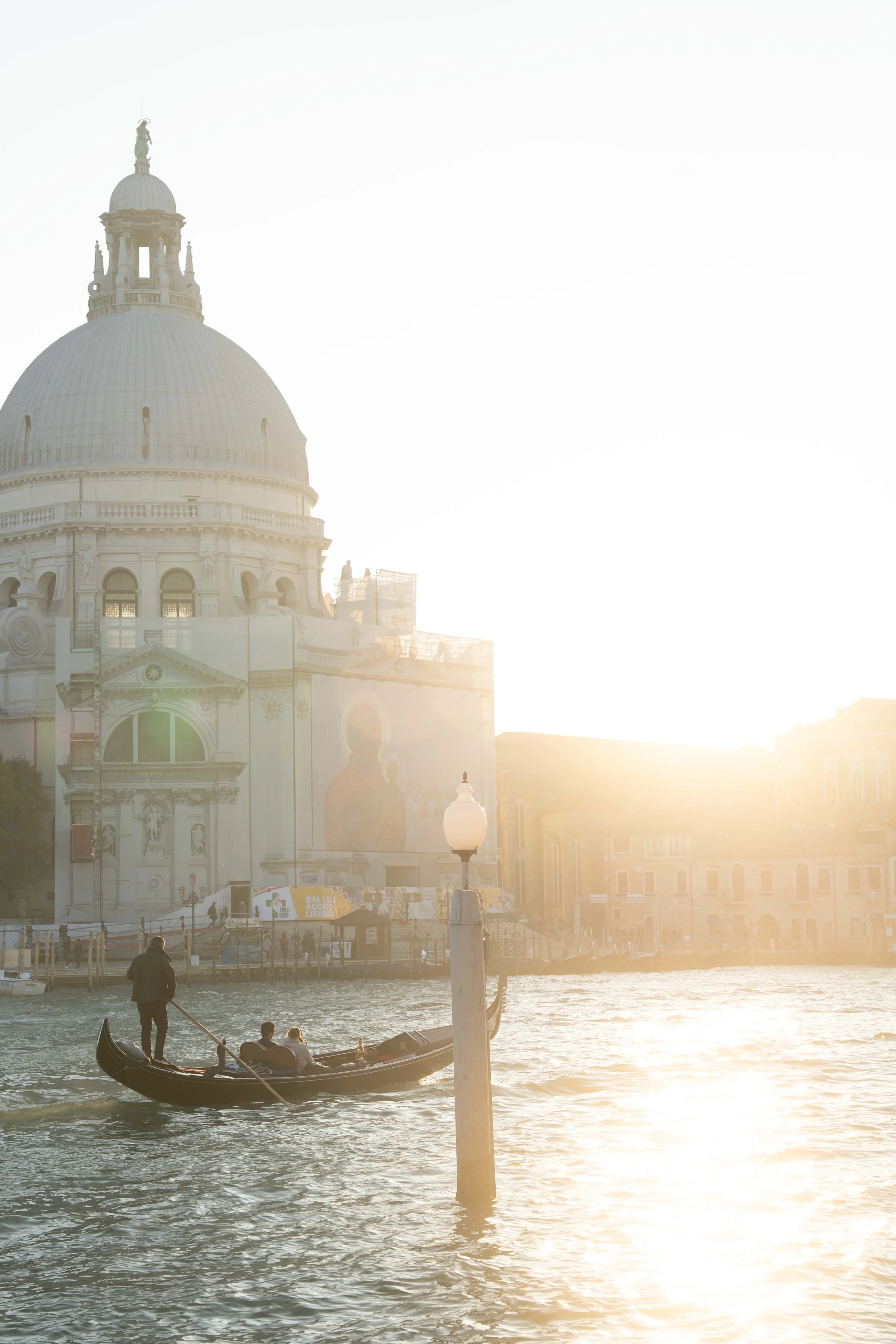
This photo was taken at sunset in Venice, right in front of Santa Maria della Salute.
The sun was already low, shining directly across the lagoon and into the lens. A gondola passed slowly in front of the church, and the water reflected the light like liquid gold.
The atmosphere in real life felt magical and calm. But the unedited image didn’t show that.
The highlights were completely blown out, the sky looked flat and white, and the church almost disappeared in the brightness. The water had no depth, and the gondola lacked separation from the background. Instead of warm evening light, the photo simply looked overexposed.
My goal wasn’t to “fix” the light —it was to shape it. I wanted the scene to feel cinematic and grounded: deep shadows, warm reflections, soft contrast, and a quiet sunset mood.
Exposure and basic adjustments
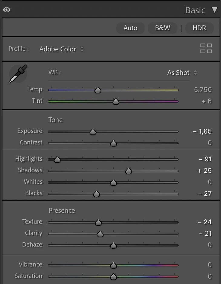
Basic Adjustments in Lightroom
The first step was reducing the overall brightness. I darkened the exposure significantly (Exposure –1.65). This immediately brought back structure in the sky and made the light feel heavier and more atmospheric.
Highlights (–91) were pulled down strongly to recover detail in the sky and reflections. Shadows (+25) were slightly lifted so the gondola and architectural details wouldn’t get lost.
Blacks (–27) were deepened to create a stronger base and give the silhouettes more weight, while Whites stayed neutral (0) to avoid artificial contrast.
For presence, I softened the image:
Texture (–24) and Clarity (–21).
This removes digital harshness and helps the light feel more natural and cinematic — especially important for backlit scenes.
Dehaze stayed at 0. The haze from the sun is part of the story and shouldn’t be removed. Vibrance and Saturation also stayed neutral. Color would be shaped later, not forced here.
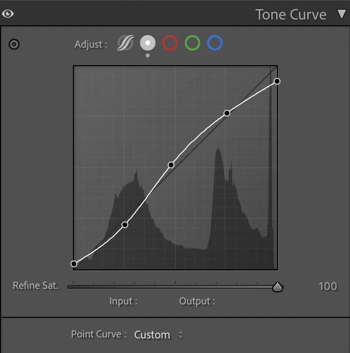
Tone curve in Lightroom
Tone curve — building depth and weight
Shadows were slightly lowered to create depth in the gondola and water. Midtones were softly lifted to keep the church readable without making it too bright. Highlights were controlled to avoid that washed-out look.
This step adds separation:
water → gondola → church → sky
Instead of everything melting into white light, each layer now has its own space. The scene starts to feel three-dimensional and calm.
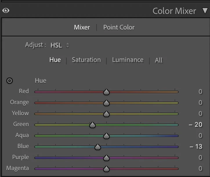
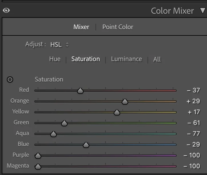
HSL Adjustments – refining colors through subtle control
The HSL adjustments focus on cleaning up the palette and supporting the warm evening atmosphere.
In the Hue panel, Green (–20) and Blue (–13) were shifted slightly to make the cooler tones feel more natural and less digital. Venice water can easily look too cyan — this small shift moves it toward a deeper, more cinematic blue.
Saturation is where most of the shaping happens.
Reds (–37) were reduced to avoid warm distractions.
Greens (–61) and Aquas (–77) were heavily lowered to remove unnecessary color noise from the water and background.
Blues (–29) were softened so the lagoon feels calm rather than vibrant.
At the same time, the warm tones were gently supported:
Orange (+29) and Yellow (+17).
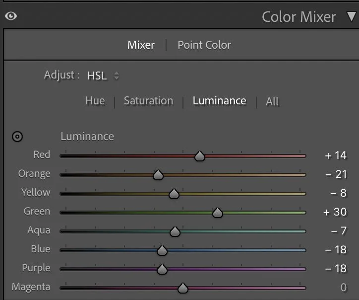
This keeps the sunset reflections alive without making them look artificial. For Luminance, I slightly lifted the warmer tones and kept the cooler tones darker. This creates brighter golden reflections while the water stays deep and grounded. The result is a clean two-color harmony:
warm light + cool shadows. Nothing more.
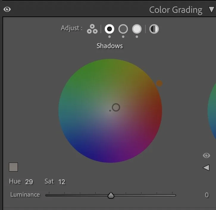
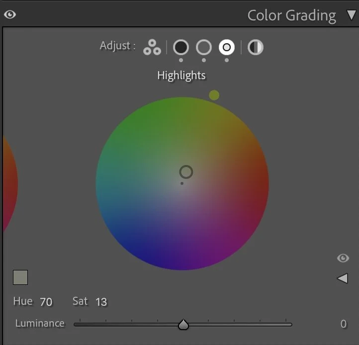
Color Grading – defining the cinematic sunset mood
Color grading gives the image its emotional character.
The Shadows (Hue 29 / Sat 12) were given a subtle warm-brown tone.
This adds weight and a slightly filmic look to the darker parts of the image instead of cold grey shadows.
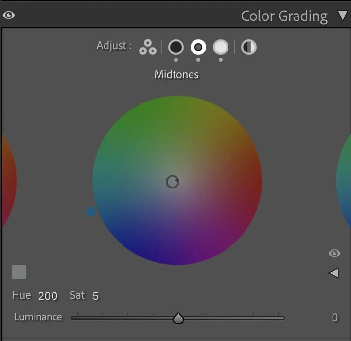
The Midtones (Hue 200 / Sat 5) introduce a soft cool balance.
This keeps the water and architecture neutral and prevents the photo from becoming overly orange.
The Highlights (Hue 70 / Sat 13) receive a gentle golden-yellow tint.
This enhances the sunset glow and makes the reflections feel natural and warm.
Together, these tones create contrast without conflict: warm light above, deeper tones below. It feels calm, not dramatic — like the end of the day, not a spectacle.
Final thoughts
This edit is a good reminder that strong light doesn’t need more brightness —it needs control. By darkening the exposure first and then carefully shaping tones and color, the image becomes more grounded and atmospheric. The gondola stands out, the church regains presence, and the reflections feel rich instead of washed out.
The scene didn’t need stronger colors or heavy contrast. It only needed balance. That’s often the difference between a snapshot and a mood. Further Before and After Articles can be found here.

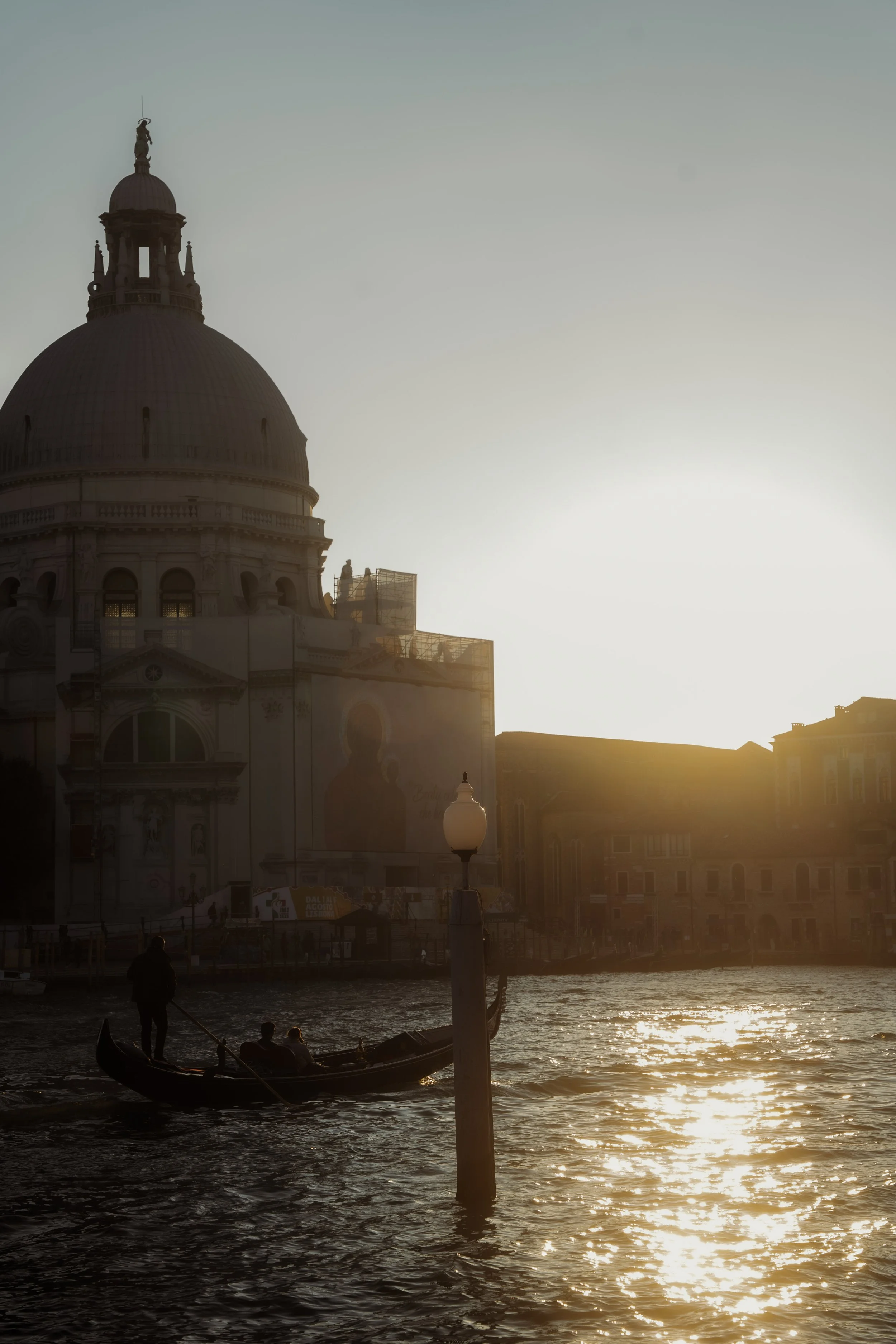
Embracing the natural contrast of the scene
In the earlier version of this image, I tried to balance the strong backlight from the sun by brightening the darker areas of the scene. This made the architecture and the gondola more visible, but it also softened the dramatic light that was actually present in that moment.
Looking at the image again today, I prefer a different interpretation.
In the current version, I allowed the scene to keep more of its natural contrast. The sun remains bright, while the gondola and the buildings stay darker, almost becoming silhouettes.
This creates a stronger visual focus on the glowing reflections on the water and the warm evening light hitting the edges of the architecture.
Instead of trying to reveal every detail, the image now embraces the atmosphere of the moment — the low sun, the shimmering water, and the quiet movement of the gondola.
Develop your own lightroom editing style
If you want to develop your own Lightroom workflow step by step – not based on presets, but on a conscious understanding of light, color and mood – you might enjoy my course.
In the course I explain how I approach editing decisions and how photographers can gradually develop their own visual style.
At first, starting a Lightroom edit in black and white may seem counterintuitive. After all, most of us care deeply about color. Yet removing color for a moment can reveal something more important: the light, balance and structure that hold an image together. In this article, I explain why I still begin many edits in black and white and how this simple approach changed both my editing workflow and the way I photograph.