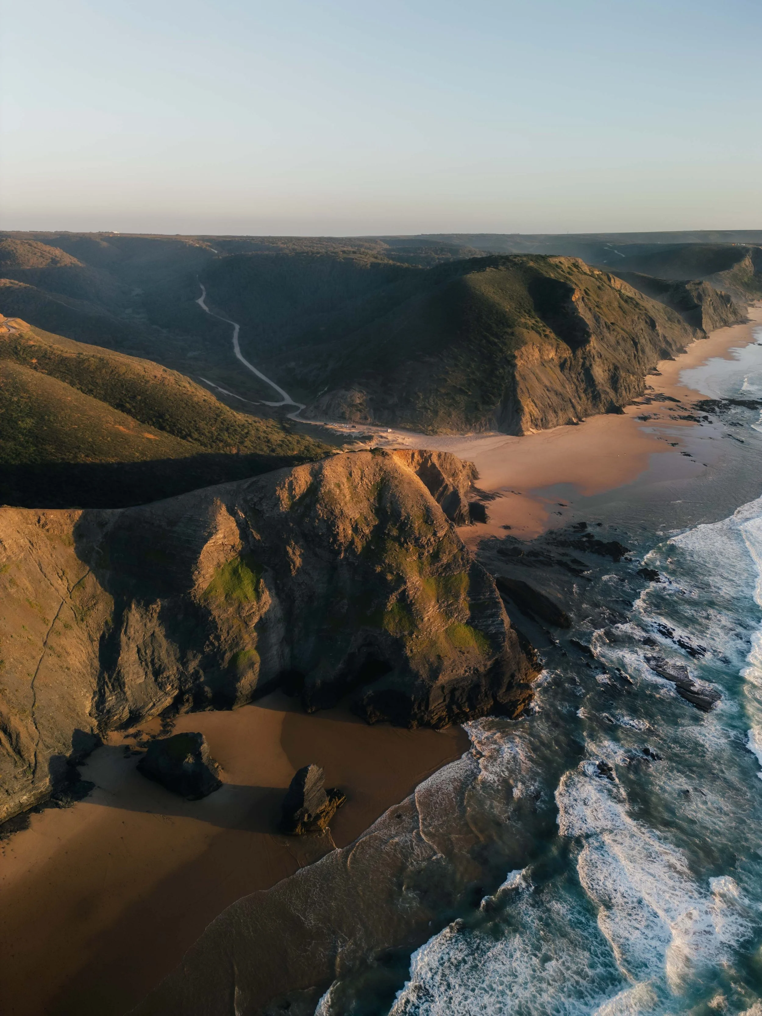
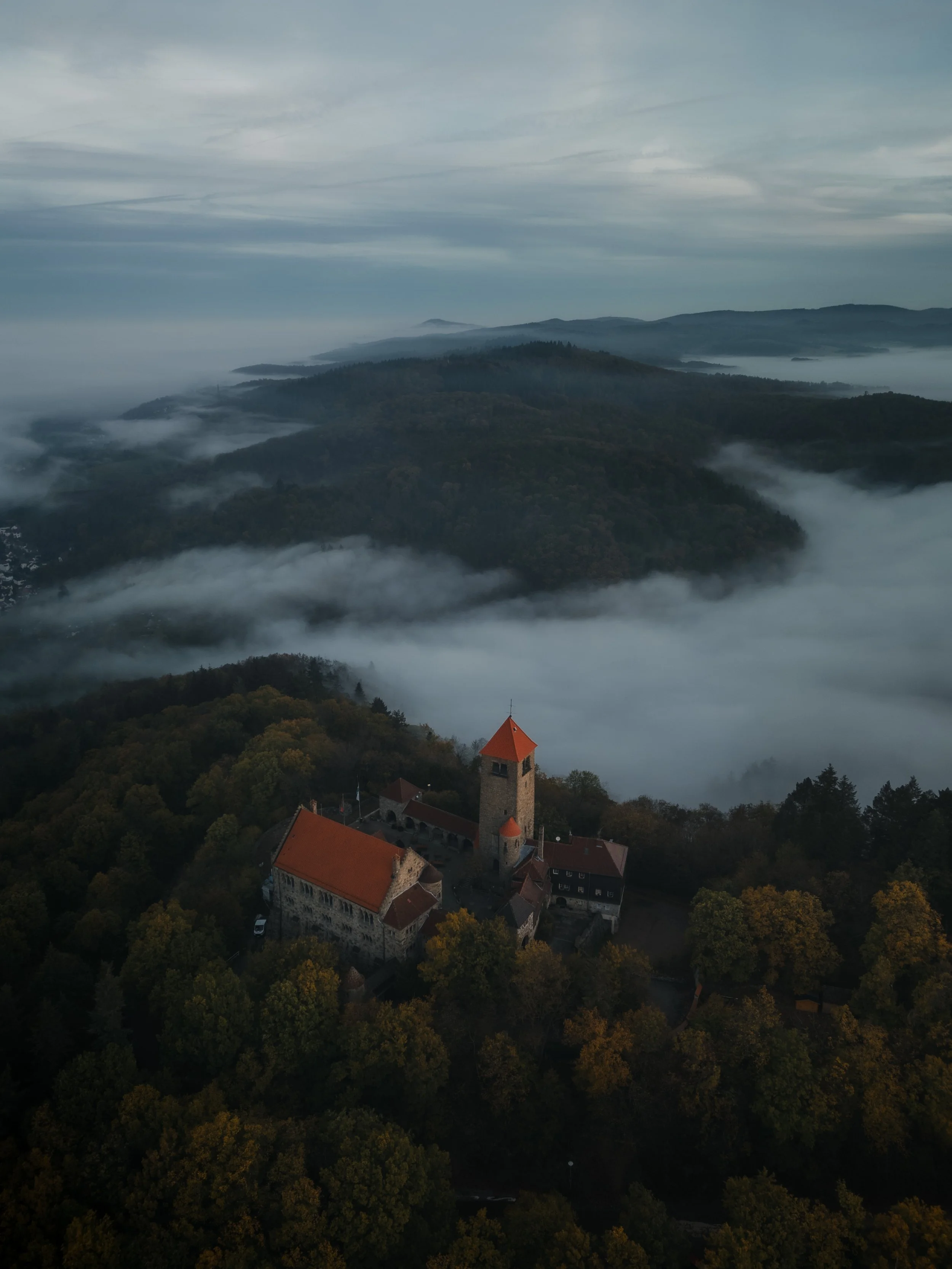
Lightroom Editing: Before and After - West algarve Coast, Portugal
RAW Photo. Lightroom Edit is shown below at the end of the article.
Starting point
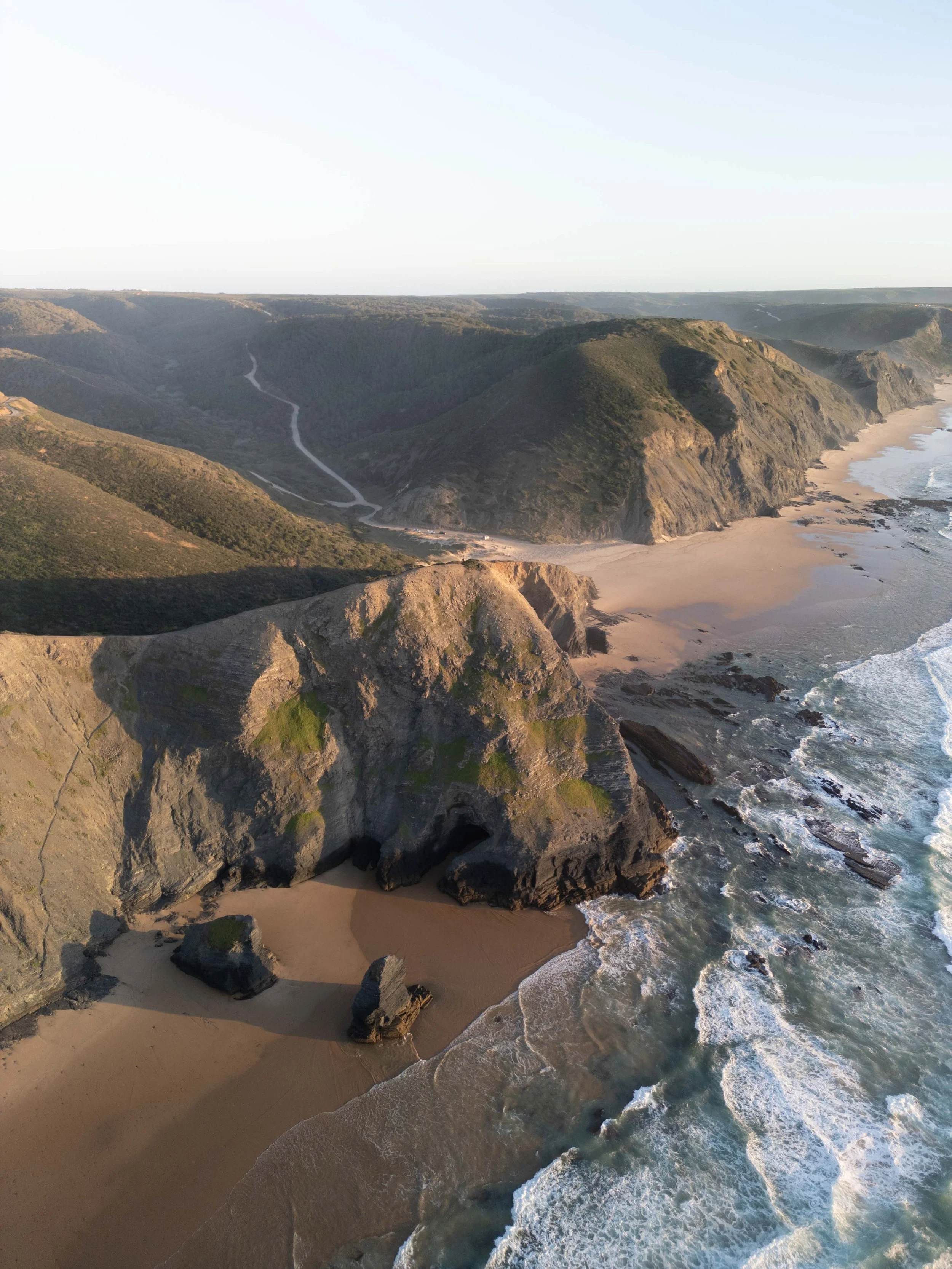
This image was taken along the wild coastline of the western Algarve. From above, the cliffs, the narrow beach, and the Atlantic create a powerful composition. The shapes are strong, the light already beautiful.
But the unedited photo felt too open and too bright. The sand reflected a lot of sunlight, the sky lacked weight, and the cliffs did not yet show the depth I experienced while flying the drone.
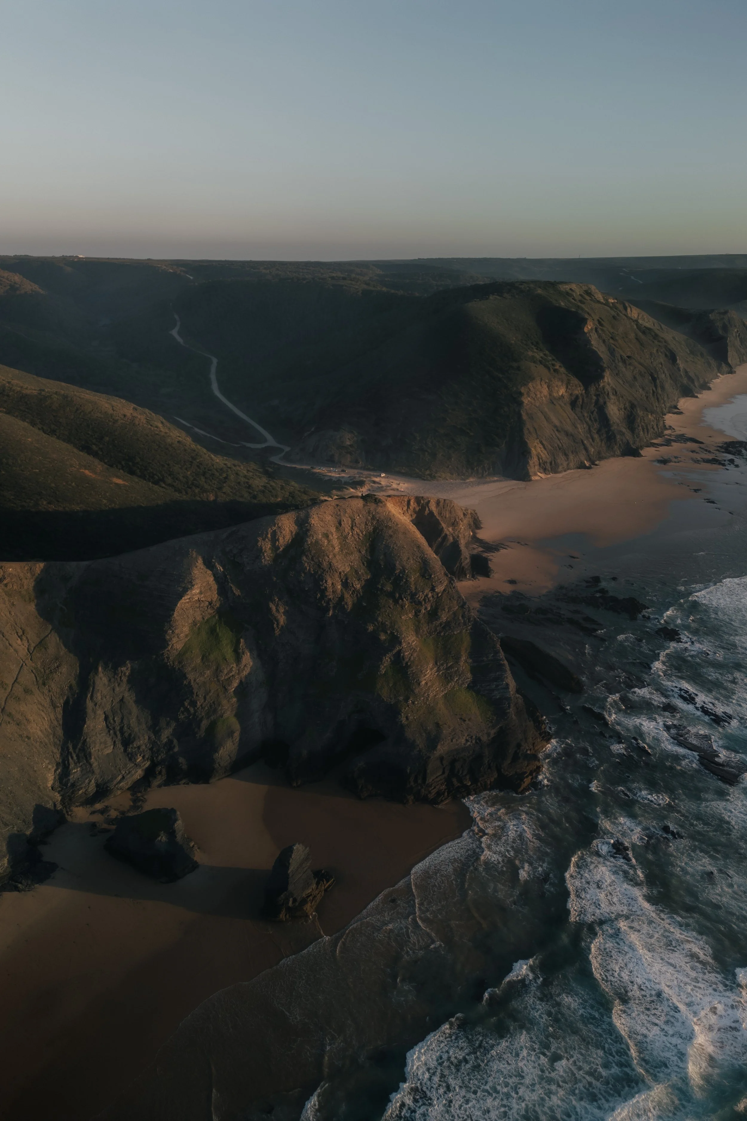
My goal was not to create drama. It was to give the landscape stability.
Less glare, more structure, clearer separation between water, rock, and land.
Exposure and basic adjustments - fixing the light
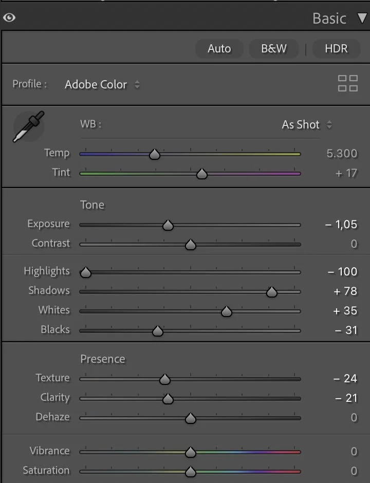
Basic Adjustments in Lightroom
The first step was to calm the brightness. I lowered the Exposure (–1.05) to bring the scene back into a believable evening mood. Highlights were pushed down strongly (–100) so the sunlit areas of sand and water would stop glowing uncontrollably.
At the same time, I opened the Shadows (+78) to keep detail in the darker rock formations. Whites (+35) helped the image stay alive, while Blacks (–31) anchored everything and created a stronger base.
Texture (–24) and Clarity (–21) were reduced as in most of my edits. Coastal air should feel soft, not crunchy. Dehaze remained at 0 because clarity here comes from tone, not from artificial contrast..
Tone curve — guiding the eye through the landscape
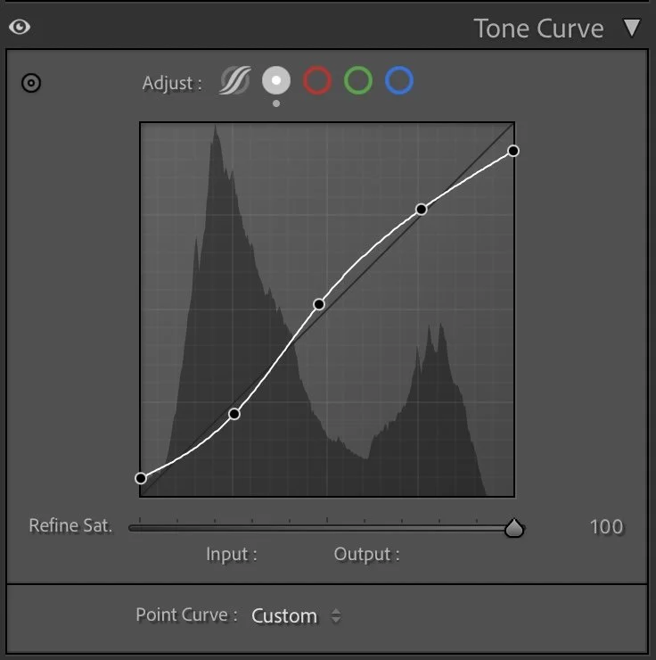
Tone curve in Lightroom
The tone curve follows a gentle S-shape. Midtones are slightly lifted, allowing the cliffs to remain readable even after darkening the exposure. Shadows keep their depth, especially in the water and in the rock faces. Highlights rise smoothly but never become aggressive.
This creates a natural flow:
foreground → cliffs → beach → distant land.
The viewer moves through the image without resistance.
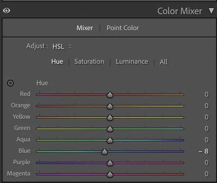
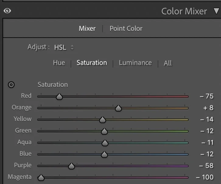
HSL Adjustments – bringing order to many competing colors
The Algarve is full of color. Warm rocks, green patches of vegetation, blue water, bright foam. Without control, these tones quickly fight each other. So instead of adding color, I simplified.
Reds were strongly reduced in saturation (–75) because they often appear in soil and small details that distract from the overall harmony. Greens were slightly muted (–12) to keep them natural and avoid a neon look.
Aquas and Blues were softened as well (–11 / –12). The ocean should feel deep and calm, not tropical.
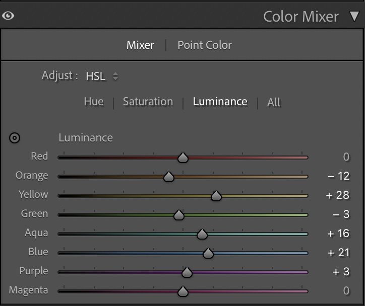
At the same time, luminance adjustments helped separate the elements:
Yellows became brighter (+28) so the cliffs receive sunlight, while Blues were lifted (+21) to keep structure in the water.
These changes are subtle individually, but together they create a calmer, more mature color palette.
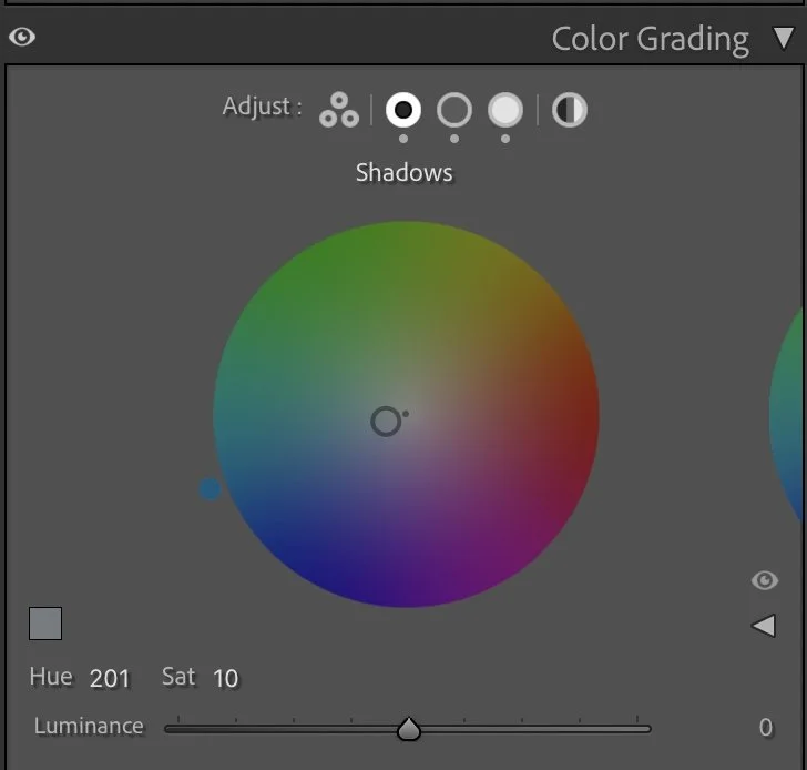
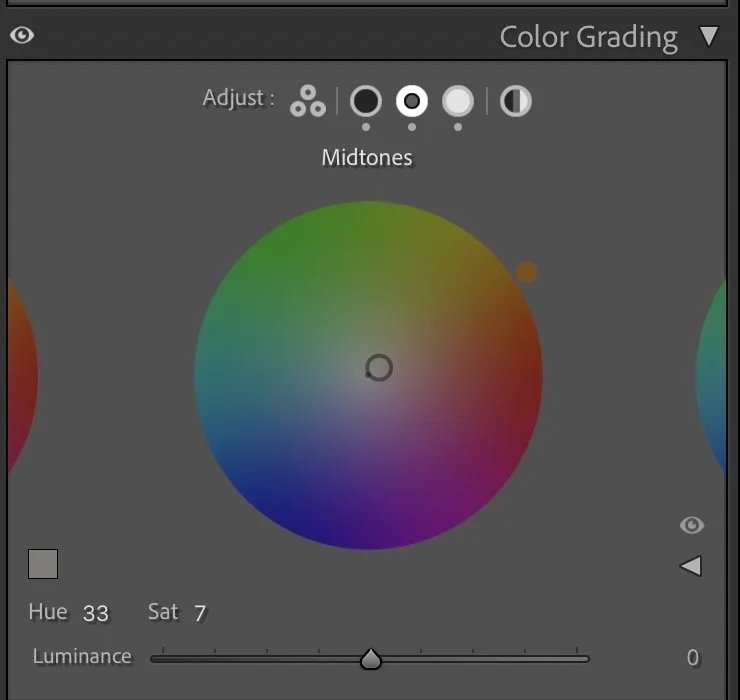
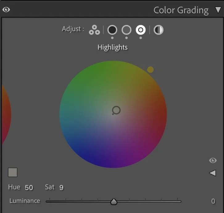
Color Grading – shaping the temperature of the evening
Color grading defines the emotional direction. The Shadows received a cool blue tone (Hue 201 / Sat 10). This coolness balances the heavy warmth from the sun and prevents the image from becoming orange.
Midtones move gently toward warmth (Hue 33 / Sat 7). This is where most of the cliffs live, so the golden light becomes present but controlled.
The Highlights (Hue 50 / Sat 9) add the final touch of sunset. Not too strong — just enough to feel the last light of the day.
Together, cool shadows and warm highlights create a cinematic equilibrium. Nothing screams; everything breathes.
Final thoughts
What I like about this edit is that it respects the natural power of the place. The Algarve doesn’t need exaggeration. It needs balance. By reducing brightness, simplifying colors, and carefully guiding warm and cool tones, the landscape gains depth and calm authority. The viewer can feel the wind, the height, and the late sun — without being overwhelmed.
This is a good example of my philosophy:
control first, atmosphere second, color last. Further Before and After Articles can be found here.
Letting the landscape keep its depth
In the earlier version of this image, my edit focused mainly on making the scene brighter and slightly more vibrant. The coastline, the cliffs, and the ocean all became a bit more evenly lit, which made the image feel clear and easy to read.
But over time I realized that this approach sometimes removed part of the natural depth of a landscape.
In the current version, I allowed the shadows in the cliffs and the darker tones in the water to remain stronger. This creates more separation between light and shadow and gives the image a stronger sense of scale.
The highlights from the low sun are still present, but they now stand out more because the surrounding areas remain darker and more natural.
For me, this version feels closer to how the moment actually looked — warm light touching the cliffs, while the ocean and the valleys stayed deeper and more subdued.
Develop your own style
If you want to develop your own Lightroom workflow step by step – not based on presets, but on a conscious understanding of light, color and mood – you might enjoy my course.
In the course I explain how I approach editing decisions and how photographers can gradually develop their own visual style.
At first, starting a Lightroom edit in black and white may seem counterintuitive. After all, most of us care deeply about color. Yet removing color for a moment can reveal something more important: the light, balance and structure that hold an image together. In this article, I explain why I still begin many edits in black and white and how this simple approach changed both my editing workflow and the way I photograph.