Lightroom Editing: Before and After - Westerhever Lighthouse
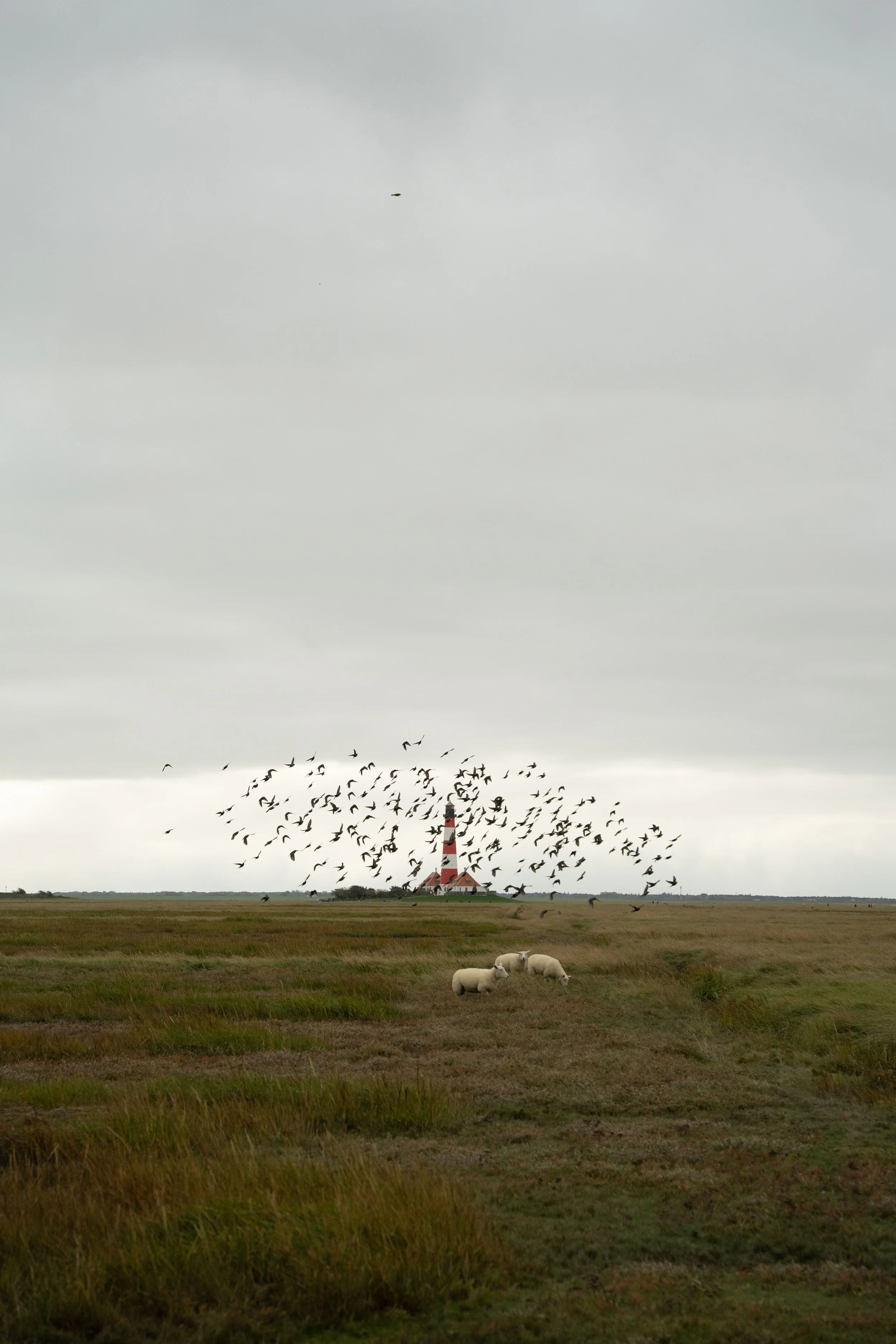
RAW Photo. Lightroom Edit is shown below at the end of the article.
Editing a Moody Landscape at Westerhever Lighthouse
Some photos are not about dramatic sunsets or spectacular light. Sometimes the atmosphere itself tells the story.
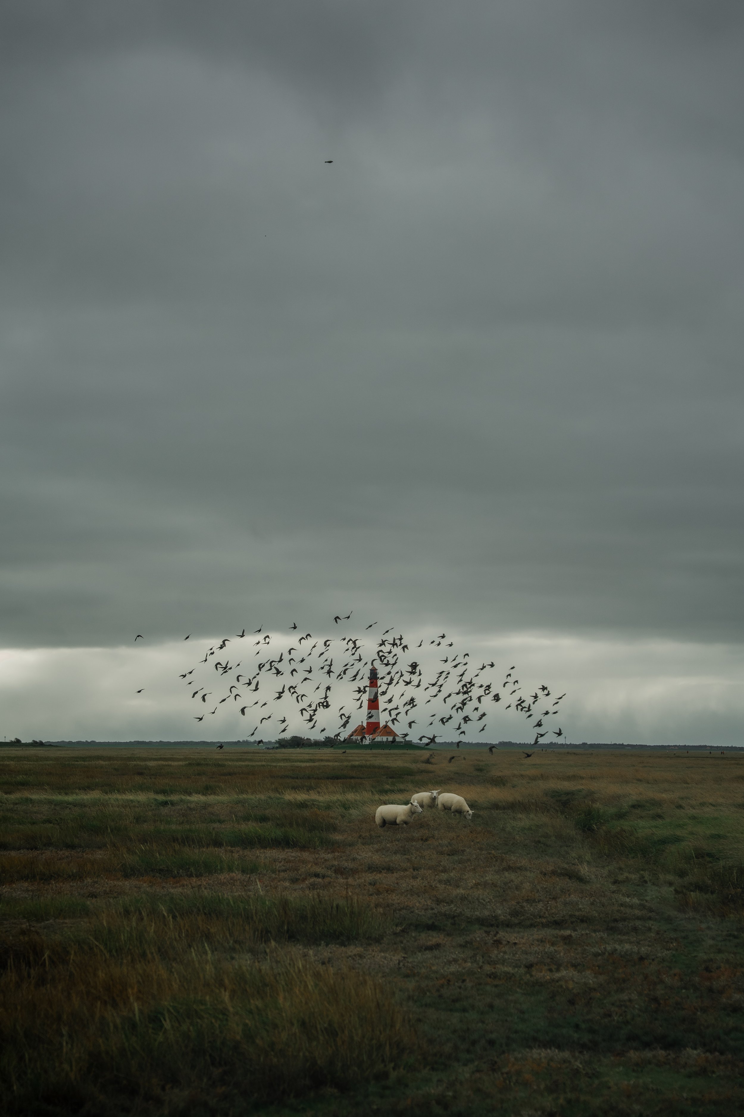
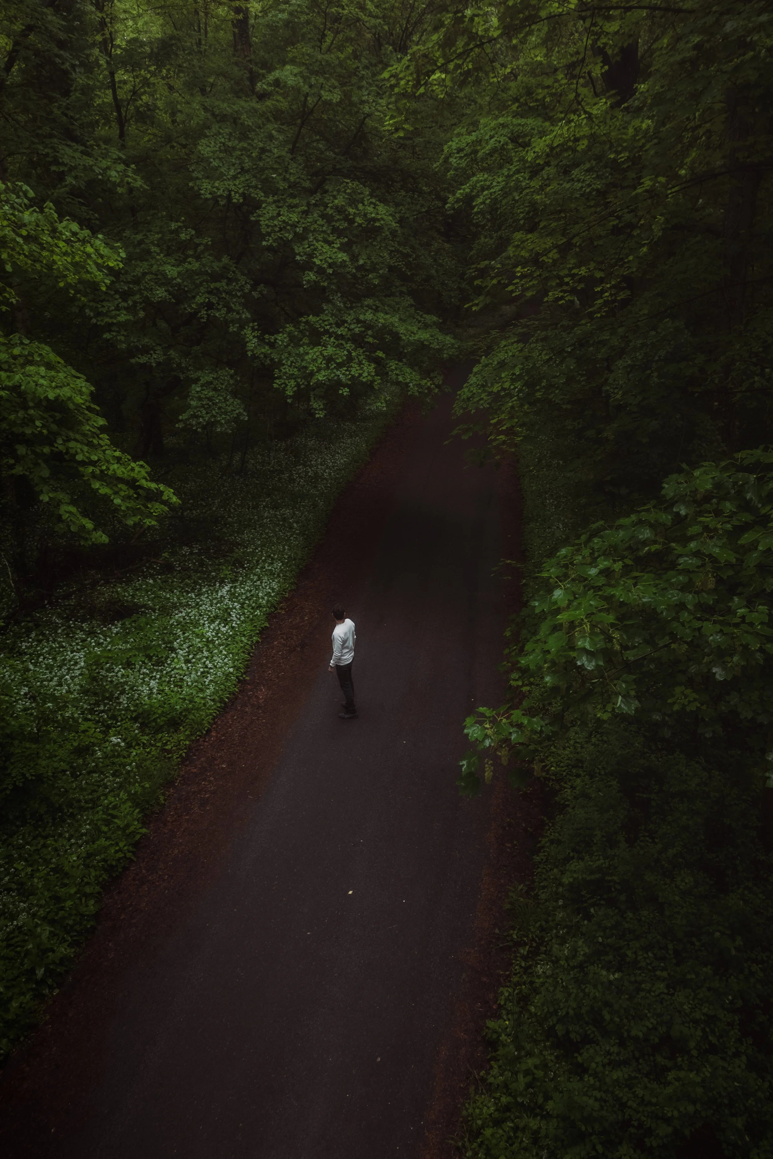
This image was taken near the Westerhever Lighthouse on the North Sea coast on a cloudy day. The sky was heavy and grey, the light very soft, and the landscape almost completely quiet. While I was standing in the marshland, a flock of birds suddenly rose into the air around the lighthouse, while sheep were calmly grazing in the foreground.
The moment felt very calm and almost cinematic. But like many RAW files, the original image looked flatter than the scene felt in reality. The sky was bright and dominant, while the colors in the grassland appeared slightly muted and unstructured.
The goal of the edit was therefore not to create drama, but to carefully reveal the natural atmosphere of the landscape.
Basic Adjustments in Lightroom
Balancing the Exposure and Recovering the Sky
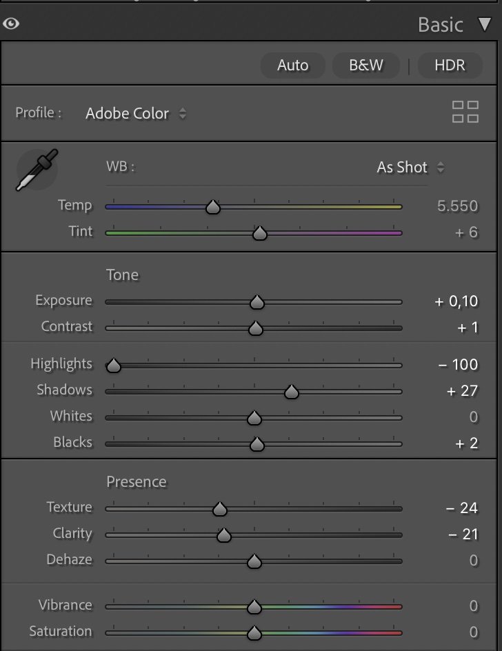
The first step was balancing the exposure of the image. Because the sky occupied a large part of the frame, it had a strong influence on the overall brightness of the photo.
To recover more structure in the clouds, I reduced the highlights significantly while slightly lifting the shadows. This helped bring back detail in the sky while making the landscape feel a little more open.
The main adjustments were a small exposure increase (+0.10) combined with strong highlight recovery (−100) and slightly lifted shadows (+27). Whites remained neutral (0) and the blacks were only slightly raised (+2) to keep the contrast soft.
At the same time, I reduced some of the micro-contrast of the image. Lowering texture (−24) and clarity (−21) creates a softer transition between tones, which fits much better with the diffused coastal light of this scene.
Refining the Contrast with the Tone Curve
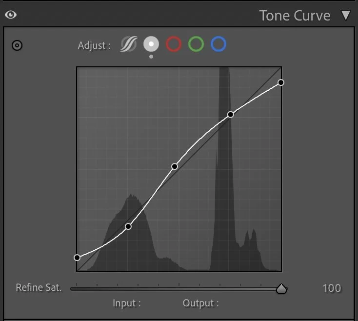
Tone curve in Lightroom
After balancing the basic exposure, I used the tone curve to shape the overall contrast more precisely.
Instead of creating strong contrast, I applied a gentle curve that slightly lifts the midtones while keeping the darker tones relatively soft. This helps separate the landscape, the lighthouse and the sky without making the image feel harsh.
This step is subtle, but it adds depth to the scene and makes the composition feel more structured.
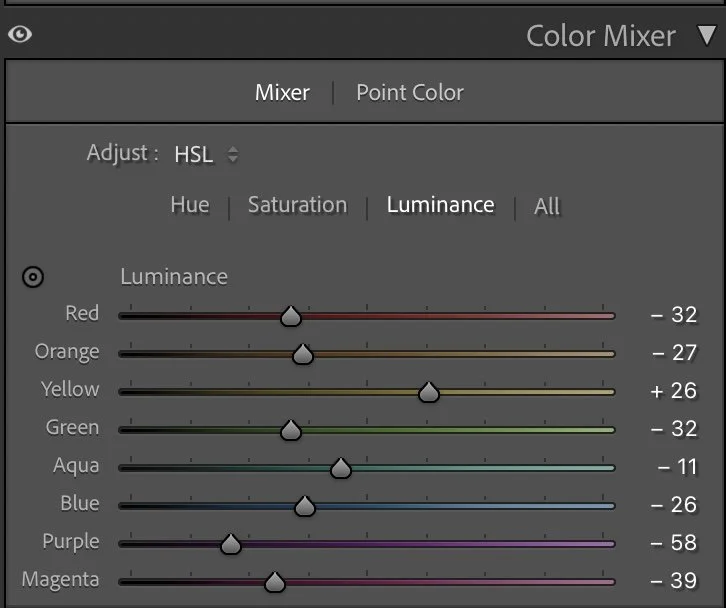
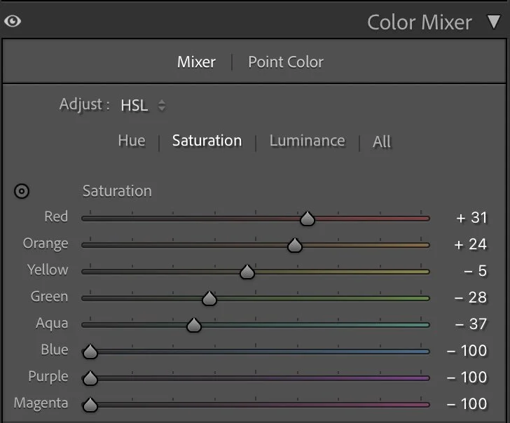
Creating Natural Color Balance with HSL
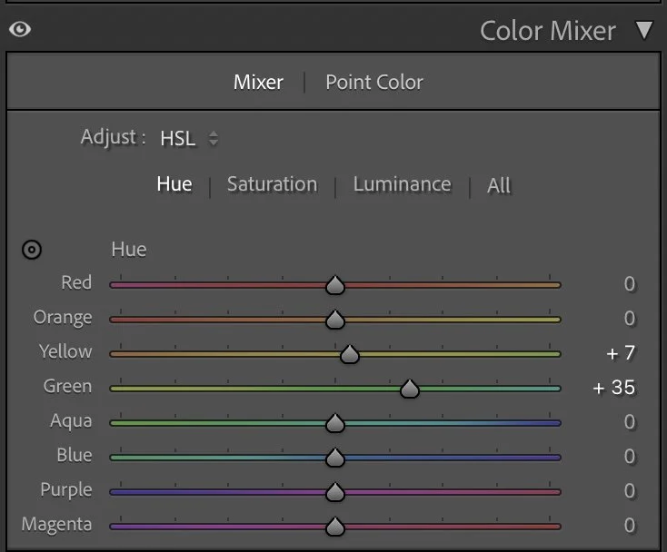
The colors of the North Sea marshland are quite complex. The grasses contain a mixture of green, yellow and brown tones that can easily become too saturated or uneven in RAW files. Instead of increasing color intensity, I focused on balancing the hues and luminance of the different tones.
The green tones were shifted slightly towards cooler hues (Hue +35) while the yellow tones were adjusted a little (+7) to better match the natural grass colors. At the same time, I reduced some of the saturation in greens and aqua tones while keeping warmer colors slightly stronger.
This helps remove distracting color noise and allows the lighthouse and landscape to feel more coherent. Luminance adjustments then added additional depth to the landscape. Darker greens (−32) create more structure in the grassland, while slightly brighter yellows (+26) help the foreground catch more light.
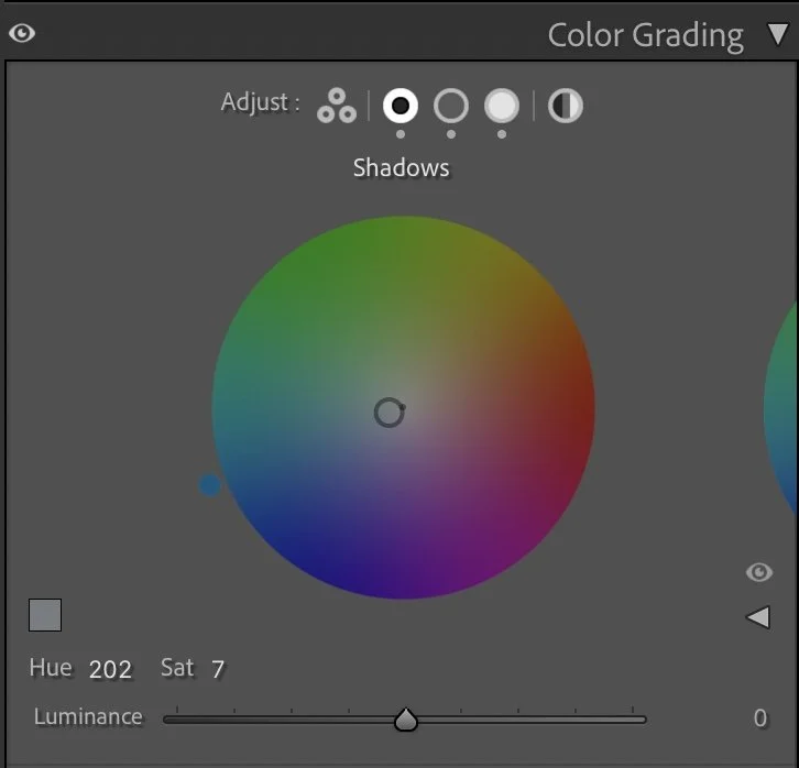
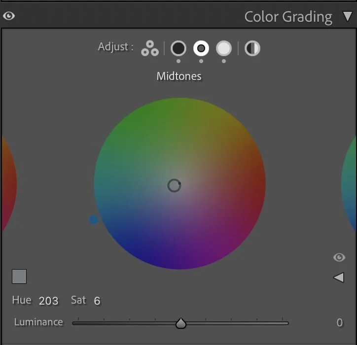
Adding a Subtle Color Atmosphere
As a final step, I added a very gentle color grading to unify the mood of the image. The shadows received a soft cool tone (Hue 202 / Sat 7), while the midtones were slightly cooled as well (Hue 203 / Sat 6). The highlights received only a very light warm tint (Hue 97 / Sat 4). These adjustments are almost invisible individually, but together they help connect the sky, the lighthouse and the landscape into one consistent atmosphere.

The Final Image
After the edit, the image feels calmer and more atmospheric. The sky now shows more structure, the grassland has gained depth, and the lighthouse naturally stands out in the landscape. Nothing in the image feels exaggerated or over-processed. Instead, the edit simply reveals the quiet mood that was already present in the moment.
For me, this is often the most satisfying kind of editing: not changing the scene, but carefully uncovering what was already there. Further Before and After Articles can be found here.

A Different Editing Approach Today
The edit explained above reflects the approach I used when I originally worked on this image. At that time my focus was mainly on clarity, balanced exposure and colors that work well across different platforms.
Today my editing style has evolved in a slightly different direction. I often work with deeper tones, softer transitions and a stronger emphasis on atmosphere.
Below you can see how I would interpret the same photo today.
While the technical workflow may look similar, the intention behind the edit is different: instead of optimizing for clarity, the goal is to shape the overall mood of the image. Developing this kind of personal style is something that takes time and experimentation. It’s less about individual slider settings and more about understanding how light, color and contrast influence the feeling of a photograph.
Develop Your Own Editing Style
If you want to develop your own Lightroom workflow step by step – not based on presets, but on a conscious understanding of light, color and mood – you might enjoy my course.
In the course I explain how I approach editing decisions and how photographers can gradually develop their own visual style.
At first, starting a Lightroom edit in black and white may seem counterintuitive. After all, most of us care deeply about color. Yet removing color for a moment can reveal something more important: the light, balance and structure that hold an image together. In this article, I explain why I still begin many edits in black and white and how this simple approach changed both my editing workflow and the way I photograph.