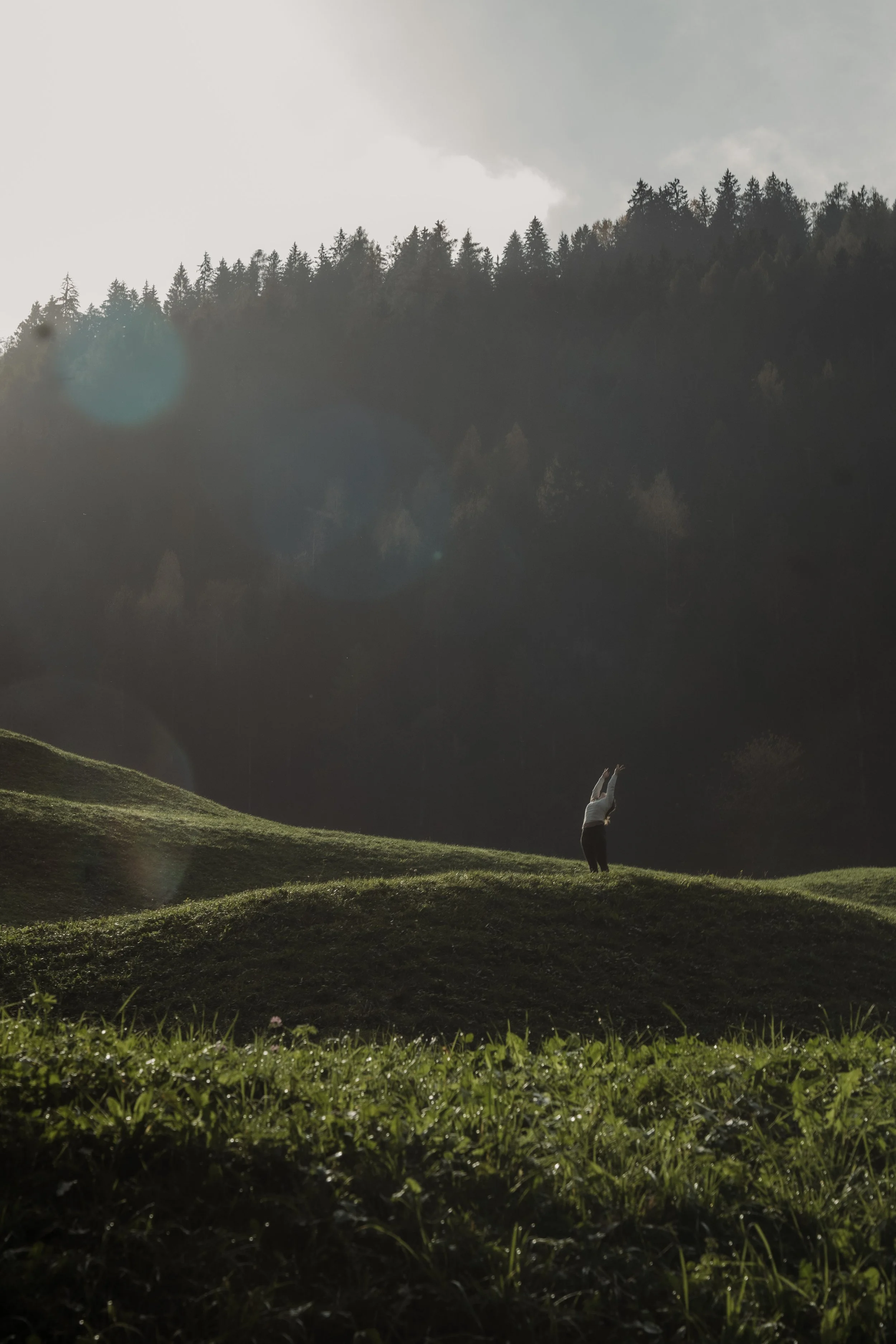
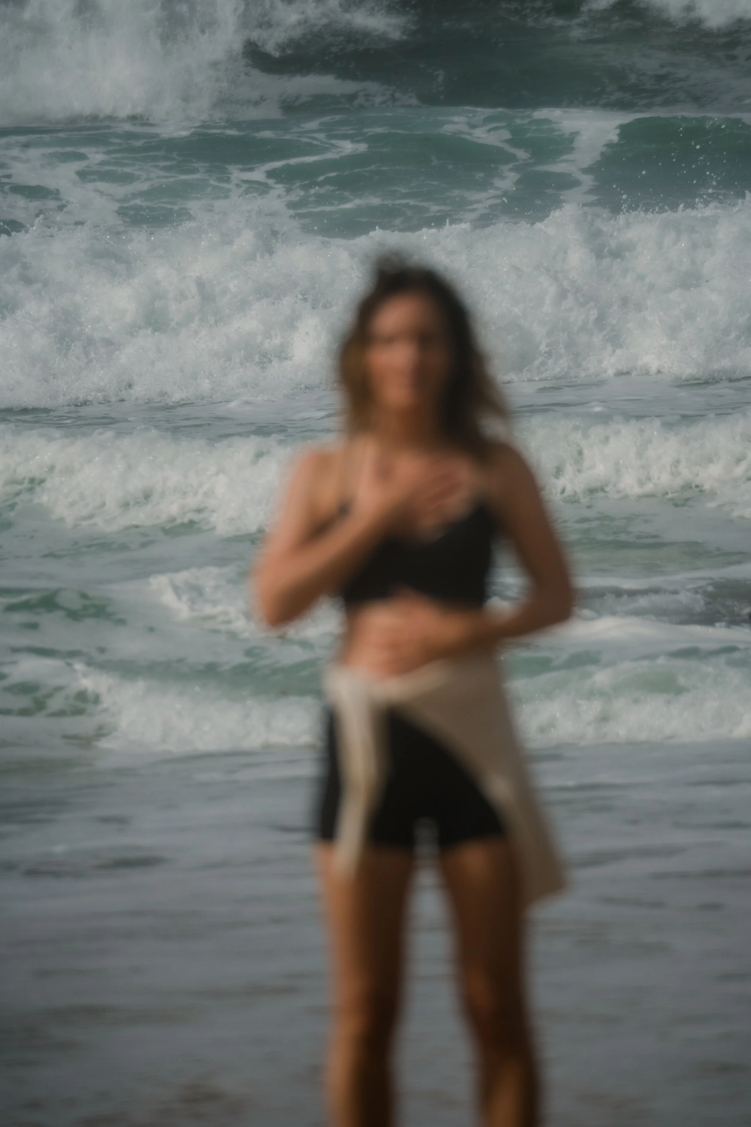
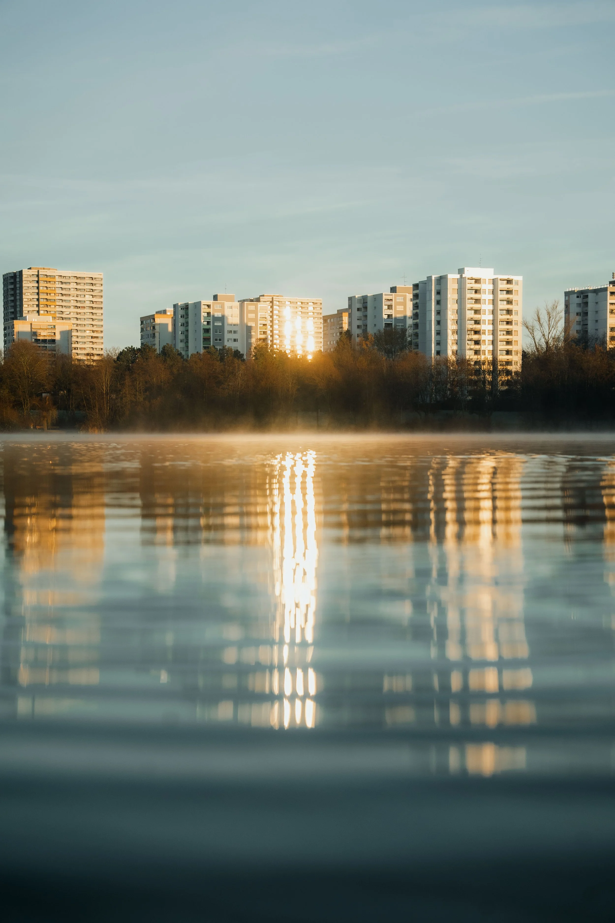
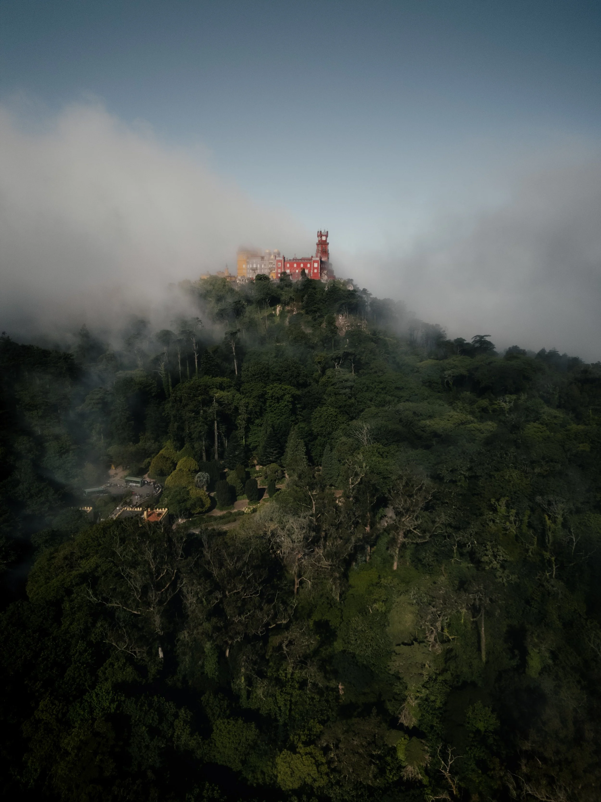
How to Develop Your Own Editing Style:Colour Perception and Consistency in Photo Editing
As a hotel and landscape photographer, it was essential for me to develop my own editing style. To do that, I had to understand how people perceive colours — and why we all have different tastes. Read more below.
Do you enjoy taking photos — but is your editing actually consistent?

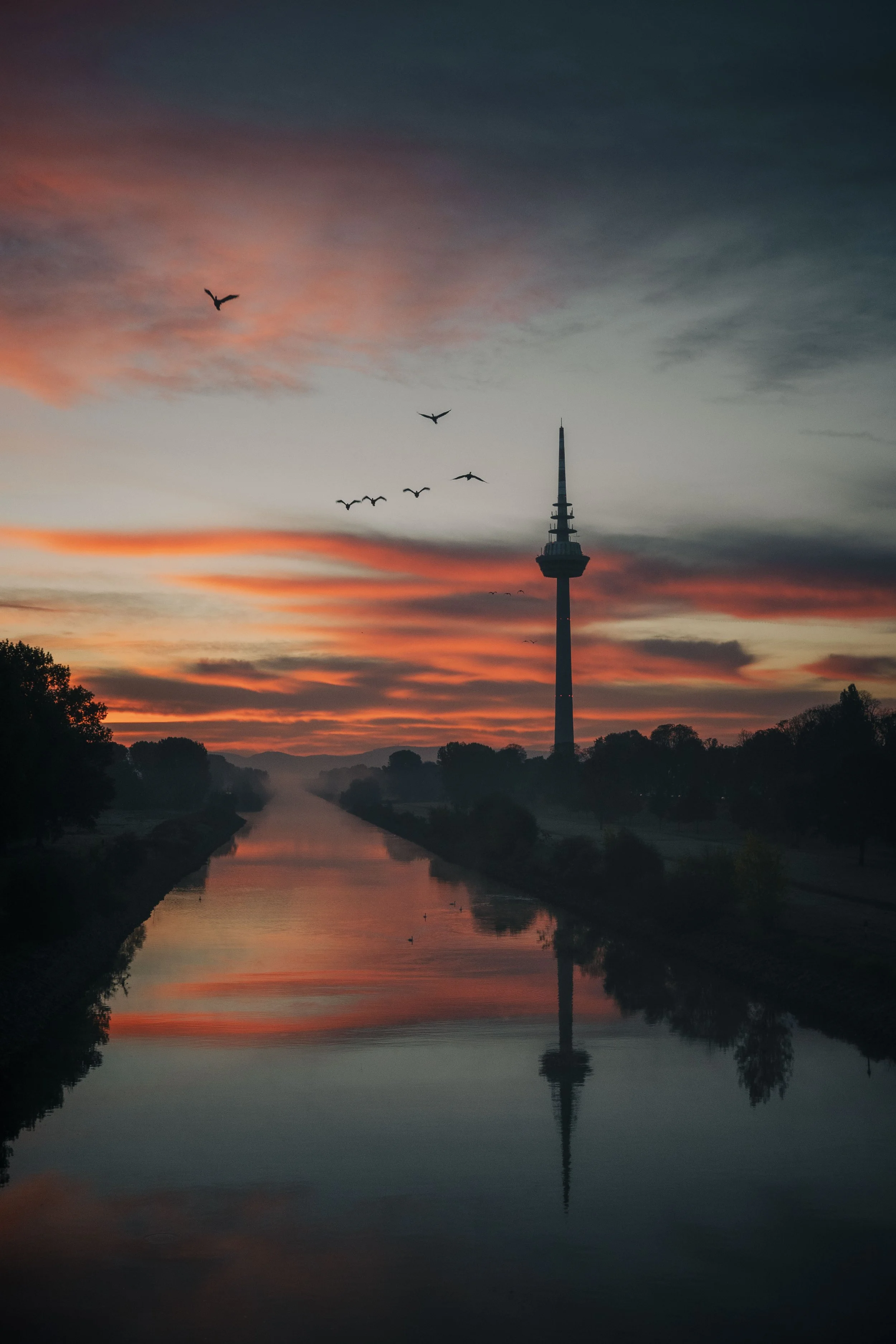
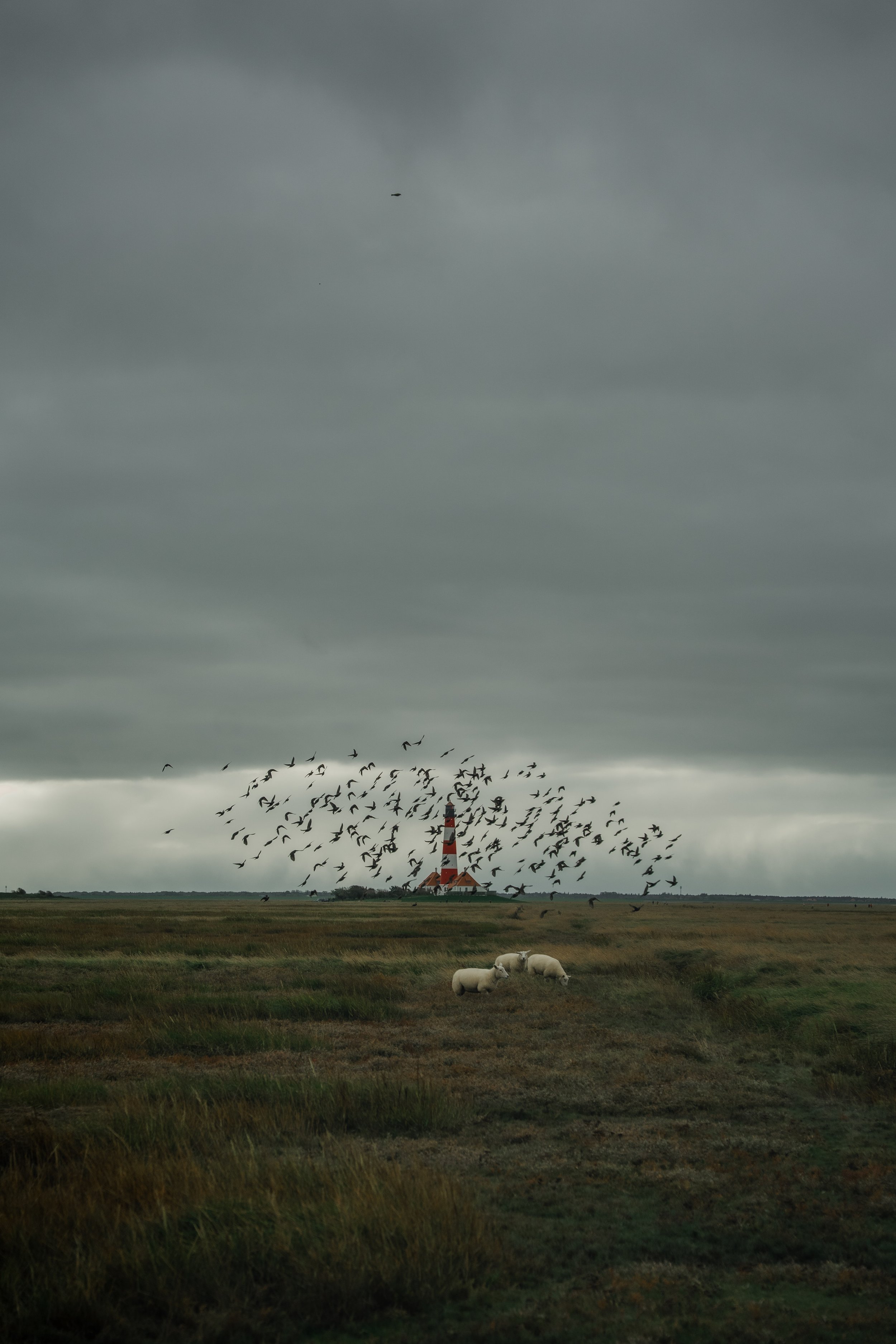
📌Did this reflection inspire you? You can also find the image on my Pinterest-Board.
Do you enjoy taking photos? Do you also edit your images in Lightroom? Do you publish your photos on social media somewhere – can I see them? Have you ever analysed your photos in detail to see whether you use consistent colours in your edits? For example, are your blue tones always the same, or do they change from photo to photo? Do you sometimes use strong colours, and other times more muted ones? Are you aware of the emotional effects these decisions can have on the viewer? Do you sometimes feel that your edits are missing that certain something? And have you ever seen someone else’s photo and thought: “Wow… that looks awful. How can something like this be successful?”
Do you want your photos to evoke emotions in the viewer – and if so, which ones?
I created an editing course that helps you develop your own colour style and apply it consistently across all your photos. You won’t just create a colour style – you’ll create a style that triggers specific emotions in the viewer, emotions that only you can express in this way. Imagine someone telling you that your images have a recognisable colour signature. People instantly know on Instagram that these are your photos.
Why is a consistent colour style so important for your photography?
Once you’ve completed my course, you won’t see “terrible photos” anymore. Instead, you’ll recognise them as images with their own style – maybe not your taste, but someone else’s. You’ll feel more at ease with yourself and won’t get frustrated as quickly.
With my editing approach, you won’t need presets from other photographers, because you’ll discover your own style – the one that truly reflects you and your work. Viewers will notice this style and perceive you more authentically. Throughout the course, you’ll discover which colours you naturally gravitate towards, and you’ll likely start choosing those colours again and again. In the end, your colour choices will express your own emotional world. If you add more blue tones, your images will feel calmer. If you add more yellow or red tones, they might feel more energetic.
How to find your own colour style in Lightroom
The key to my method is that you don’t have to overthink anything. You’ll naturally discover your style and the emotional impact of your images. Let me give you a simple example with a sunset:
You might edit it with strong, intense colours to tell the story of a vibrant, powerful end of the day.
Or you reduce the intensity, use softer colours and blue tones to express calmness and a gentle closing of the day.
Colour perception: How colours create emotions
When you go on this journey of finding your own colour style, one thing is essential: people perceive colours differently, and personal taste varies. As a hotel and landscape photographer, this is an important insight – because every hotel has its own preferences, and not every rejection means your work is bad. In this article, I want to share a few reasons why understanding colour perception is so important. After reading this, you’ll look at Instagram feeds and other images with completely different eyes.
Understanding why people perceive colours differently
Understanding how colours are perceived is crucial if you want to develop your own visual voice as a photographer. There are many articles out there explaining the meaning of different colours. For example, blue is often associated with calmness, trust and communication, while green is linked to happiness, hope and contentment.
But people perceive colours and their intensity very differently. Have you ever heard someone say: “What a beautiful red sunset!” while to you it looked more orange or even purple? There are reasons for these differences – and I want to explain them here.
5 reasons why people see colours differently
1. Colour perception
Our ability to see colours is influenced by the genes we inherit from our parents. These genes determine the number of special cells in our eyes that react to light and allow us to see different colours. Since everyone has different genes, people perceive colours differently.
Imagine a group of friends looking at a painting in a museum. One friend might admire the cool tones like blue and green, while another focuses more on the warm tones like red and yellow. They’re experiencing the artwork differently because they literally see colours differently.
2. Colour blindness
As mentioned before, some people cannot see all colours correctly. Imagine two friends looking at a rainbow. One may not see the full spectrum at all, while the other can clearly distinguish every vibrant colour.
3. Lack of experience or training
For beginners, it’s difficult to understand how colours should be mixed or balanced within a photo. With practice, you learn how to combine them in a meaningful way. There are concepts like complementary, secondary and tertiary colours that you can learn and apply.
Personally, I limit my colours to a maximum of three in my edits. For example, I always reduce the purple and magenta channels in HSL. For the remaining colours, I shift the hue sliders until I end up with only three colour families.
4. Too much screen time
If you stare at screens for too long, your eyes get tired and you can’t perceive colours accurately anymore. That’s why I always recommend reviewing your edits the next day. You might think an edit looks perfect at night, but the next morning you realise it’s not. That happens because your eyes were exhausted the evening before.
5. Personal preferences
Some people simply prefer certain colours over others. Personal taste and what someone finds visually pleasing will influence how they see colours.
Think of your friends: do they prefer bright colours, muted tones, earth colours or neon? Everyone is different, and this also affects the clients you choose to work with.
Personal experience: How I learned to find the right clients
A personal story: I once took photos for a good friend for free and edited everything in my style. I liked the edits, but I already had a feeling he wouldn’t. And I was right – he prefers vibrant colours, while I’m the complete opposite. I prefer muted, earthy tones with a touch of grey.
So I gave him the DNG files and told him he could increase the blue tones however he liked. That was fine for me. But I still wasn’t truly satisfied with the outcome because I want happy clients – and I knew he wasn’t fully happy either.
From that moment on, I decided I wouldn’t edit photos for clients who don’t like my style.
Conclusion: Work with people who love your colours
The main message is simple: find out which colours you truly love – and work with clients and partners who love those colours too.
I’m sure you can find yourself in one of these examples and now have a better understanding of why people see colours differently and have different tastes. Understanding this will help you in your client acquisition process and spare you a lot of unnecessary frustration when someone decides not to work with you.

At first, starting a Lightroom edit in black and white may seem counterintuitive. After all, most of us care deeply about color. Yet removing color for a moment can reveal something more important: the light, balance and structure that hold an image together. In this article, I explain why I still begin many edits in black and white and how this simple approach changed both my editing workflow and the way I photograph.