Lightroom Editing: Before and After - algarve coast

RAW Photo. Lightroom Edit is shown below at the end of the article.
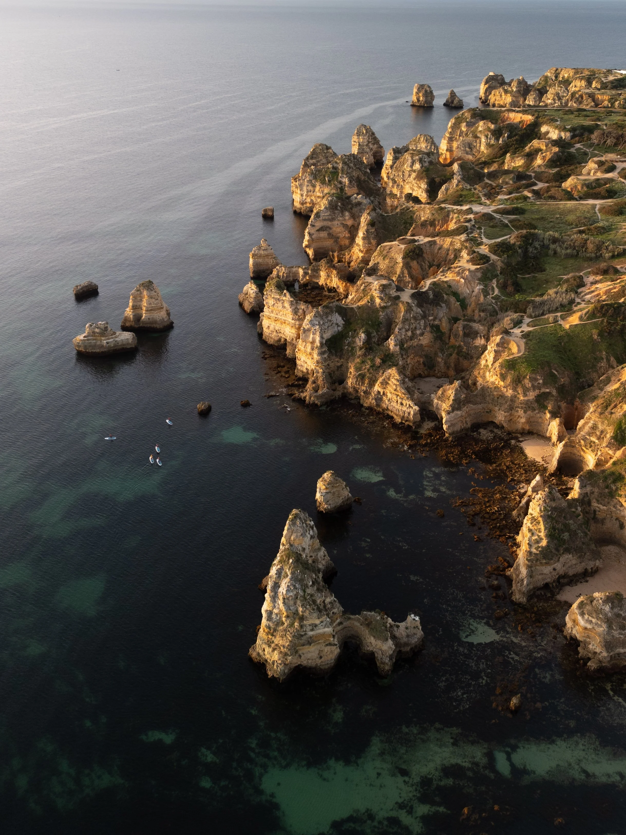
Starting point
This image was taken along the Algarve coast in Portugal during the late afternoon, when the sun was already low and the light had softened. The cliffs were glowing slightly warm, while the Atlantic below appeared calm but heavy — a deep surface with subtle color variations beneath.
In the unedited image, the scene felt flatter than it actually was. The water looked pale and slightly grey, the rock formations lacked separation, and the overall contrast didn’t reflect the quiet strength of the coastline. My goal was not to make the colors louder, but to give the image more depth and presence — allowing the sea to feel deep and the cliffs to stand confidently against it.
Exposure and basic adjustments
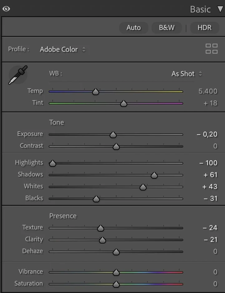
Basic Adjustments in Lightroom
The edit started by carefully shaping the light rather than changing it drastically. I slightly lowered the Exposure (–0.20) to anchor the image and prevent the highlights on the rocks from becoming too dominant.
Highlights were pulled down aggressively (–100) to recover detail in the brighter cliff faces and the reflective parts of the water. At the same time, I lifted the Shadows (+61) to reveal more structure in the darker areas of the sea without flattening it.
Whites were increased (+43) to bring clarity back into the lighter rock textures, while Blacks were deepened (–31) to give the ocean more visual weight. This balance creates a strong base: bright cliffs above, deep water below.
Texture (–24) and Clarity (–21) were reduced to avoid a harsh, over-detailed look. The goal here was smoothness and flow, not crispness. Dehaze stayed at 0 — the atmosphere already had enough clarity, and adding dehaze would have destroyed the calm mood.
Tone curve in Lightroom
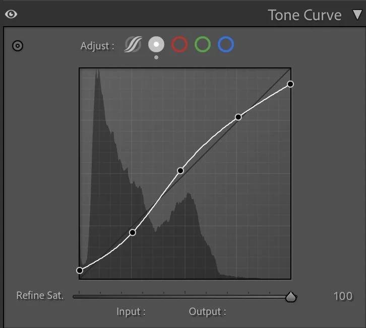
Tone curve — creating separation and depth
The tone curve plays a key role in this edit. A gentle S-curve was applied to increase contrast without pushing the image into a dramatic or artificial look.
The shadows were slightly lifted to keep detail in the darker parts of the water, while the midtones were brightened to help the cliffs stand out more clearly from the sea. Highlights were raised carefully, ensuring that the sunlit edges of the rocks remain soft rather than harsh.
This curve helps guide the eye naturally through the image — from the deep foreground water up to the illuminated cliffs and further into the distance.
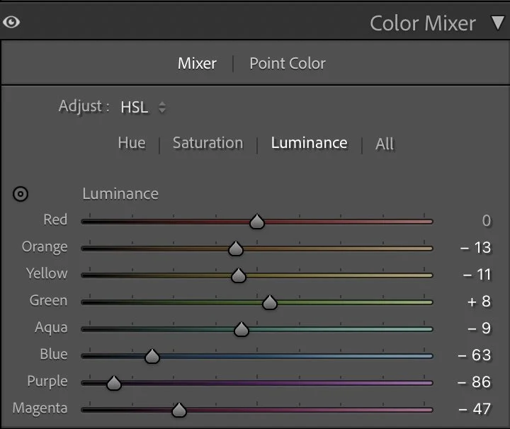
HSL Adjustments – Controlling color without exaggeration
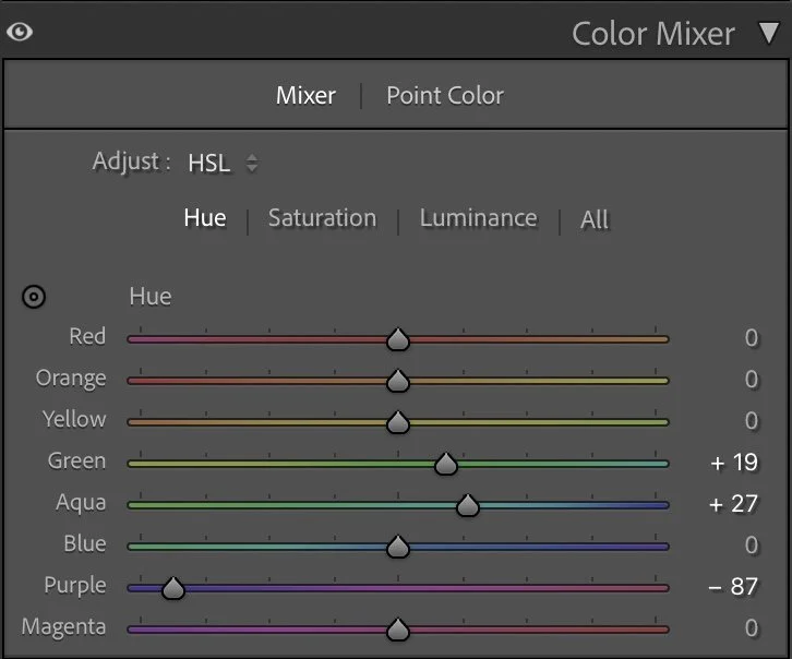
Color work in this image focuses on balance rather than intensity. In the Hue panel, Green was shifted slightly (+19) and Aqua was pushed further (+27) to refine the transition between shallow water and deeper sea tones. Purple was reduced significantly (–87) to keep the image clean and avoid unwanted color noise in the shadows.
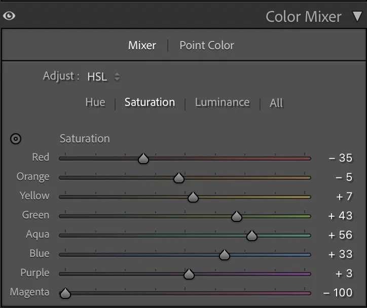
Saturation adjustments were used selectively. Reds (–35) and Oranges (–5) were slightly reduced to prevent the cliffs from becoming too warm or overpowering. Greens (+43), Aquas (+56), and Blues (+33) were increased to give the sea more presence — not brighter, but richer.
In the Luminance panel, Blue was darkened strongly (–63) to give the ocean depth, while Aqua (–9) and Green (+8) were adjusted to maintain separation between underwater tones and surface reflections. Purple (–86) and Magenta (–47) were reduced to keep the image grounded and natural.
Color Grading – defining the mood
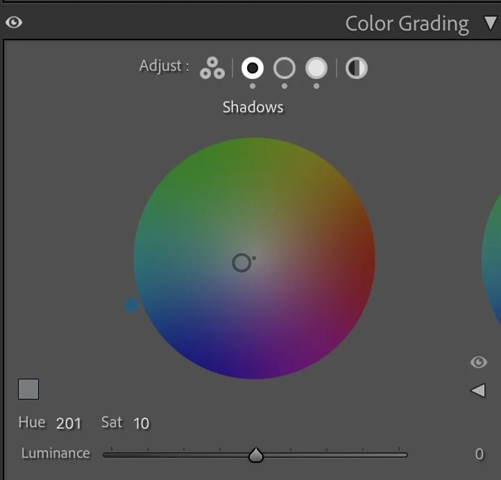
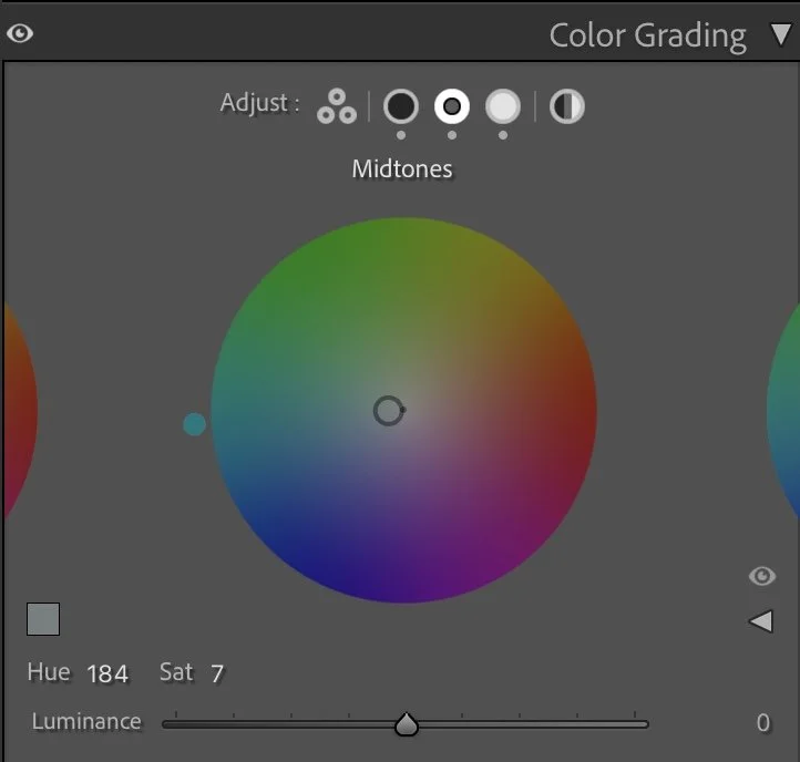
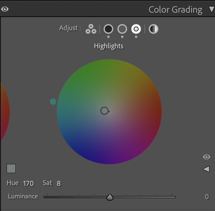
Color grading ties the image together emotionally.
The Shadows were given a cool blue tone (Hue 201 / Sat 10), reinforcing the depth and calmness of the Atlantic water.
The Midtones follow a similar direction (Hue 184 / Sat 7), creating consistency across the cliffs and mid-range tones.
The Highlights were shifted slightly toward a softer, cooler tint (Hue 170 / Sat 8), keeping the sunlit rock edges subtle and refined.
This combination creates a quiet cinematic look — cool and calm overall, with just enough warmth left in the cliffs to suggest late-day light.
Final thoughts
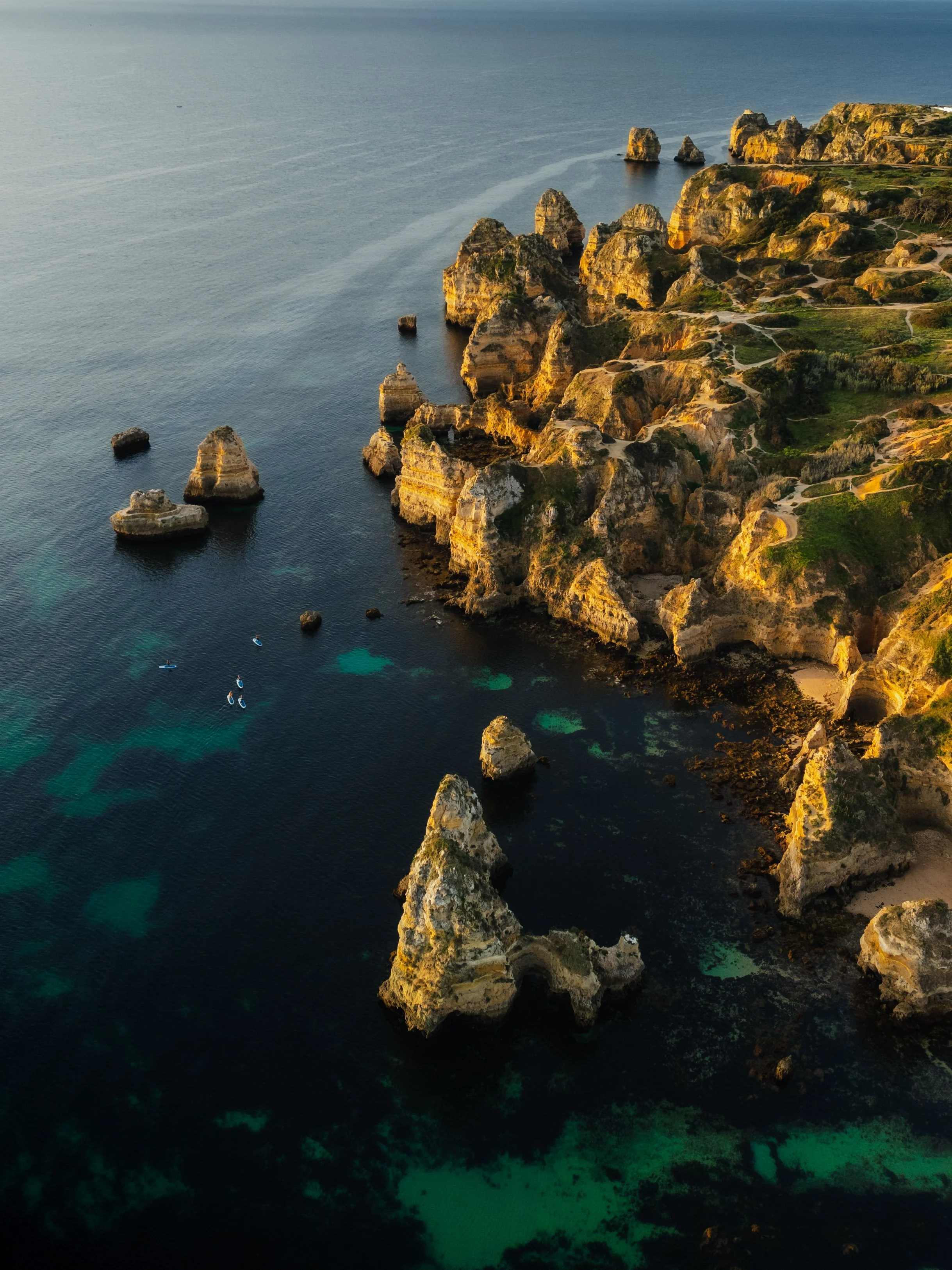
This edit is about restraint. The coastline didn’t need stronger colors — it needed structure, balance, and depth. By controlling luminance, reducing texture, and carefully shaping color relationships, the image becomes more immersive without feeling processed. The sea feels heavier, the cliffs feel grounded, and the entire scene gains a sense of stillness.
This is a good example of how coastal images benefit from less saturation and more contrast control. When light and color are treated with care, the landscape doesn’t shout — it simply holds your attention.. Further Before and After Articles can be found here.
Allowing the light to shape the landscape
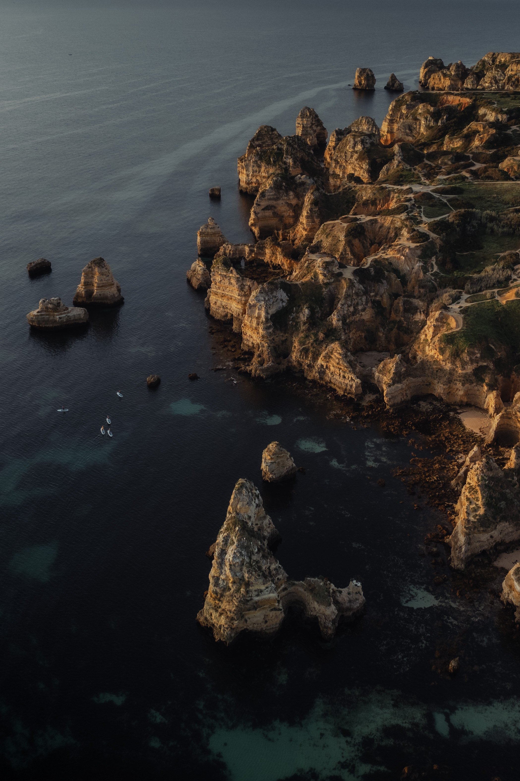
In the earlier version of this image, I focused on bringing out as much detail as possible in the cliffs and the water. The scene became brighter overall, which made the landscape feel clear and visually open.
But when I revisited the image later, I realized that this approach slightly reduced the depth created by the evening light.
In the current version, I kept the shadows deeper and allowed the darker tones of the ocean to remain more pronounced. This helps the warm sunlight on the cliffs stand out much more naturally.
Instead of lifting every part of the image, the edit now follows the direction of the light. The illuminated rock formations become the visual focus, while the surrounding water stays calm and darker.
For me, this version feels closer to the actual atmosphere of the moment — warm sunlight touching the cliffs while the ocean remained deeper and more subdued.
Develop your own style
If you want to build your personal Lightroom workflow step by step — not based on presets, but on a conscious understanding of light, color and mood — you might enjoy my course.
In the course I explain how photographers can develop their own editing approach and gradually build a consistent visual style.