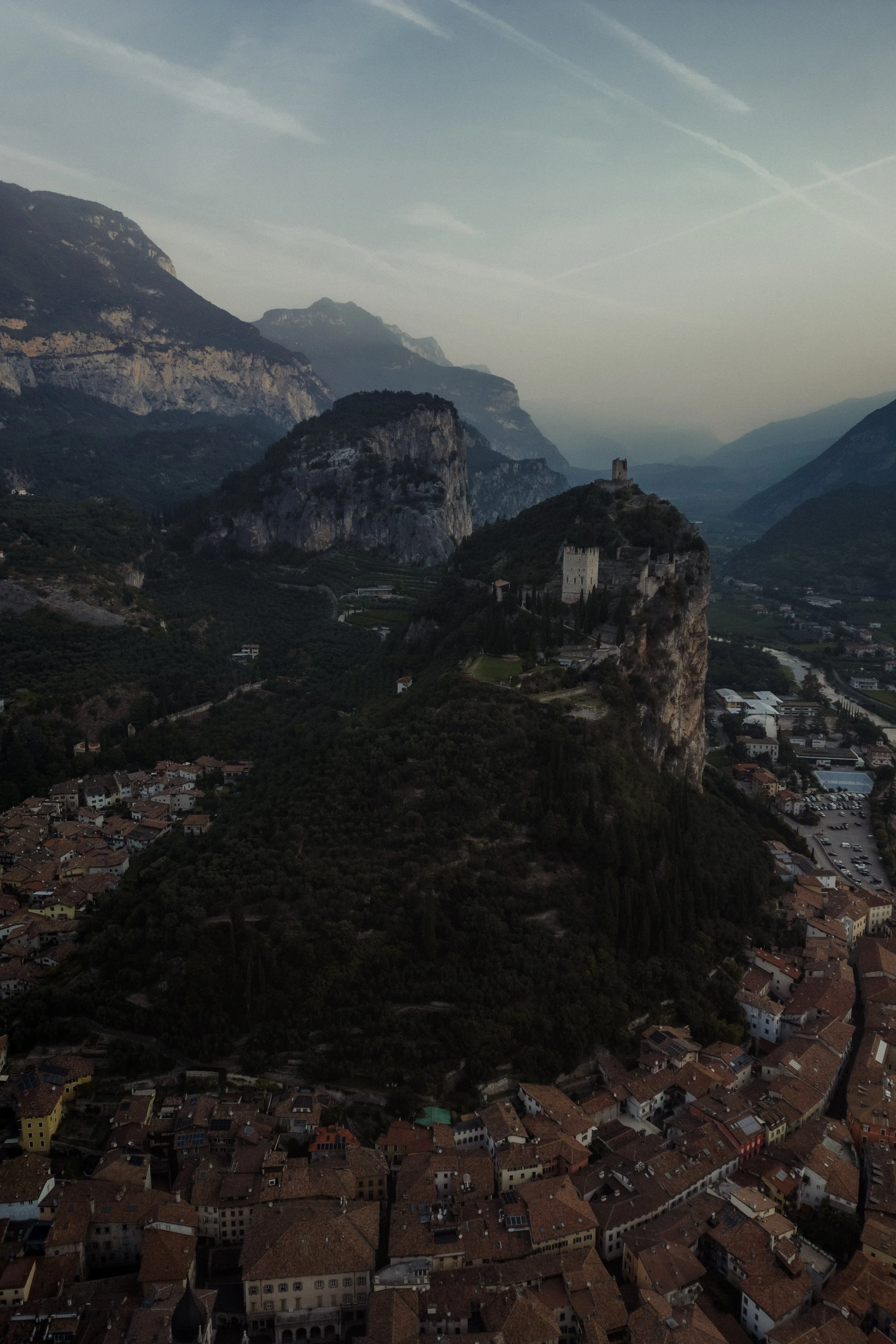
Lightroom Editing: Before and After: Arco, Italy
RAW Photo. Lightroom Edit is shown below at the end of the article.
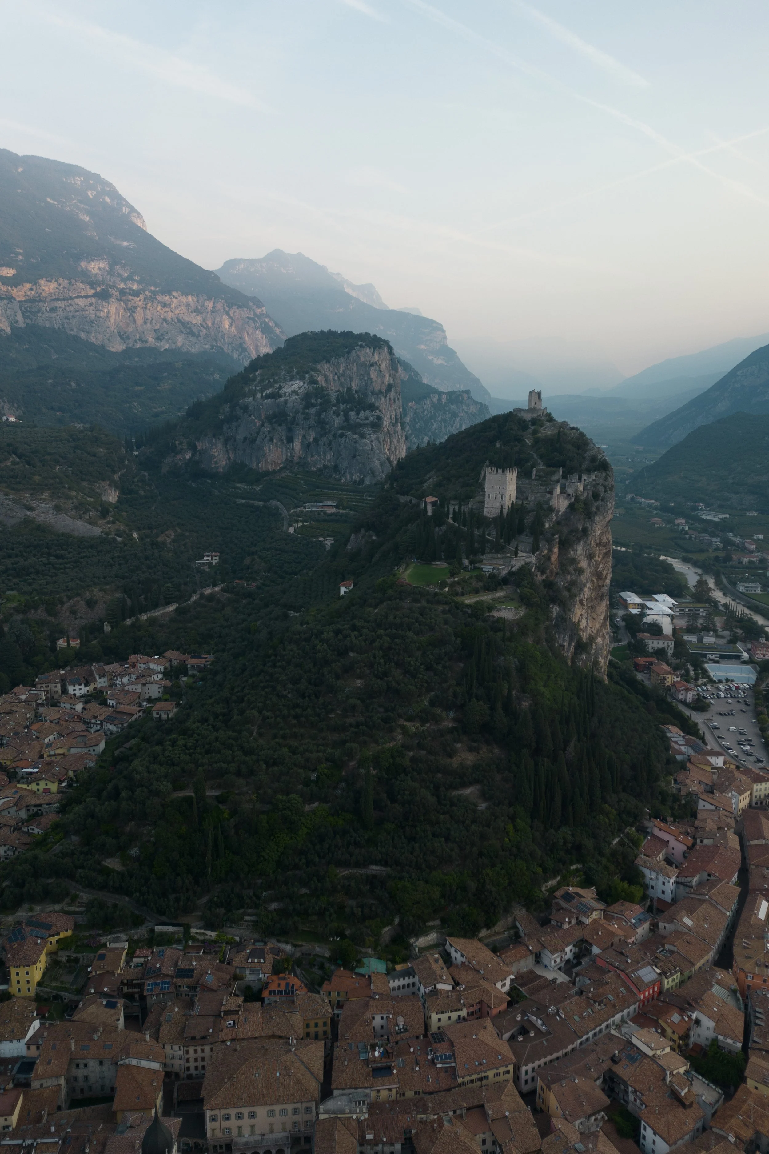
Starting point
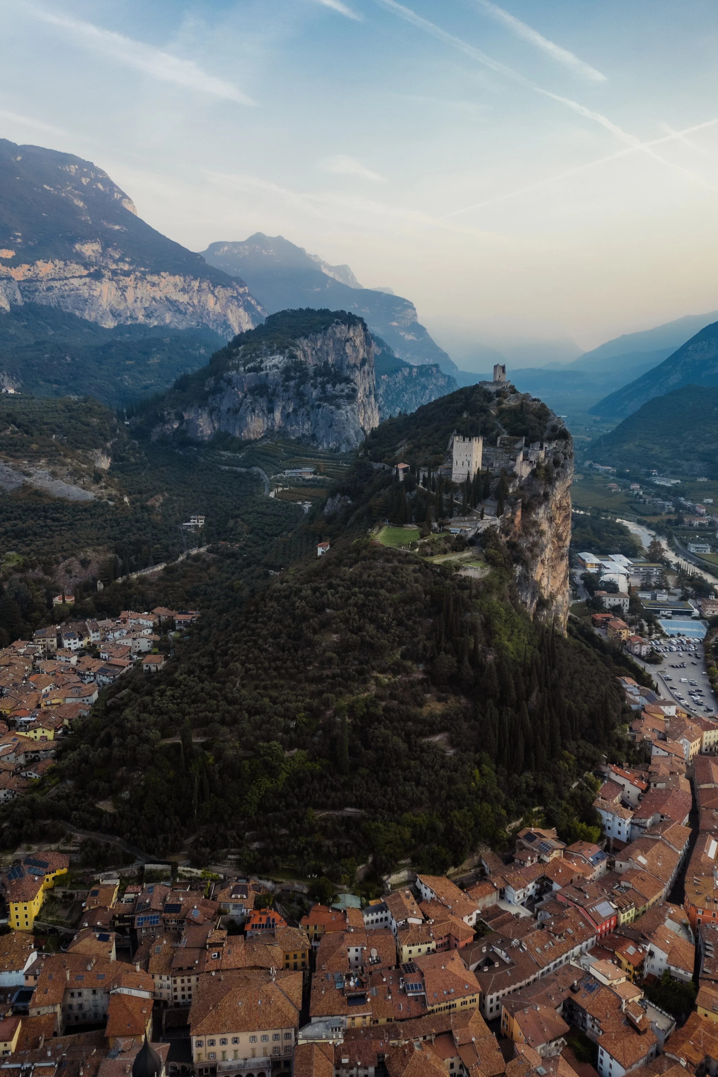
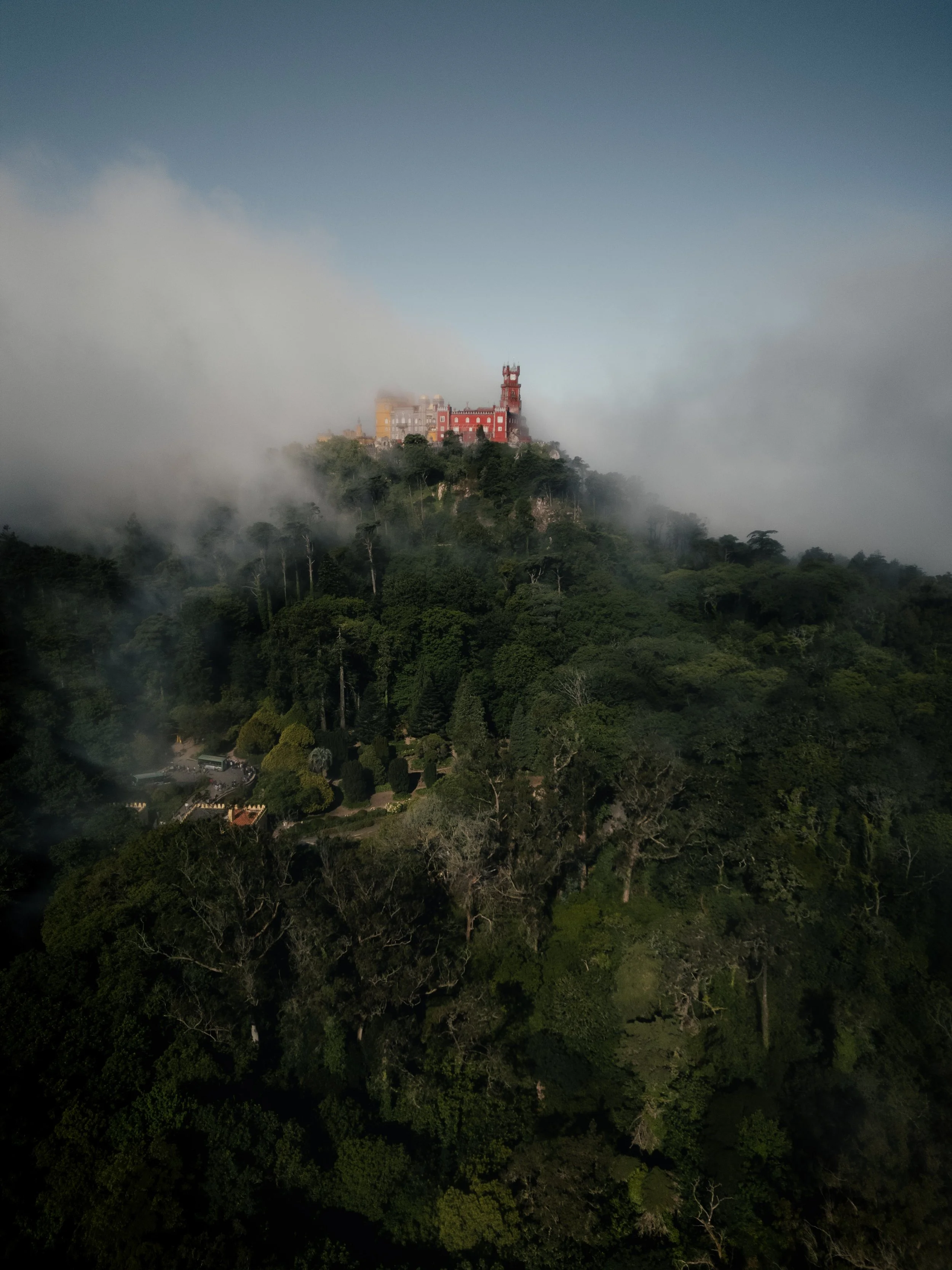
This photo was taken above the town of Arco, just before sunset, when the warm sunrise light settles gently over the valley. From the air, the castle blends into the rock, the town lies quietly below, and the mountains form soft layers fading into the distance.
The unedited image captured the scene, but it lacked the atmosphere of that moment. The colours were muted, the shadows felt heavy, and the town didn’t reflect the warmth of the setting sun. The mountains in the distance appeared hazy and flat, and the sky had little definition. My goal was to bring back the depth and warmth of the sunrise — to let the landscape breathe again while keeping the calm character of the scene.
Exposure and basic adjustments
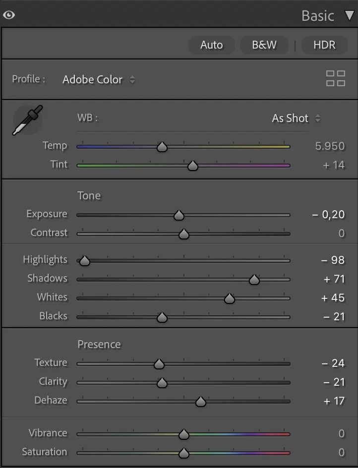
Basic Adjustments in Lightroom
TThe edit began with subtle adjustments to the overall exposure. Lowering the Exposure slightly (–0.20) helped maintain the soft sunrise mood, while reducing the Highlights (–98) recovered structure in the sky and distant ridges. Shadows were lifted to +71 so the town, trees and rock formations could emerge more clearly, and the Whites were increased to +45 to add gentle brightness where the last light touched the buildings. To give the scene a grounded base, the Blacks were deepened to –21, adding contrast without making the image harsh.
Texture and Clarity were both reduced (–24 and –21) to avoid the overly sharp look that drone photos often produce. A small amount of Dehaze (+17) restored definition in the mountain layers without removing the softness of the atmosphere. Vibrance and Saturation remained neutral — the colour work would happen in the HSL panel.
Tone curve in Lightroom
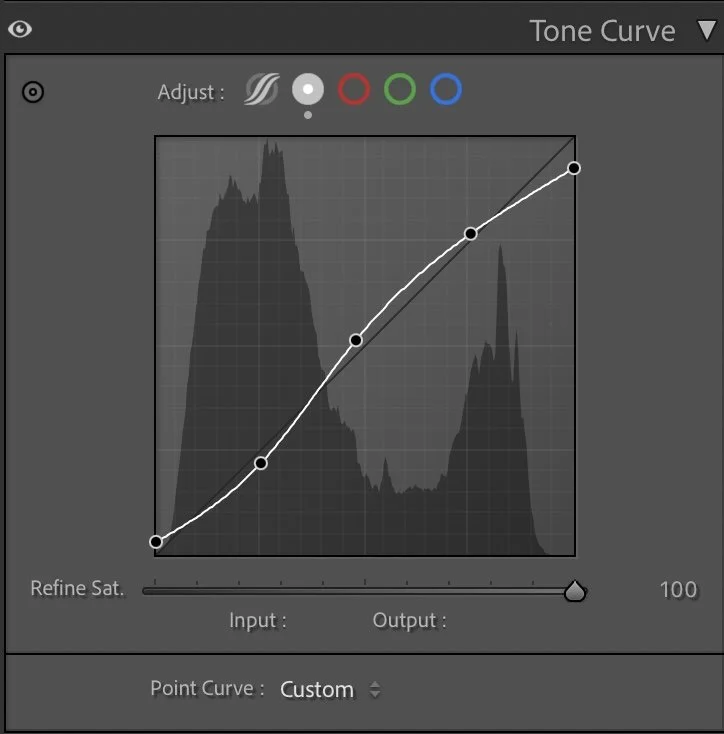
Tone curve — shaping the mood
The tone curve uses a gentle S-shape to give the image natural depth. The lower part of the curve is lifted just a little so the darkest areas don’t become solid black, while the midtones are pushed up to bring out the structure in the hill, castle and town.
The upper part of the curve adds a bit of contrast in the brighter tones, but not so much that the sky becomes harsh. This curve lets the viewer’s eye travel from the darker roofs and trees in the foreground, up to the illuminated castle, and finally into the softer mountains and sky in the distance.
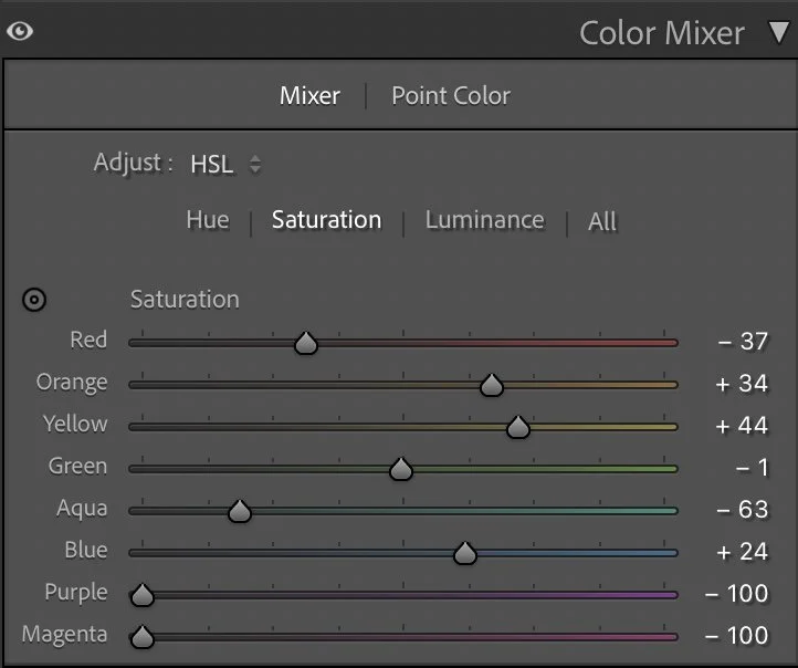
HSL Adjustments – refining colors through subtle control
In the HSL panel, the goal was to give each main element its own character: earthy roofs, natural greens, and a calm, understated blue sky.
In Hue, only two channels were changed. Green was shifted slightly toward yellow (Green –20) to keep the vegetation warm and Mediterranean rather than cold and bluish. Blue was moved a little toward teal (Blue –4), which helps the sky feel softer and more in line with the hazy mountain light. All other hues stayed at 0, keeping the overall color relationships natural.
In Saturation, I pulled back some tones and pushed others to find balance:
Red –37 reduces the intensity of the roofs so they don’t dominate the frame.
Orange +34 and Yellow +44 add warmth and life to the town and sunlit stone.
Green sits almost neutral at –1, keeping the vegetation present but not too loud.
Aqua –63 and Blue +24 work together so that the sky feels richer but still restrained — not over-saturated.
Purple and Magenta are both set to –100, removing any distracting fringe colors and keeping the image clean.
In Luminance, I shaped the brightness of each color to support the depth:
Red +14 and Yellow +5 brighten the roofs and lighter parts of the town.
Orange –14 slightly darkens warm midtones, adding depth and keeping the buildings from looking too flat.
Green +30 lifts the trees and hillside just enough so they remain readable, even though the overall scene is quite dark.
Aqua –7 and Blue –40 darken the sky and distant mountains, giving them a more dramatic, sunrise feel.
Purple –18 subtly deepens any remaining cool tones.
These adjustments create a calm, structured palette: warm earth below, gentle greens on the hill, and a controlled, slightly moody sky.


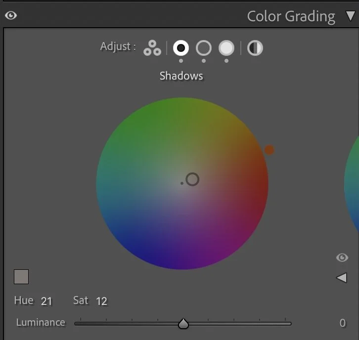
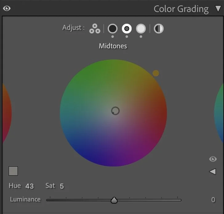
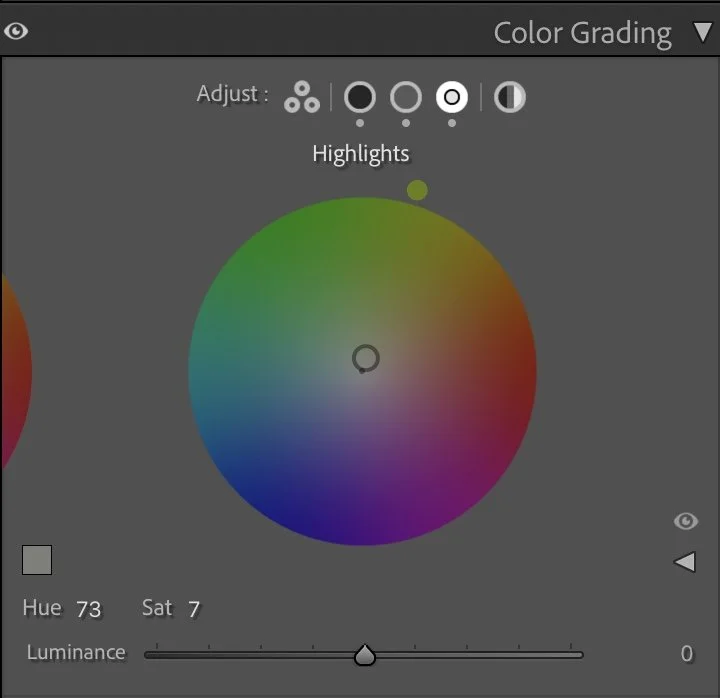
Color Grading – balancing cold and warm light
Color grading is where the final mood comes together. For this Arco image, I wanted a warm, grounded feeling in the darker areas, while keeping the brighter tones gentle and natural.
The Shadows are tinted with a warm tone (Hue 21, Sat 12). This adds a subtle earthy warmth to the dark roofs, trees and rock, making the whole foreground feel rich rather than simply dark.
The Midtones get a softer, slightly more golden touch (Hue 43, Sat 5). This affects the castle, the hill and parts of the town, giving them the sense of late sunrise light.
The Highlights receive a gentle greenish-warm tint (Hue 73, Sat 7), which helps the light in the sky and on the mountain edges stay soft and cohesive.
Together, these tones create a calm, cinematic mood: warm earth below, soft air above, and a smooth transition between the two.
Final thoughts
This edit is a good example of how small, precise changes can transform a scene without losing its natural character. By slightly darkening the overall exposure, strongly controlling the highlights, and then carefully shaping colors through HSL and color grading, the image moves from flat and grey to deep and atmospheric.
The castle becomes a clear focal point, the town feels warm and lived-in, and the mountains in the distance hold the whole composition together. The result is not a dramatic, high-contrast postcard, but a quiet, grounded view of Arco at the end of the day — exactly the kind of mood I look for in my landscape edits. Further Before and After Articles can be found here.
Preserving depth in large landscapes
In the earlier version of this image, I edited the photo with the intention of making the landscape brighter and easier to read. The town in the foreground, the cliffs, and the distant mountains all became more evenly visible.
While this approach revealed more detail, it also slightly reduced the natural depth of the scene.
In the current version, I chose to keep the shadows in the foreground stronger and allowed the darker tones of the valley to remain deeper. This helps separate the different layers of the landscape much more clearly.
The light now naturally guides the viewer from the darker town in the foreground toward the illuminated cliffs and the softer tones of the distant mountains.
Instead of brightening the entire image, the edit now follows the natural structure of the landscape and the direction of the light.
Develop your own style
If you want to build your own Lightroom workflow step by step — not based on presets, but on a conscious understanding of light, color and atmosphere — you might enjoy my course.
In the course I explain how photographers can develop their own editing style and create a consistent visual look over time.
At first, starting a Lightroom edit in black and white may seem counterintuitive. After all, most of us care deeply about color. Yet removing color for a moment can reveal something more important: the light, balance and structure that hold an image together. In this article, I explain why I still begin many edits in black and white and how this simple approach changed both my editing workflow and the way I photograph.