Lightroom Editing: Before and After: Vernazza Cinque Terre

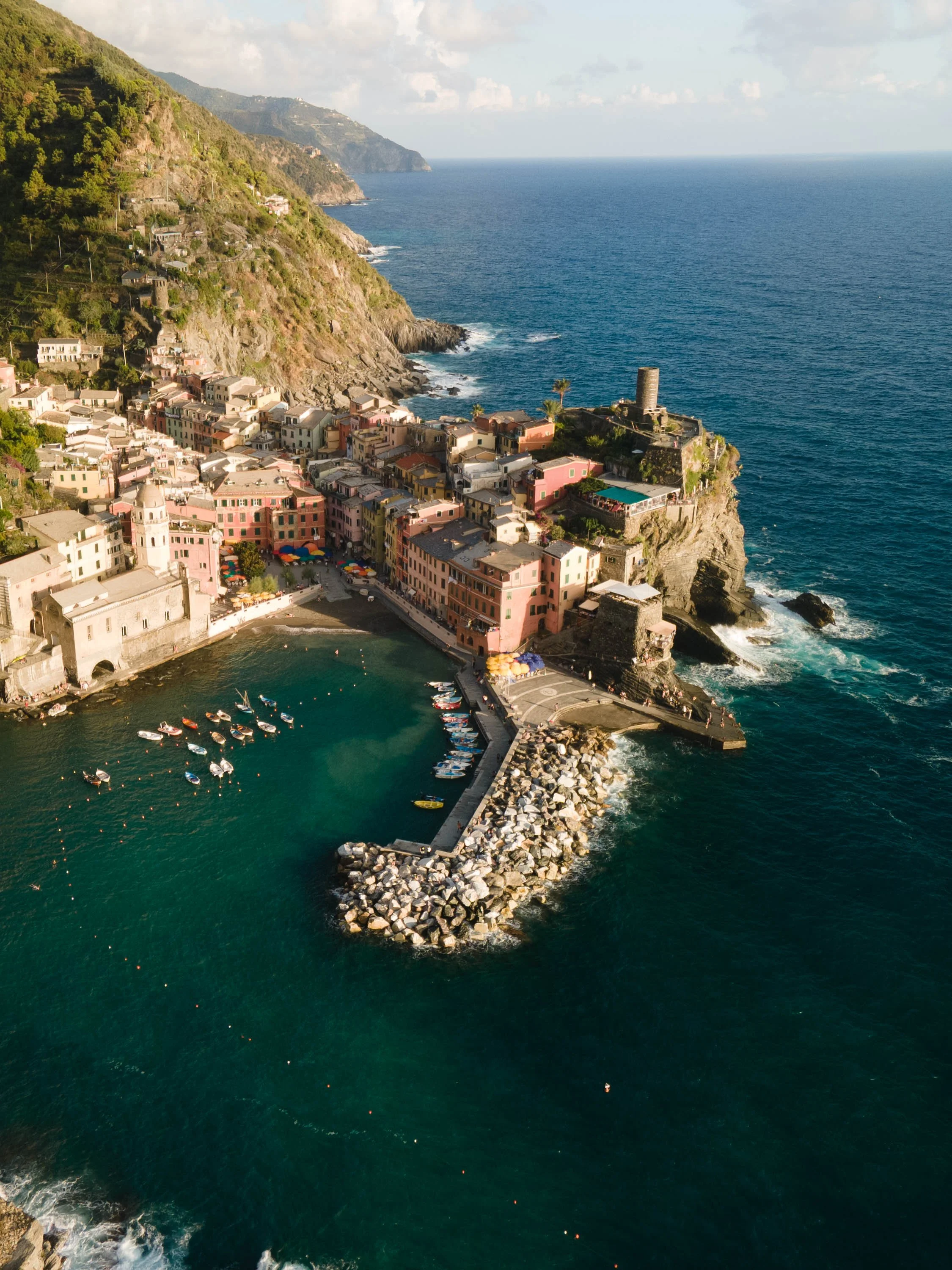
RAW Photo. Lightroom Edit is shown below at the end of the article.
This drone shot of Vernazza shows one of Italy’s most iconic coastal villages — colorful houses, dramatic cliffs, and deep blue water shaping a natural amphitheater around the harbor.
But the RAW file felt too clean and modern: bright water, strong greens, and a slight digital sharpness that didn’t fit the mood of the place.
What was missing was warmth, atmosphere, and a sense of late-summer stillness — the way Vernazza actually feels when the sun hangs low and the sea turns dark turquoise.
My goal was to leave the structure intact, but shift the colors toward something softer, deeper, and more timeless.
Basic adjustments - building the foundation
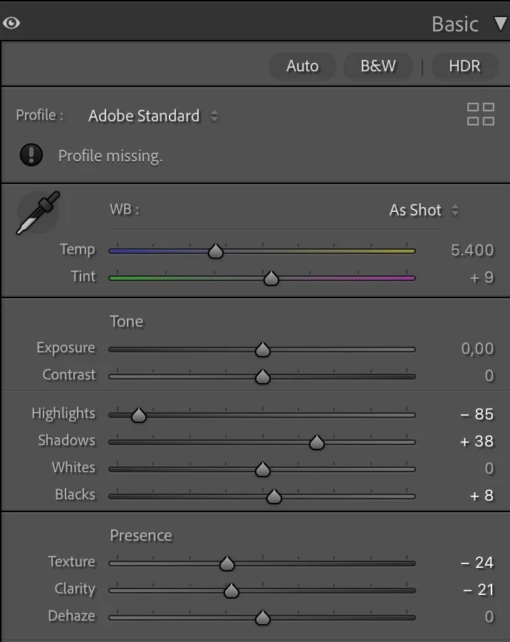
Basic Adjustments in Lightroom
The exposure stayed neutral, but the light balance was fully reshaped through Highlights, Shadows, and Blacks.
Highlights: –85 to recover details in the bright buildings
Shadows: +38 to open the cliff and harbor areas
Blacks: +8 to avoid crushed tones in the water
Texture –24 and Clarity –21 to remove digital sharpness and create a smoother, more film-like surface
Unlike many coastal edits, I didn’t push Dehaze — the scene needed softness, not clarity.
No change in Vibrance or Saturation at the global level: all color control happened in the HSL panel..

Tone curve in Lightroom
Tone curve — adding depth and contrast
The tone curve is a gentle S-curve with lifted shadows and compressed highlights. This gives the image depth without harsh contrast — the buildings stay warm and readable, while the sea gains weight in the midtones.
It’s the curve that makes the image feel like evening light instead of midday sun. Less punch, more presence.
HSL Adjustments – refining the colors
Most of the transformation in this image happens in the HSL panel. Instead of increasing saturation, the goal was to remove distracting colors and guide the eye toward the warm tones of the village and the depth of the sea.
The biggest shift is in the blues and aquas. By pushing Aqua slightly toward teal and darkening the Blue tone, the water becomes richer and more cinematic. It loses that “typical drone turquoise” and instead takes on a deep, quiet tone that feels more like late summer than high noon.
At the same time, the saturation of greens, yellows, and secondary colors was reduced strongly. The cliffs and vegetation were never meant to dominate the scene — they’re there to frame the harbor, not fight for attention. Desaturating these tones lets the terracotta roofs breathe and gives the palette a more timeless character.
A final luminance adjustment lifts Aqua and Blue just enough so the water still has structure and detail, while darker Reds and Oranges bring weight into the buildings.
The result: fewer colors, more intention. A controlled palette that feels calm instead of busy.


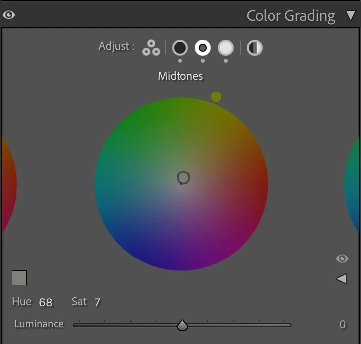
Color Grading – the finishing touch
The color grading completes the atmosphere rather than changing it. Instead of dramatic cool shadows and golden highlights, everything leans into a subtle warmth — the kind you feel when the sun is low but still lingering on the stone walls.
The shadows carry a soft brown tone, removing the digital blue cast that often appears in aerial photos. The midtones are slightly olive, giving the buildings and cliffs a sun-aged character. And in the highlights, a gentle golden hue suggests late-afternoon light without ever looking like a filter.
What makes this grading work is restraint. Nothing is pushed too far. The colors don’t compete — they settle into each other. The scene feels warm, but not nostalgic. Cinematic, but still real.
It’s the kind of color that doesn’t shout, but stays with you — the kind that feels like memory more than effect.


Conclusion
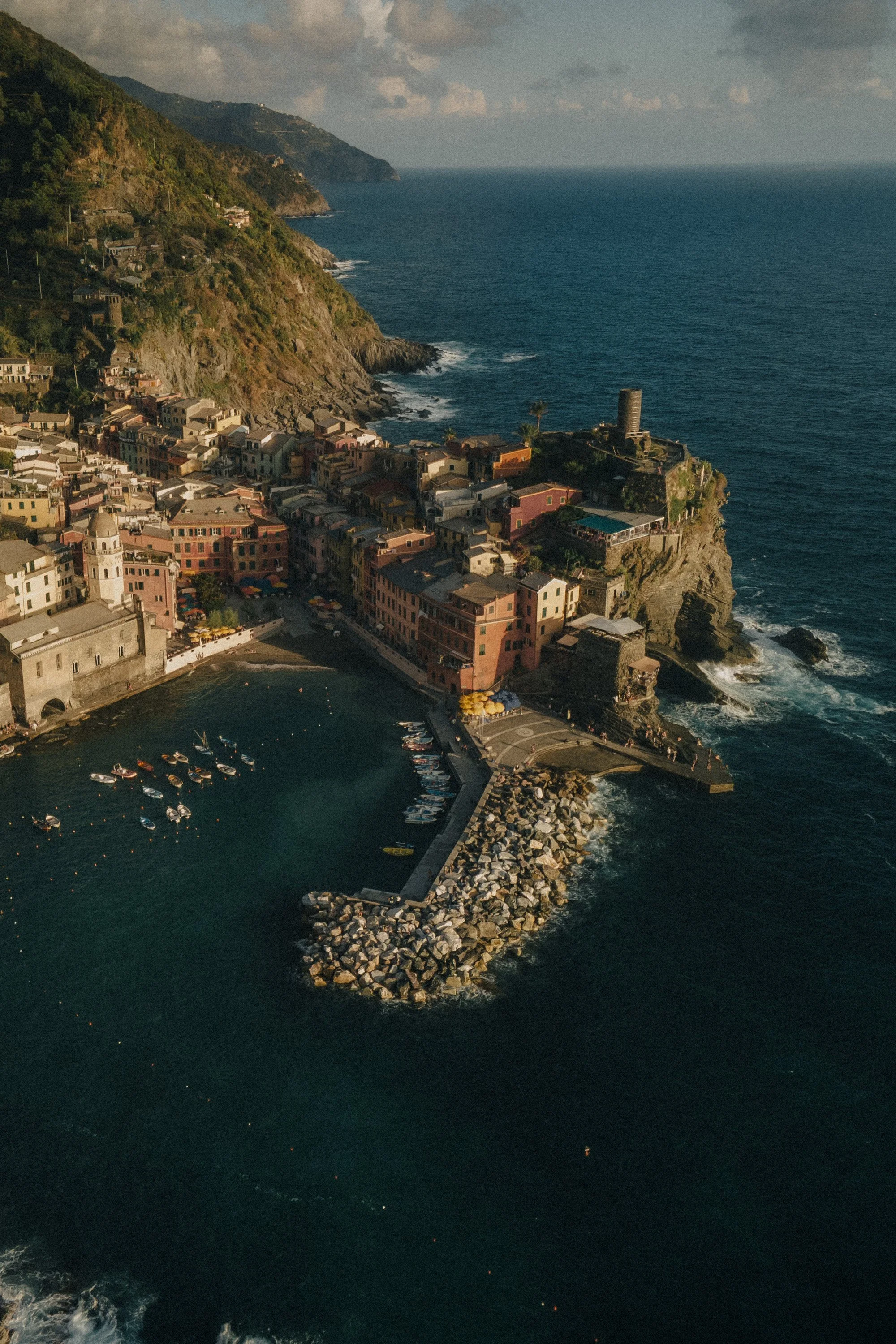
This edit is a reminder that cinematic doesn’t always mean dramatic contrast — sometimes it’s just controlled color, softened detail, and a quiet mood. By muting blues and greens, shifting the water toward teal, and giving the midtones gentle warmth, the image moves from digital postcard to something more atmospheric — something with memory in it.
That’s the heart of my editing approach: Light first. Tone second. Color last — only where it matters. Further Before and After Articles can be found here.

Creating a more natural coastal atmosphere
In the earlier version of this image, my edit focused on making the coastal village appear brighter and slightly more vibrant. The colors of the buildings and the ocean became stronger, which helped the scene feel lively and visually striking.
However, over time I realized that increasing brightness and color intensity can sometimes make landscapes feel slightly artificial.
In the current version, I chose a more restrained approach. The darker tones of the ocean remain deeper, and the overall color palette is slightly more muted. This allows the warm sunlight hitting the village and the cliffs to stand out more naturally.
Instead of pushing the colors, the image now relies more on the natural contrast between the illuminated buildings and the darker sea surrounding them.
For me, this interpretation feels calmer and closer to the atmosphere of the moment when the photo was taken.

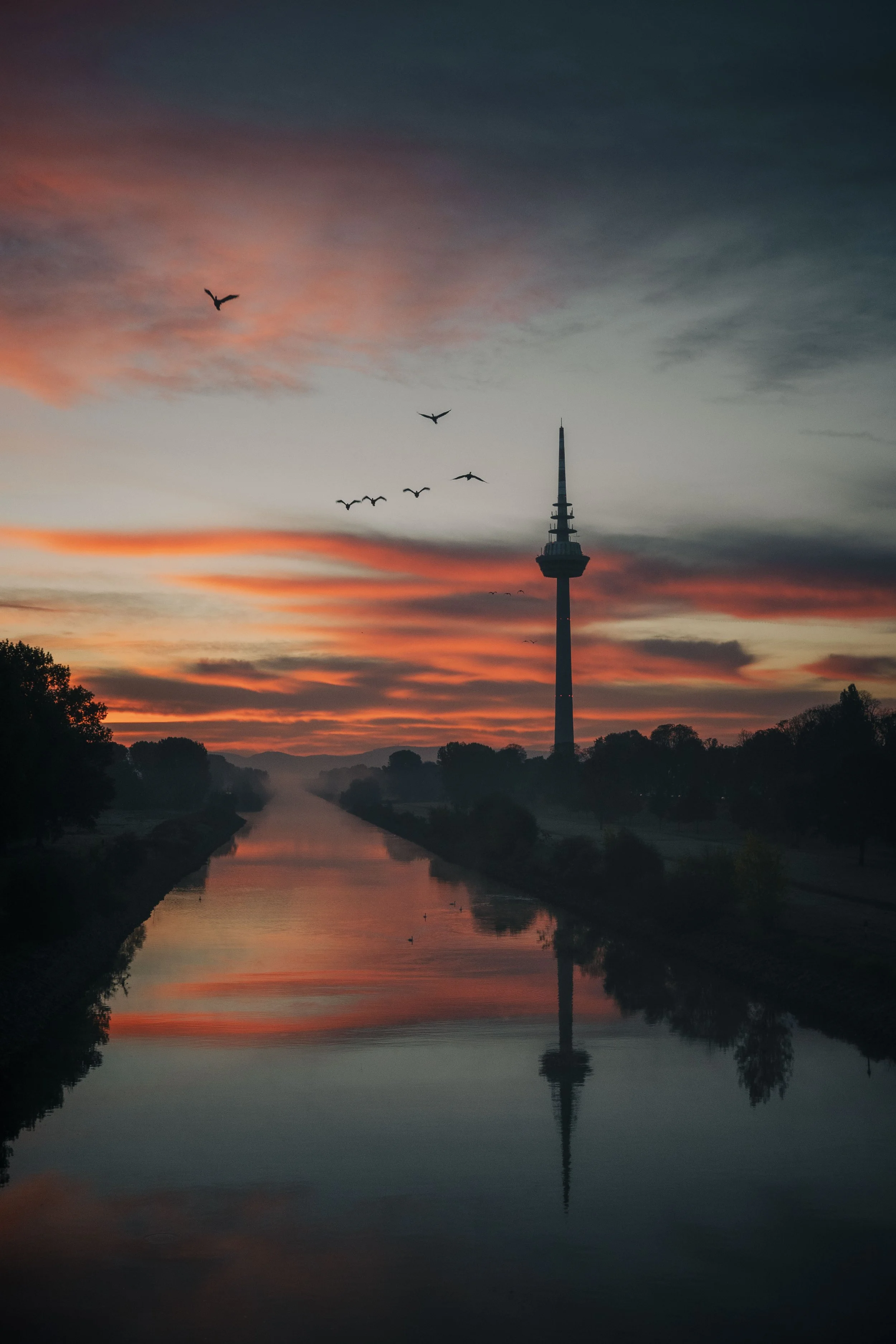
Develop your own style
If you want to build your own Lightroom workflow step by step — not based on presets, but on a conscious understanding of light, color and atmosphere — you might enjoy my course.
In the course I explain how photographers can develop their own editing style and create a consistent visual look over time.
At first, starting a Lightroom edit in black and white may seem counterintuitive. After all, most of us care deeply about color. Yet removing color for a moment can reveal something more important: the light, balance and structure that hold an image together. In this article, I explain why I still begin many edits in black and white and how this simple approach changed both my editing workflow and the way I photograph.