Lightroom Editing: Before and After - Coast Mallorca
RAW Photo. Lightroom Edit is shown below at the end of the article.
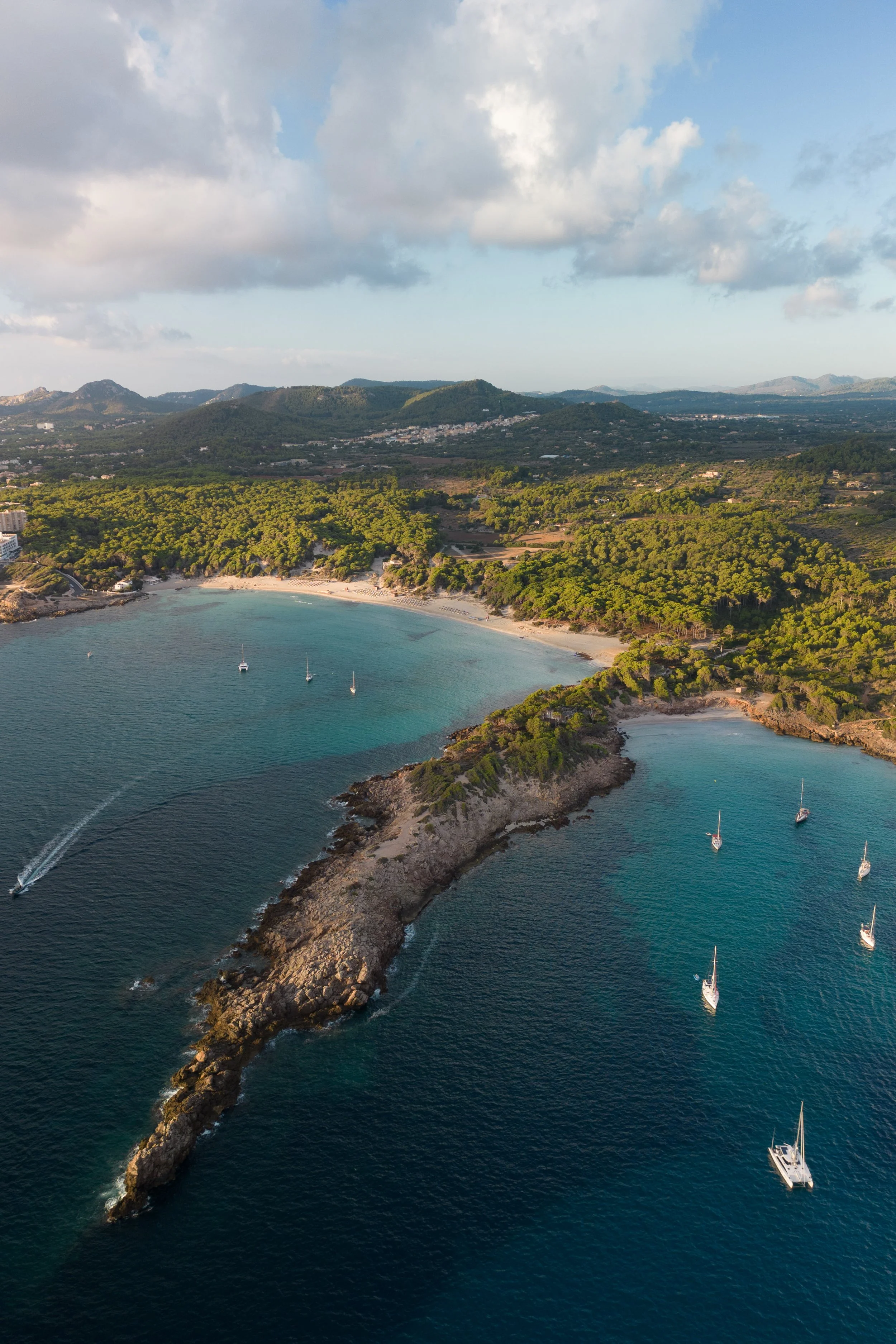
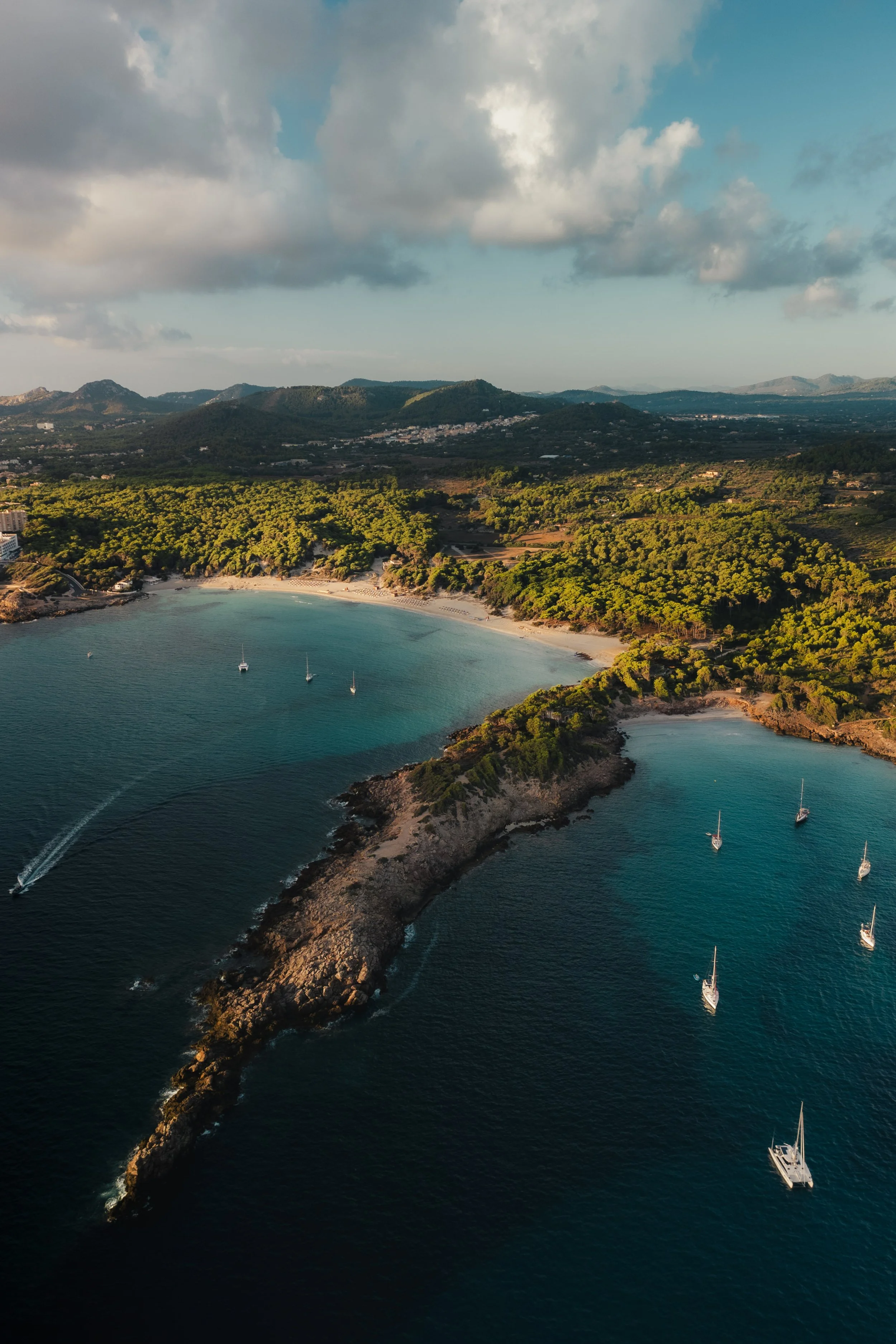
Starting point
This image was taken from above along the Mediterranean coast, looking down on a small bay where land and sea meet in a gentle curve. From the air, the scene already had strong natural lines: the rocky shoreline, the turquoise water, and the scattered boats resting quietly in the bay.
In the unedited photo, however, the scene felt too open and slightly flat. The highlights in the clouds were bright and distracting, the water lacked depth, and the overall contrast didn’t reflect the calm but grounded feeling I experienced while flying the drone. My goal was not to make the colors more intense, but to create a quieter, more cinematic balance — deeper water, softer light, and a stronger sense of structure from foreground to background.
Exposure and basic adjustments
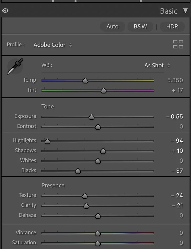
Basic Adjustments in Lightroom
I started by shaping the overall light of the image.
The exposure was slightly reduced (Exposure –0.55) to bring the scene closer to how it felt in reality and to avoid a washed-out look. Highlights were pulled down strongly (–94) to control the bright clouds and preserve detail in the sky, while Shadows were lifted just a little (+10) to keep the land readable without flattening it.
The Blacks were deepened (–37) to give the water more weight and to anchor the image visually. Whites remained neutral (0) to avoid pushing the highlights back into an artificial brightness.
To maintain a smooth, natural surface, I reduced Texture (–24) and Clarity (–21). This helps the water and the landscape feel calmer and less sharp, which is important for aerial scenes. Dehaze stayed at 0 — the atmosphere was already clear, and adding dehaze would have made the image too harsh.
Tone curve in Lightroom
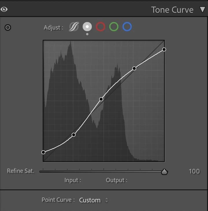
Tone curve — building gentle depth
The tone curve follows a soft S-shape, focused on separation rather than contrast.
The lower part of the curve gently deepens the shadows, giving the sea more depth and presence. The midtones are lifted slightly to keep the land readable, while the highlights are controlled to maintain a soft transition into the sky.
This curve helps guide the eye naturally from the darker water in the foreground toward the brighter coastline and clouds, without introducing dramatic contrast or losing the calm mood.
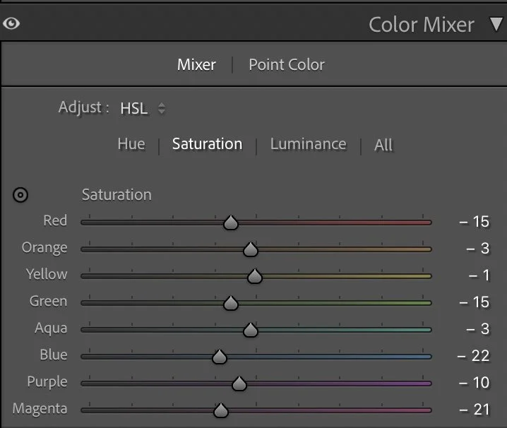
HSL Adjustments – Controlling color without exaggeration
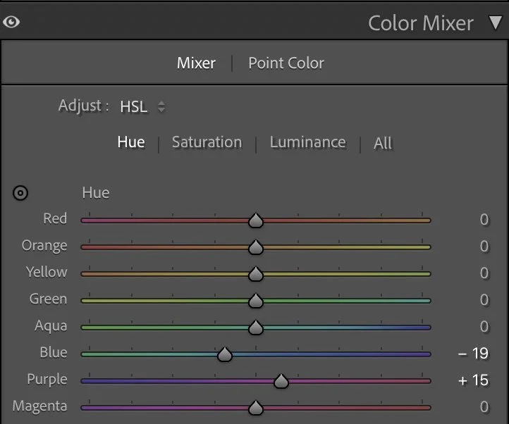
The HSL adjustments were used to refine the color balance and prevent the scene from becoming too vibrant.
In the Hue panel, Blue was shifted slightly (–19) and Purple was moved forward (+15). These small changes help refine the sky and water tones, keeping them natural and slightly muted rather than overly tropical.
Saturation was reduced across most colors:
Red (–15), Green (–15), Blue (–22), Aqua (–3), and Purple (–10) were all pulled back to calm the palette. Yellow (–1) and Orange (–3) were only adjusted slightly to keep the coastline warm but not dominant.
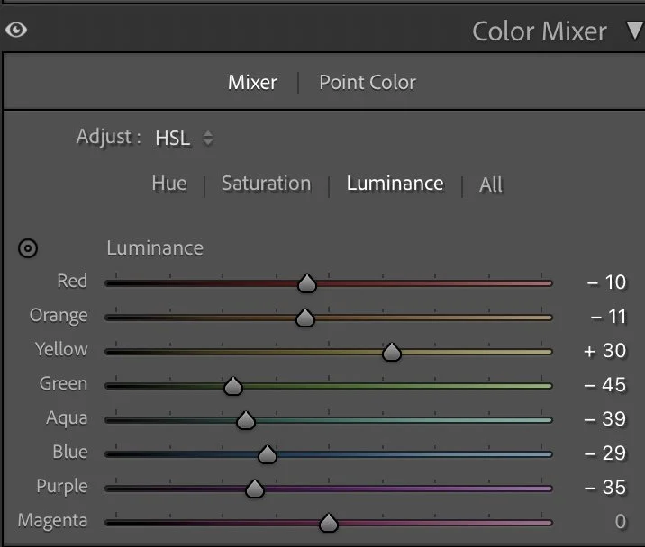
For Luminance, Yellow was lifted (+30) to brighten the land subtly, while Green (–45), Aqua (–39), and Blue (–29) were darkened. This gives the water more depth and helps separate sea and land more clearly. Red (–10) and Orange (–11) were lowered slightly to keep buildings and rocks from becoming too bright.
These adjustments create harmony: the land feels warm and present, while the sea becomes deeper and more grounded.
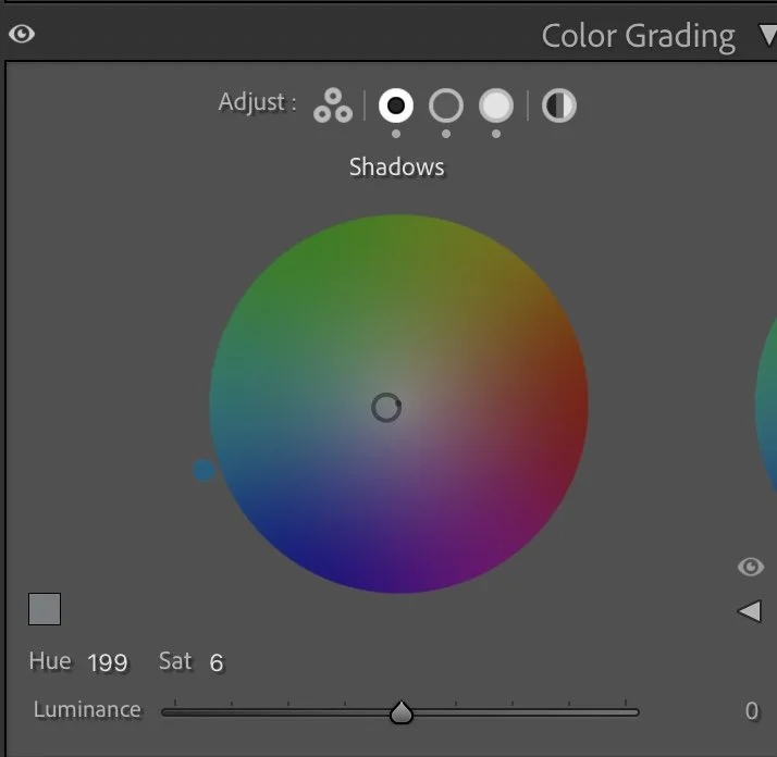
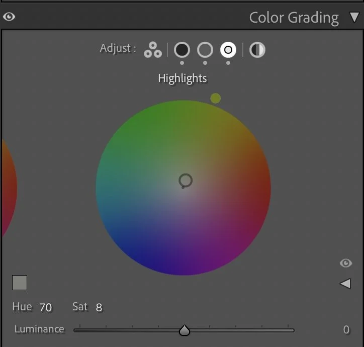
Color Grading – balancing cold and warm light
Color grading was used to set the emotional tone of the image.
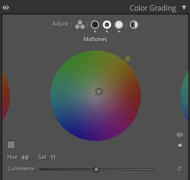
The Shadows were given a subtle cool tone (Hue 199 / Sat 6), reinforcing the depth and calmness of the water. The Midtones received a gentle warm shift (Hue 49 / Sat 11), which helps the land and vegetation feel sunlit without looking golden or exaggerated.
The Highlights were balanced with a soft warm tint (Hue 70 / Sat 8), adding a natural glow to the clouds and sky. This warm–cool balance keeps the image cinematic and calm at the same time — cool depth in the water, warm light above.
Final thoughts
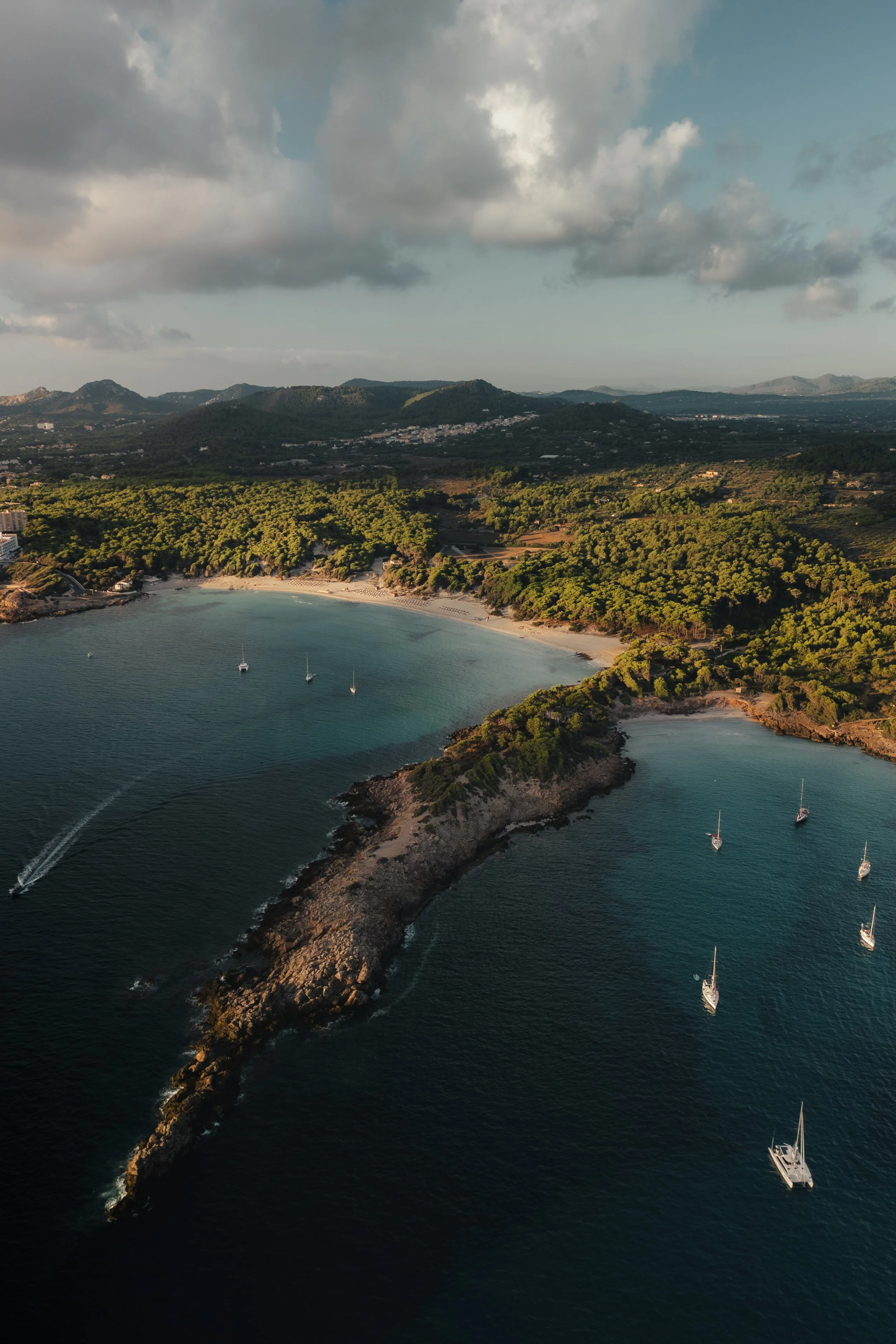
This edit is about restraint. The scene didn’t need stronger colors or dramatic contrast. It needed structure, balance, and a quieter rhythm. By controlling highlights, softening texture, and carefully shaping color, the image now feels more intentional and grounded.
The boats rest more clearly in the water, the coastline has presence without dominance, and the sky supports the scene instead of overpowering it. This is the kind of edit where nothing stands out — and that’s exactly the point.
Calm images often work best when the edit stays in the background, shaping the mood rather than announcing itself. Further Before and After Articles can be found here.

A quieter and more balanced atmosphere
When I edited this image some time ago, my goal was mainly to make the scene look bright and visually striking. The colors of the water and the coastline were slightly stronger, the highlights were lifted a bit more and the overall image felt more vibrant. It worked well, especially for social media, where brighter images often attract attention more quickly.
Looking at the image again today, my approach is a little different.
In the current version, I reduced some of the brightness in the highlights and allowed the darker tones in the water to stay deeper. This creates more contrast between the calm, dark sea and the warm light hitting the coastline. The result feels less “edited” and closer to how the scene actually felt when I captured it.
The colors are also slightly more restrained. Instead of pushing the blues and greens to stand out, I let the natural tones of the landscape guide the overall mood. The image becomes quieter and more balanced, while still keeping the beautiful light of the scene.
For me, this shift reflects how my editing style has evolved over time. I am less focused on making an image look spectacular and more interested in preserving atmosphere and depth.
Develop your own style
If you want to build your own Lightroom workflow step by step — not based on presets, but on a conscious understanding of light, color and atmosphere — you might enjoy my course.
In the course I explain how photographers can develop their own editing style and create a consistent visual look over time.