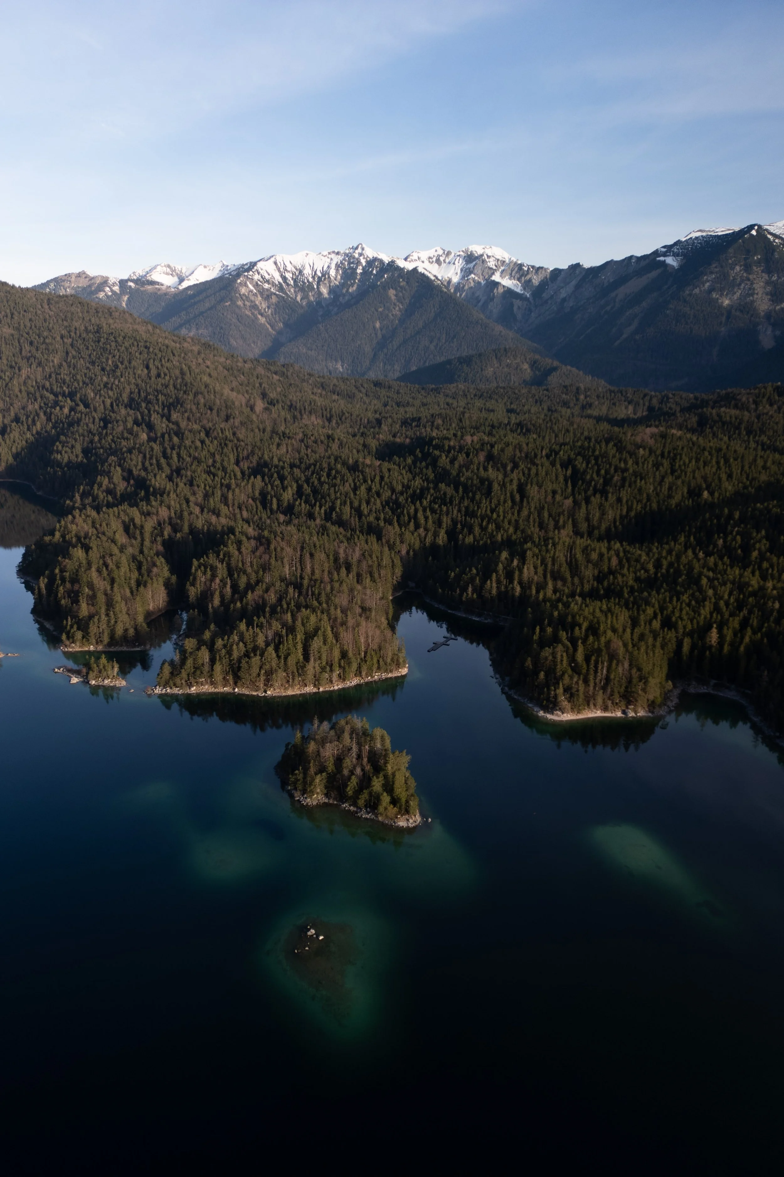
Lightroom Editing: Before and After - Eibsee, Germany

RAW Photo. Lightroom Edit is shown below at the end of the article.
Starting point
This photo was taken at the Eibsee on a clear day, with the Zugspitze mountains in the background and calm water surrounding the small forested islands. From above, the scene already had a strong composition: dark water in the foreground, layered forest tones in the midground, and bright mountain peaks under a clean sky.
The unedited image, however, felt slightly unbalanced. The highlights in the sky were too dominant, the water lacked depth, and the forest appeared flatter than it felt in reality. My goal was not to make the image more dramatic, but to shape a calm, natural alpine mood — one that feels quiet, deep, and timeless rather than edited.
Exposure and basic adjustments
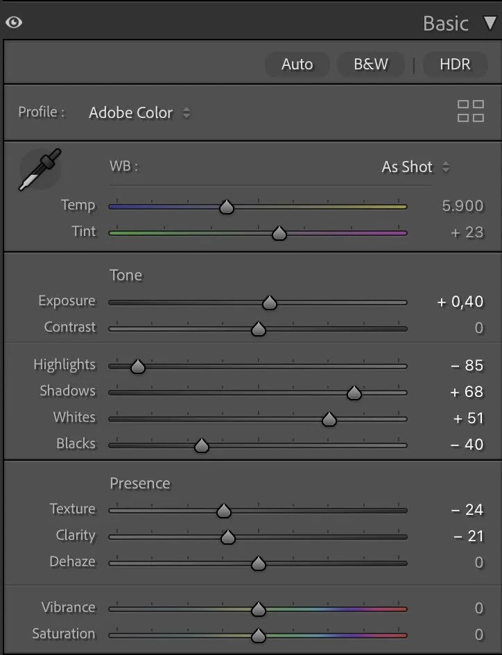
Basic Adjustments in Lightroom
I started by balancing the overall exposure and tonal range.
The exposure was gently increased (+0.40) to lift the image without making it brighter in a visible way. Highlights were reduced significantly (–85) to bring back structure in the sky and prevent the snow-covered peaks from feeling harsh. At the same time, shadows were lifted (+68) to reveal more detail in the forest and the darker parts of the water.
Whites were pushed up (+51) to give clarity to the brightest areas, while Blacks were pulled down (–40) to anchor the image and create depth in the lake.
Texture (–24) and Clarity (–21) were reduced again to keep the scene soft and natural. Dehaze stayed at 0 — the atmosphere was already clear, and adding dehaze would have made the image feel too crisp and technical.
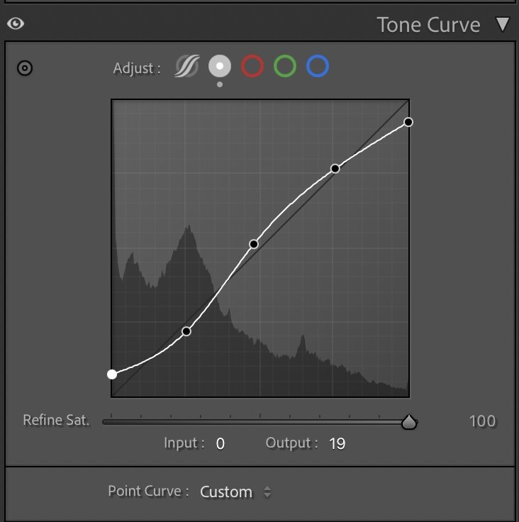
Tone curve in Lightroom
Tone curve — creating depth without contrast
The tone curve follows a smooth, gentle S-shape.
The shadows are slightly lifted to avoid crushed blacks, while the midtones are raised to give the forest more volume and separation. The highlights are controlled carefully so the sky transitions softly from blue to white near the horizon.
This curve does not aim for punch or contrast. Instead, it creates a calm visual flow from the dark water in the foreground through the forest and up to the mountains — allowing the eye to move naturally through the frame.
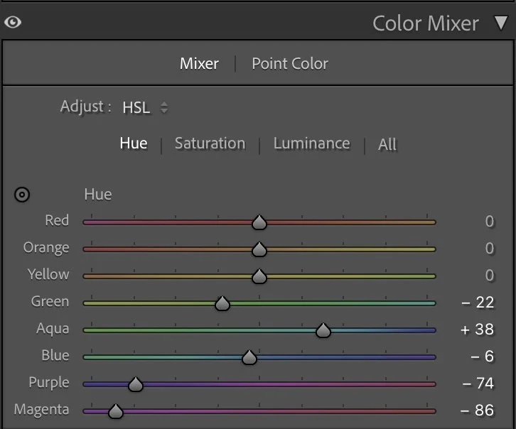
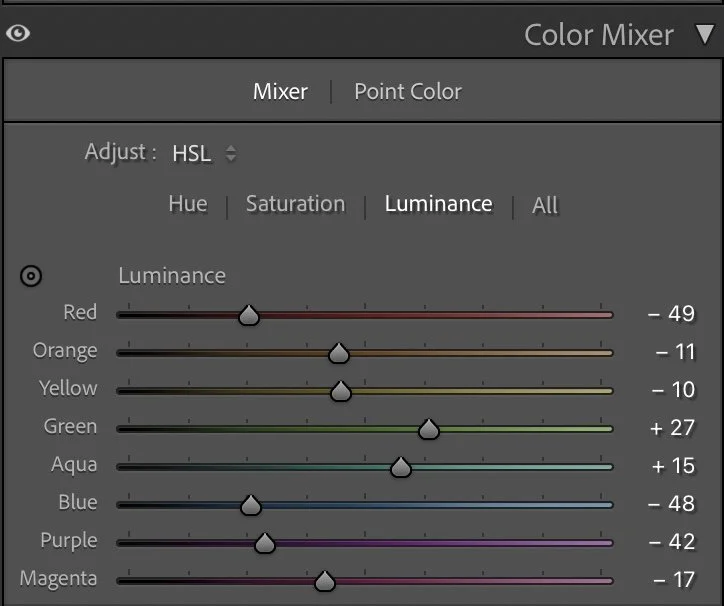
HSL Adjustments – shaping natural alpine colors
The HSL adjustments are focused on realism and balance rather than strong color shifts.
In the Hue panel, Greens were slightly shifted (–22) to reduce their artificial look, while Aquas were pushed (+38) to give the shallow water areas a clearer, cleaner tone. Blues were adjusted minimally (–6) to keep the lake and sky connected.
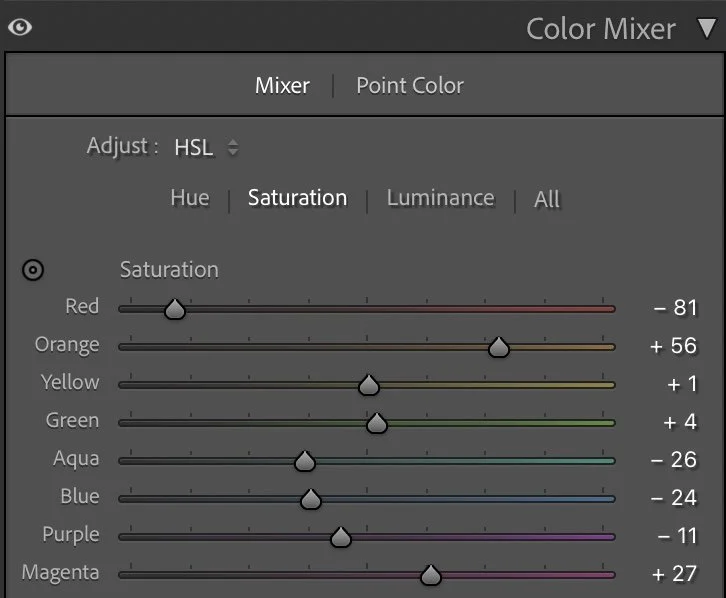
Saturation was used selectively:
Reds were strongly reduced (–81) to remove unwanted color noise.
Oranges were increased (+56) to bring warmth back into the forest.
Aquas and Blues were reduced (–26 / –24) so the water feels deep rather than tropical.
In Luminance, Greens (+27) were lifted to give the forest more depth and structure, while Blues (–48) were darkened to add weight to the water. Purple and Magenta were reduced heavily (–42 / –17) to keep the image clean and free of color distractions.
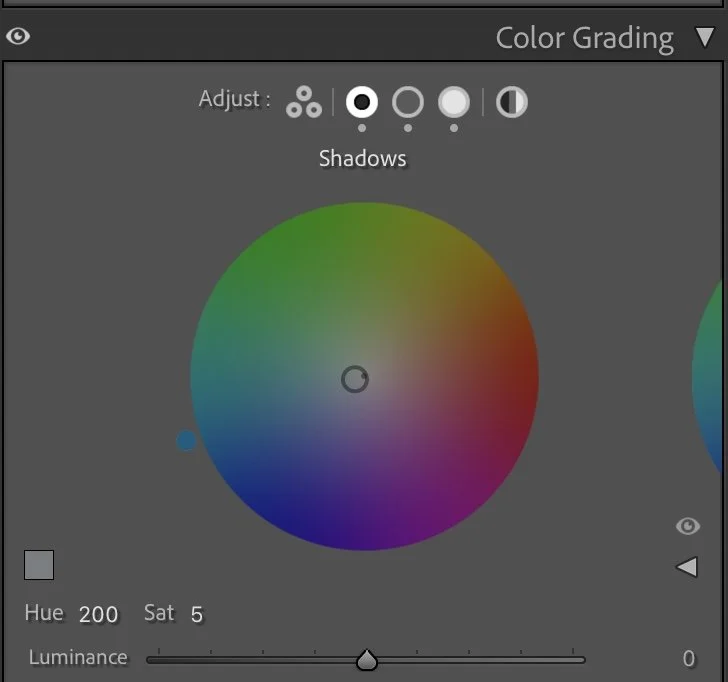
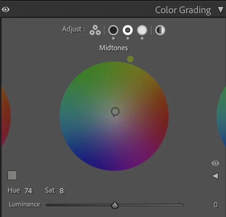
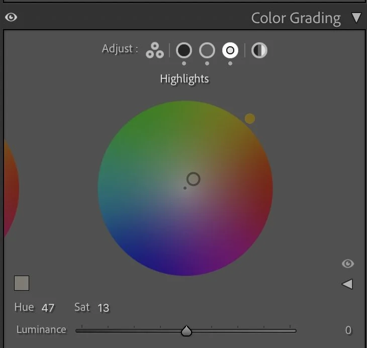
Color Grading – balancing warmth and calm
Color grading defines the emotional tone of the image.
The Shadows were cooled slightly (Hue 200 / Sat 5) to deepen the lake and reinforce the calm, alpine feeling. The Midtones received a subtle warm-green shift (Hue 74 / Sat 8), which supports the forest tones without making them feel colorful. The Highlights were warmed gently (Hue 47 / Sat 13) to give the mountains and sky a soft, natural glow.
This combination keeps the image balanced: cool water, neutral forest, and warm highlights — without any part overpowering the others.
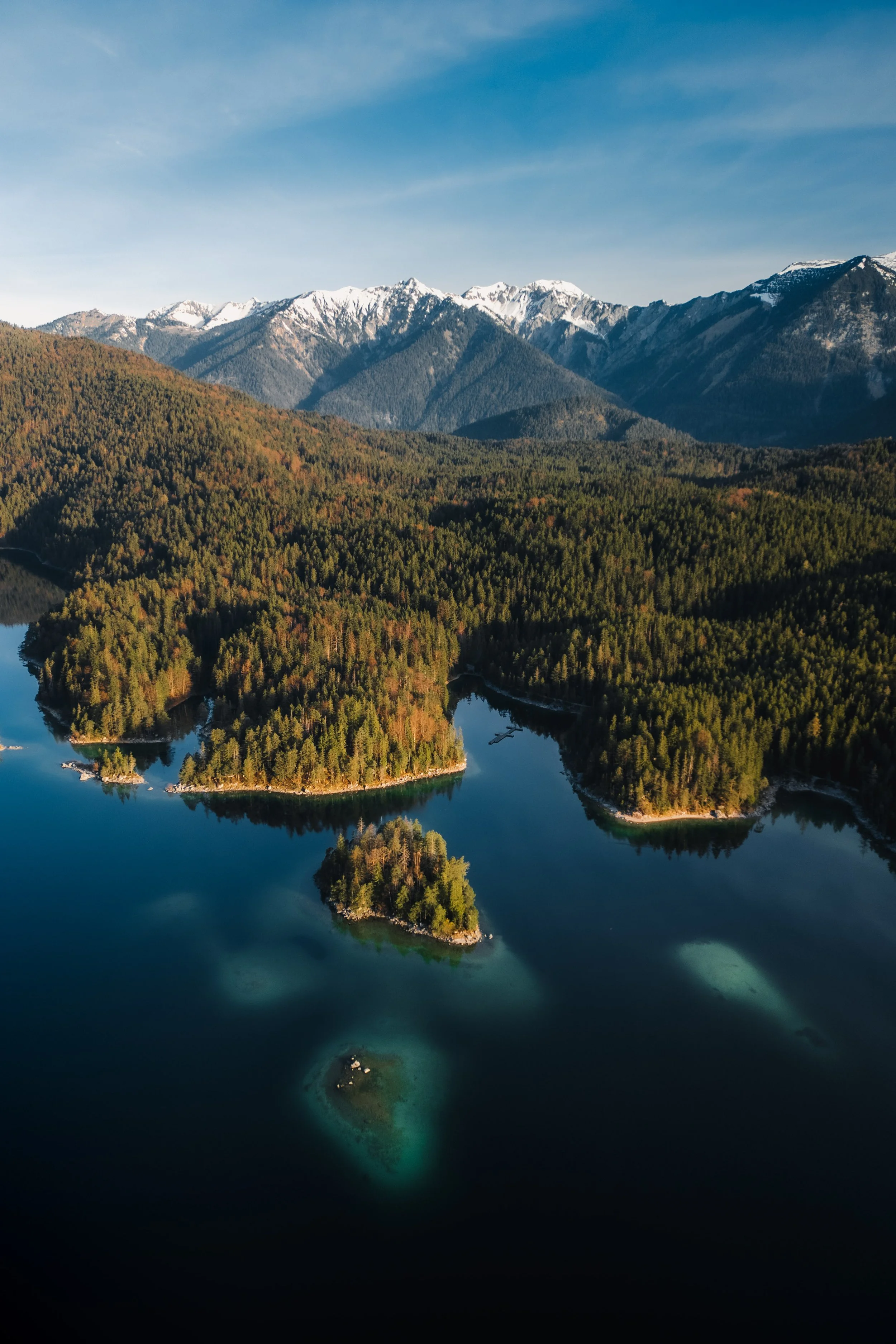
Final thoughts
This edit is about restraint. The Eibsee does not need drama or heavy contrast to be impressive. By carefully shaping exposure, controlling color, and keeping the textures soft, the image stays true to the calm and clarity of the location. The water feels deep, the forest feels layered, and the mountains remain quiet but present.
It’s a reminder that landscape editing is not about making scenes louder — it’s about helping them breathe. Further Before and After Articles can be found here.
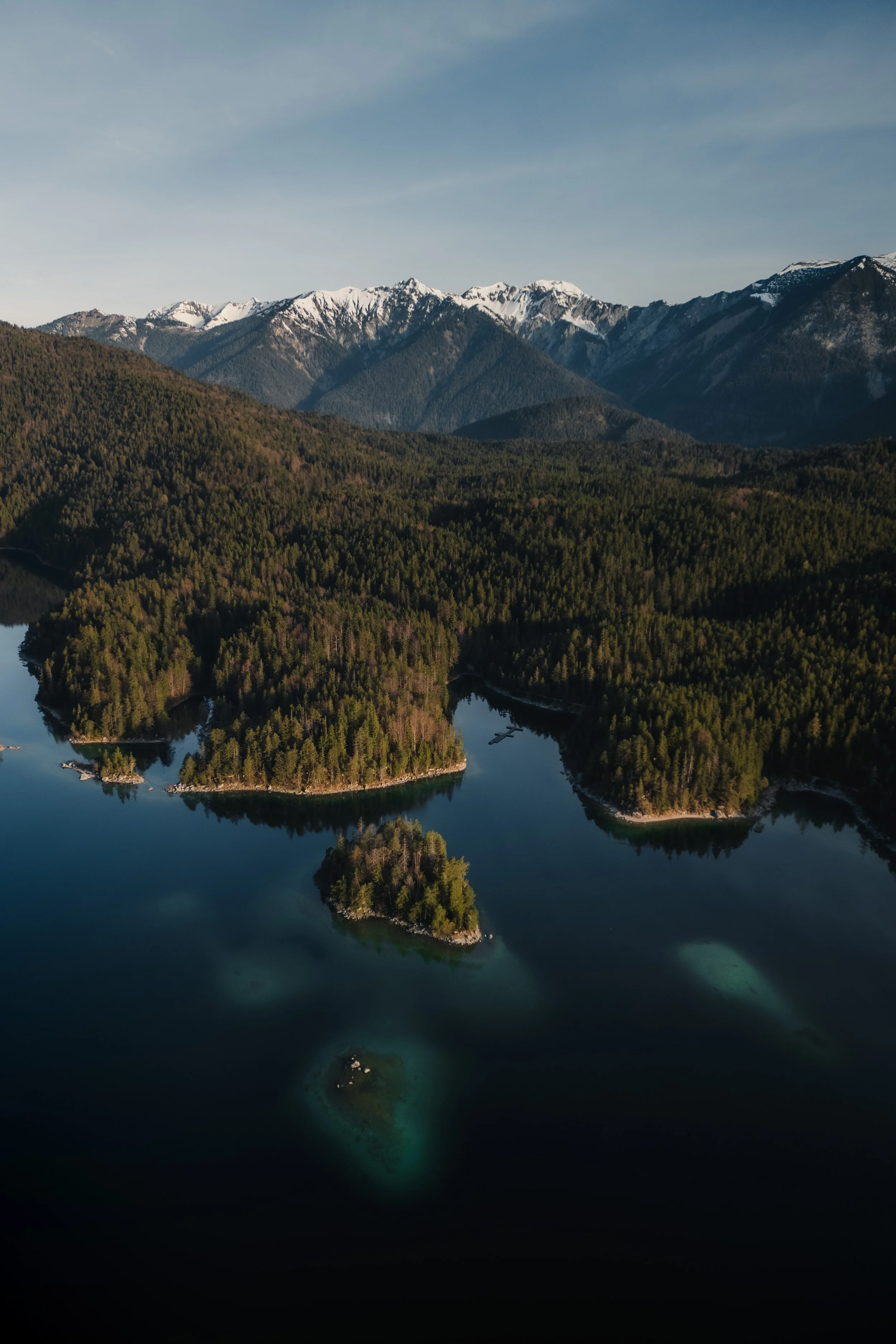
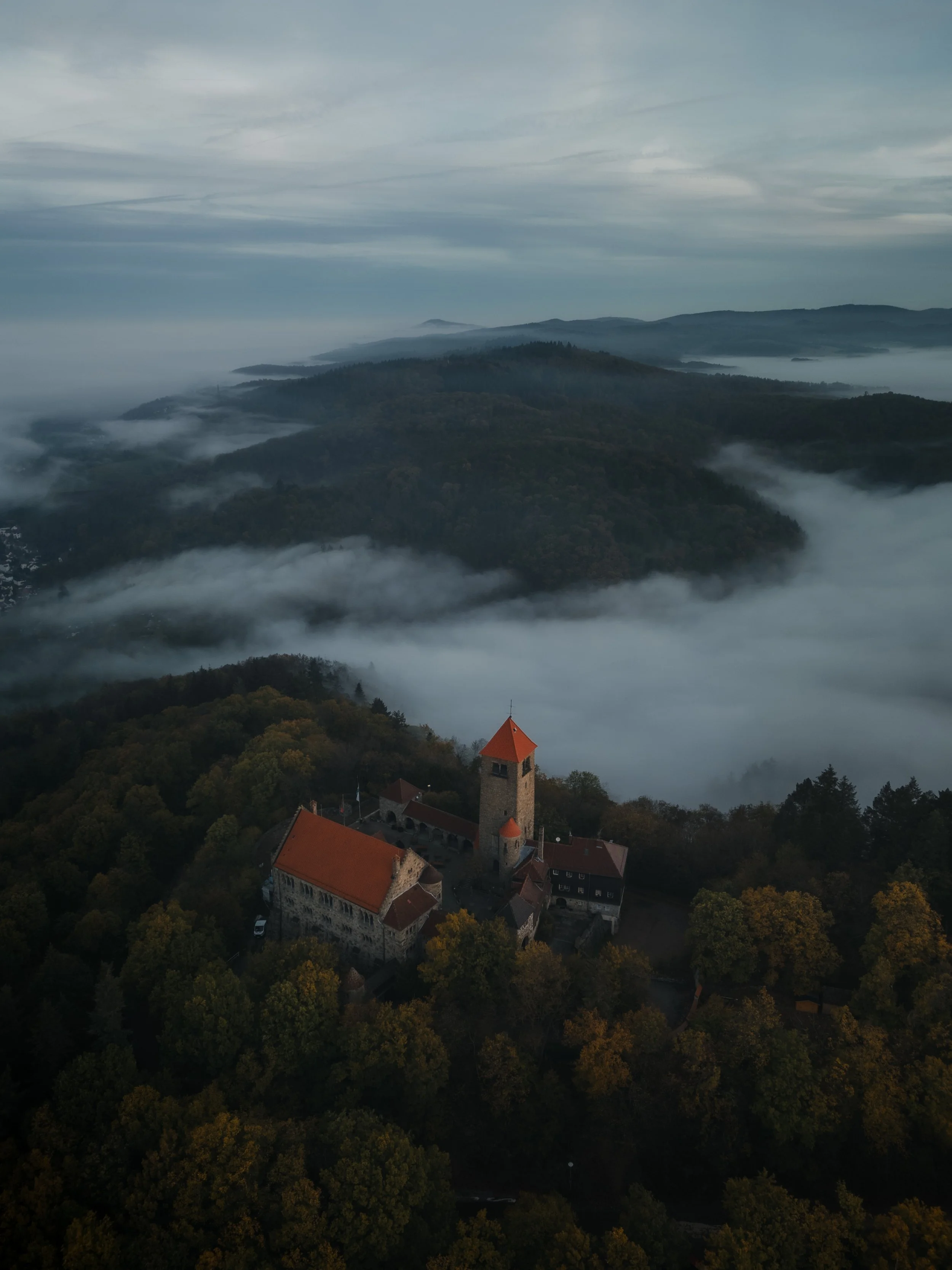
Editing This Image in My Current Style
When I first edited this image, my goal was to emphasize the bright colors of the lake and the dramatic mountain landscape. The turquoise water and the sunlit islands created a strong visual contrast that worked well for travel-oriented imagery.
Over time my editing style has shifted slightly towards a calmer and more natural interpretation of a scene.
When revisiting this photo, I reduced some of the color intensity in the water and allowed the darker tones of the landscape to play a stronger role. The result feels less about visual impact and more about atmosphere and depth.
Both versions work in different contexts, but the newer edit reflects more closely how I approach landscape images today.
Develop Your Own Lightroom Editing Style
If you want to build your personal Lightroom workflow step by step — not based on presets, but on a conscious understanding of light, color and mood — you might enjoy my course.
In the course I explain how photographers can develop their own editing approach and gradually build a consistent visual style.
At first, starting a Lightroom edit in black and white may seem counterintuitive. After all, most of us care deeply about color. Yet removing color for a moment can reveal something more important: the light, balance and structure that hold an image together. In this article, I explain why I still begin many edits in black and white and how this simple approach changed both my editing workflow and the way I photograph.