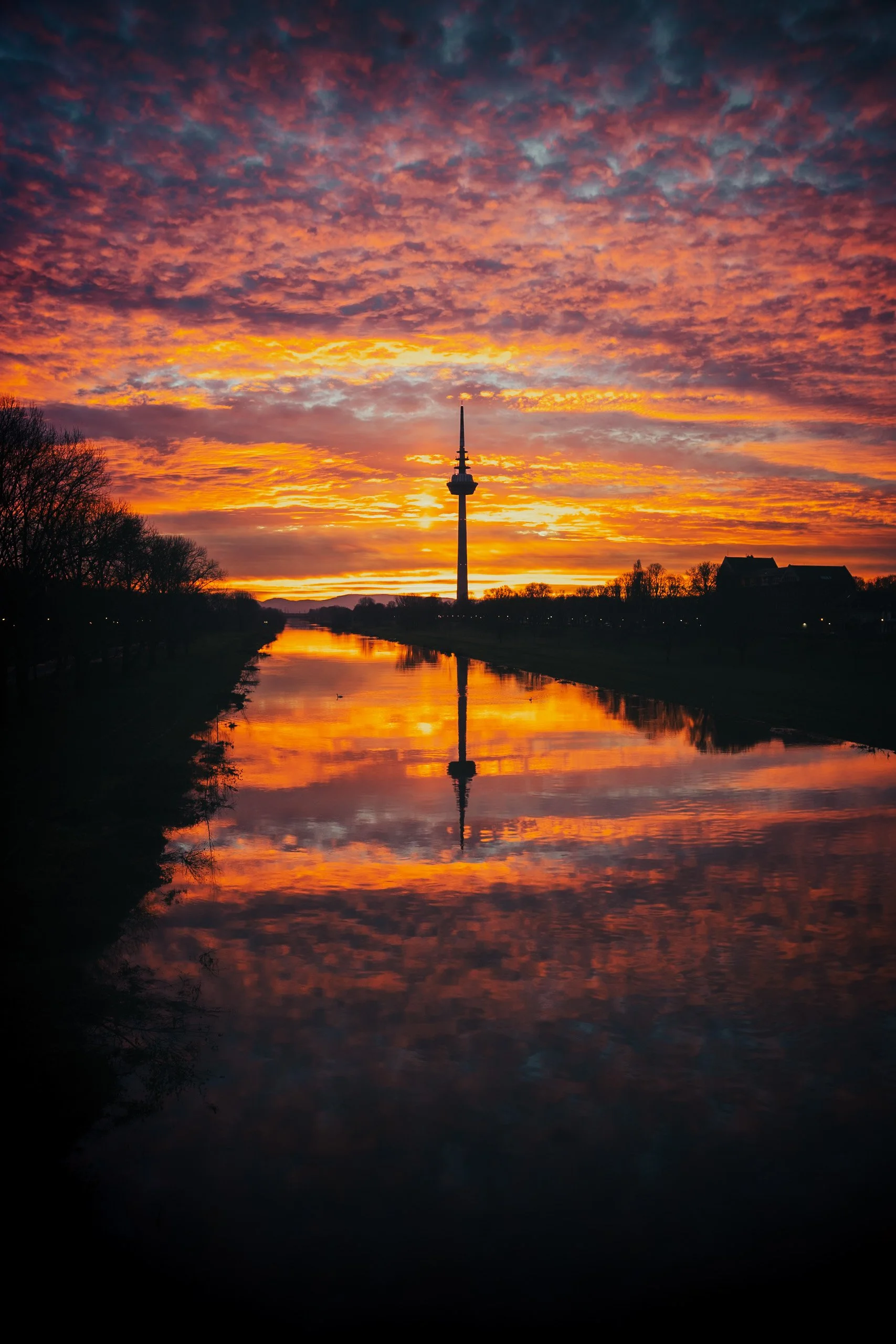
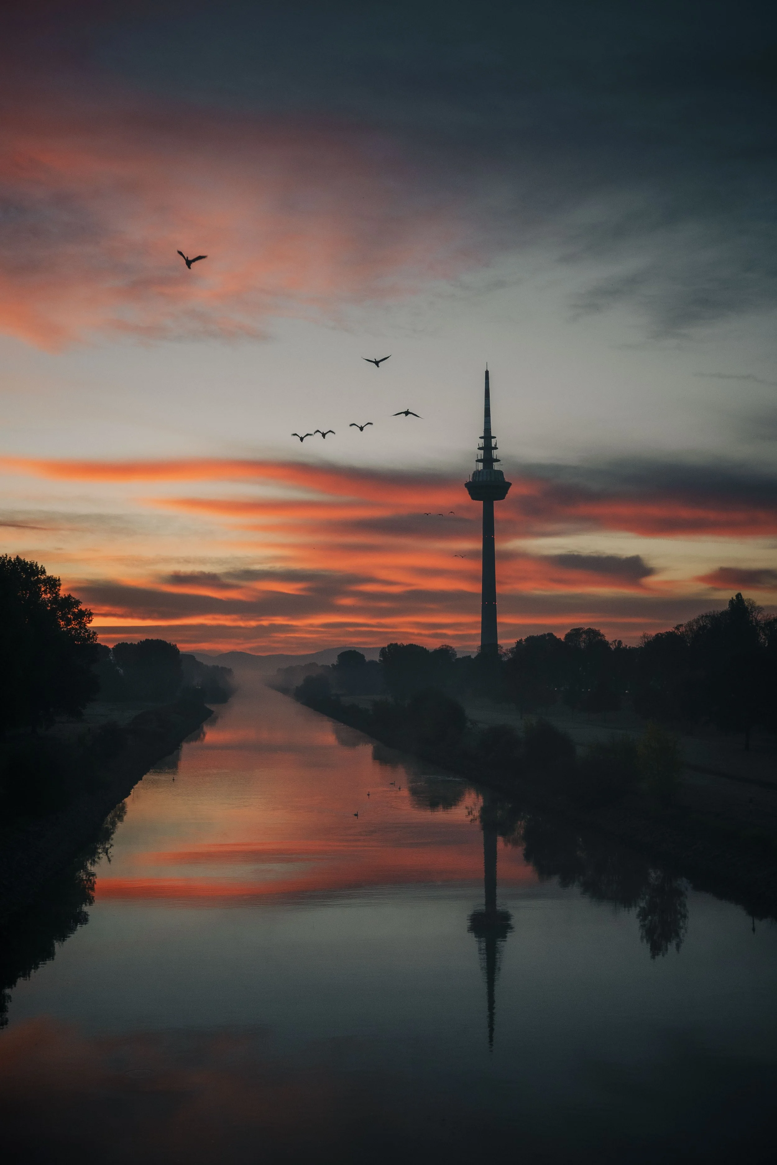
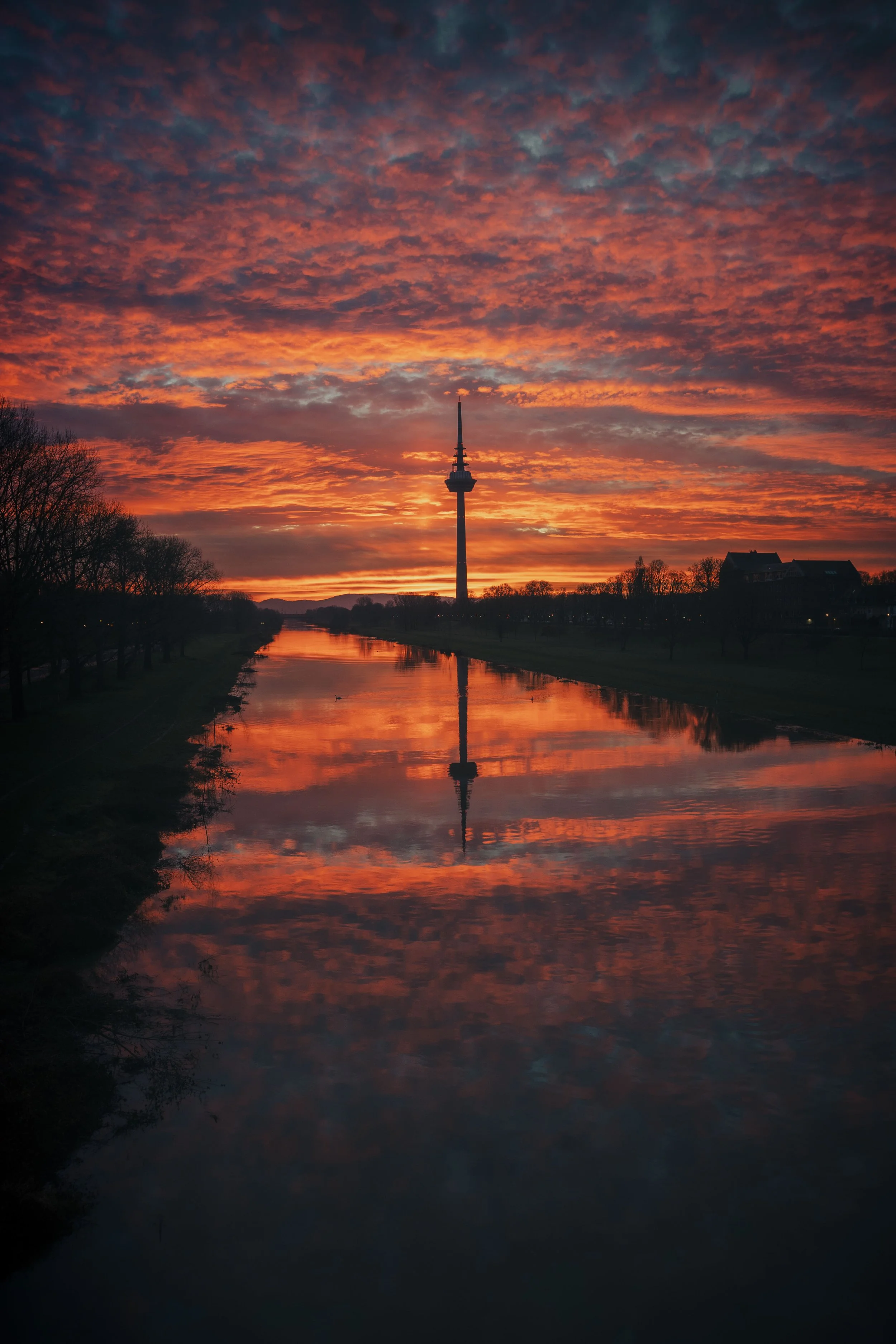
Lightroom Editing: Before and After: Mannheim Sunrise
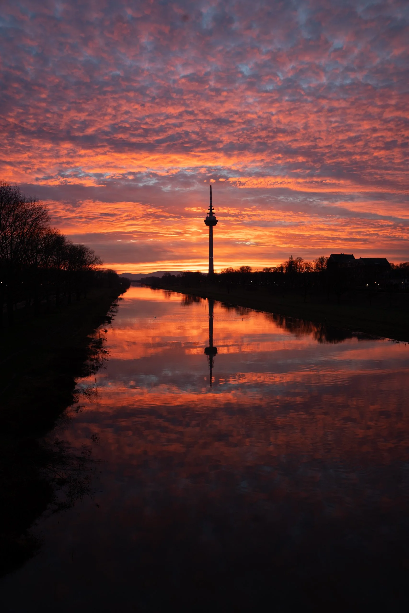
RAW Photo. Lightroom Edit is shown below at the end of the article.
This image was taken on a quiet winter evening in Mannheim, when the sky suddenly turned into layers of red, orange, and violet. The reflection on the canal was already strong in the RAW version, but the image felt flat and lacked emotional depth. My goal was to emphasize the warm tones of the sunset while keeping the mood calm and natural — a true balance between contrast and softness.
Basic adjustments - building the foundation
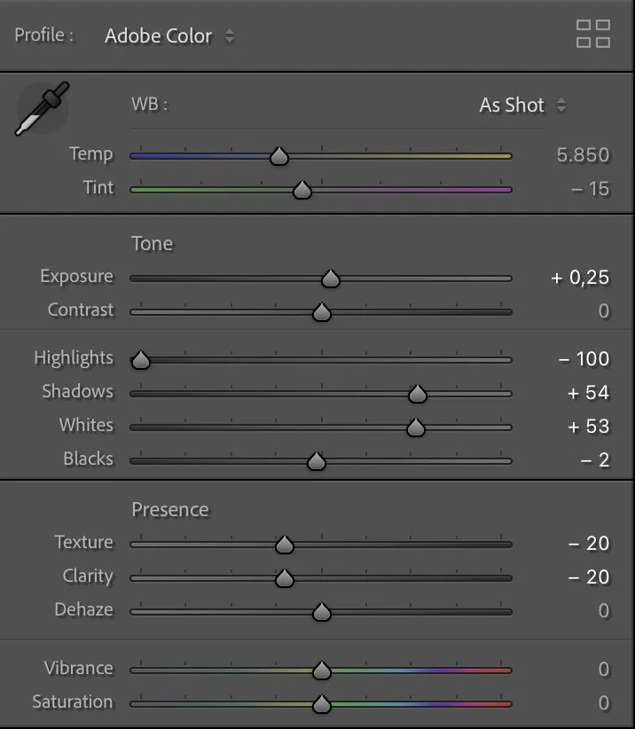
Basic Adjustments in Lightroom
I slightly increased the Exposure (+0.25) to open the image, while reducing the Highlights (-100) and lifting the Shadows (+54). This allowed the darker silhouettes to remain defined without losing detail in the glowing sky.
Both Whites (+53) and Blacks (-2) were used to extend the tonal range — the whites give light more brilliance, while the blacks keep the overall image grounded.
I reduced Texture (-20) and Clarity (-20). This creates a smoother transition between sky, clouds, and reflection. The white balance at Temp 5850 / Tint -15 adds a slightly cooler undertone, balancing the strong reds and oranges of the sunset.

Tone curve in Lightroom
Tone curve — adding depth and contrast
The tone curve follows a classic S-shape with soft contrast. The shadows are gently deepened, while the highlights are lifted just enough to give dimension without overpowering the scene. This approach creates that cinematic balance between dark silhouettes and luminous sky — enhancing the sense of depth while keeping the reflection natural.
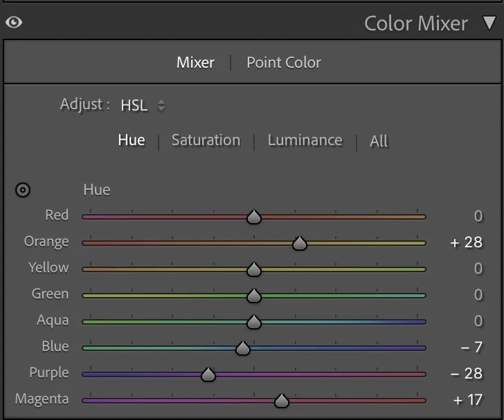
HSL Adjustments – refining the colors
In the Hue settings, the Oranges (+28) were slightly shifted toward yellow to create a warmer center tone in the sky. The Blues (-7) and Purples (-28) were adjusted to cool down the lower parts of the sky and reflection, helping the warm tones stand out naturally.
For Saturation, I reduced Red (-30) and Orange (-10) to prevent oversaturation, while pulling back Yellow (-49) and removing Green and Aqua (-100). This focuses all color contrast on the sunset itself. Blue (-48) and Purple (-16) were softened to keep the sky from becoming too heavy, while Magenta (-15) maintains subtle color transitions.
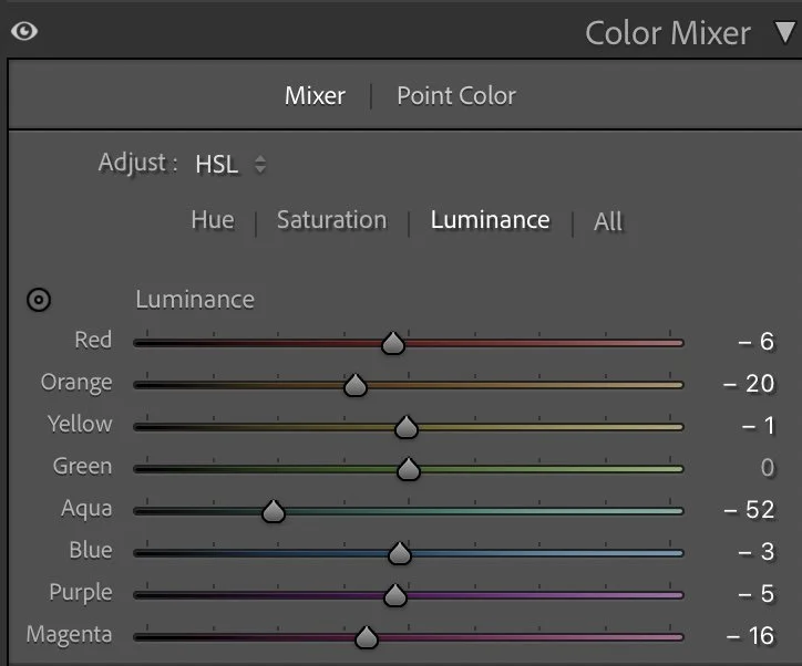
In Luminance, I darkened Orange (-20) and Blue (-52) to strengthen the glow of the horizon and reflection. This makes the light feel as though it’s slowly fading into the evening.

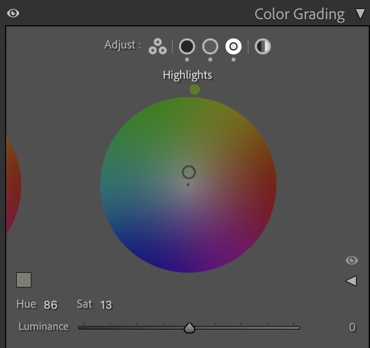
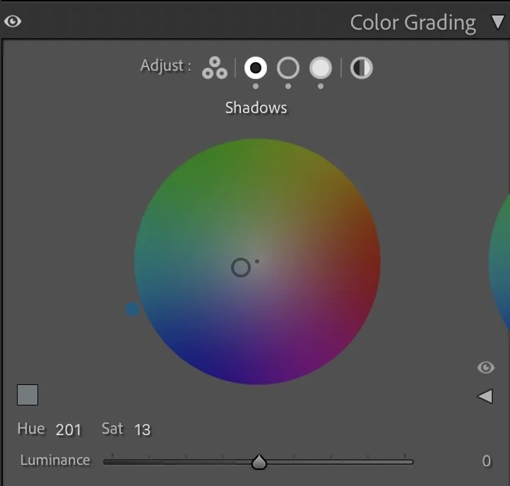
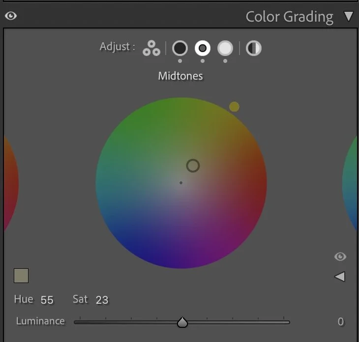
Color Grading – the finishing touch
The Shadows (Hue 201 / Sat 13) add a cool tone to the lower areas, grounding the image and emphasizing the contrast between the warm sky and cool reflection. In the Midtones (Hue 55 / Sat 23), a warm golden tone enhances the soft light of the sunset, while the Highlights (Hue 86 / Sat 13) add a gentle greenish warmth to balance the overall color harmony. The result is a layered and natural tone structure — blue base, golden midtones, and neutral light — creating emotional depth without over-editing.
Conclusion
The final image feels both strong and serene. By reducing texture, shaping contrast carefully, and balancing warm and cool tones, the photo captures the quiet intensity of that evening sky. It’s a reminder that even with dramatic light, subtle adjustments often have the greatest emotional impact. Further Before and After Articles can be found here.
Balancing the intensity of the sunset
When I edited this image earlier, my main goal was to emphasize the dramatic colors of the sunset. The warm tones in the sky and their reflection in the water became stronger and brighter, which made the scene appear very vivid and eye-catching.
At the time, this approach felt natural. Strong sunsets often invite photographers to push the colors and brightness to highlight the spectacle of the moment.
Looking at the photograph again today, I approach the image with a slightly different mindset. In the current version, I allowed the darker tones in the foreground and along the river to remain deeper. This creates more contrast between the glowing sky and the calm water below. The reflection still carries the warmth of the sunset, but the overall scene feels more balanced and less processed.
Instead of pushing the colors further, I now focus more on preserving the natural intensity of the light. The sunset remains powerful, but the image feels calmer and more atmospheric.
For me, this version better reflects the quiet moment of watching the sky change colors above the river.
Develop your own style
If you want to build your own Lightroom workflow step by step — not based on presets, but on a conscious and individual editing approach — take a look at my course.
In the course, I explain how photographers can develop their own editing style and gradually build a consistent visual look.
Further Articles you might like
Some photographs immediately grab our attention. Others stay with us long after we have seen them. For years, I believed that stronger colors, more contrast and more dramatic edits would make my images better. Over time, I realised that attention and atmosphere are not the same thing. In this article, I explore the difference between editing for reactions and editing for connection, and how this shift completely changed the way I approach photography and Lightroom.