Lightroom Editing: Before and After: Old Harry Rocks
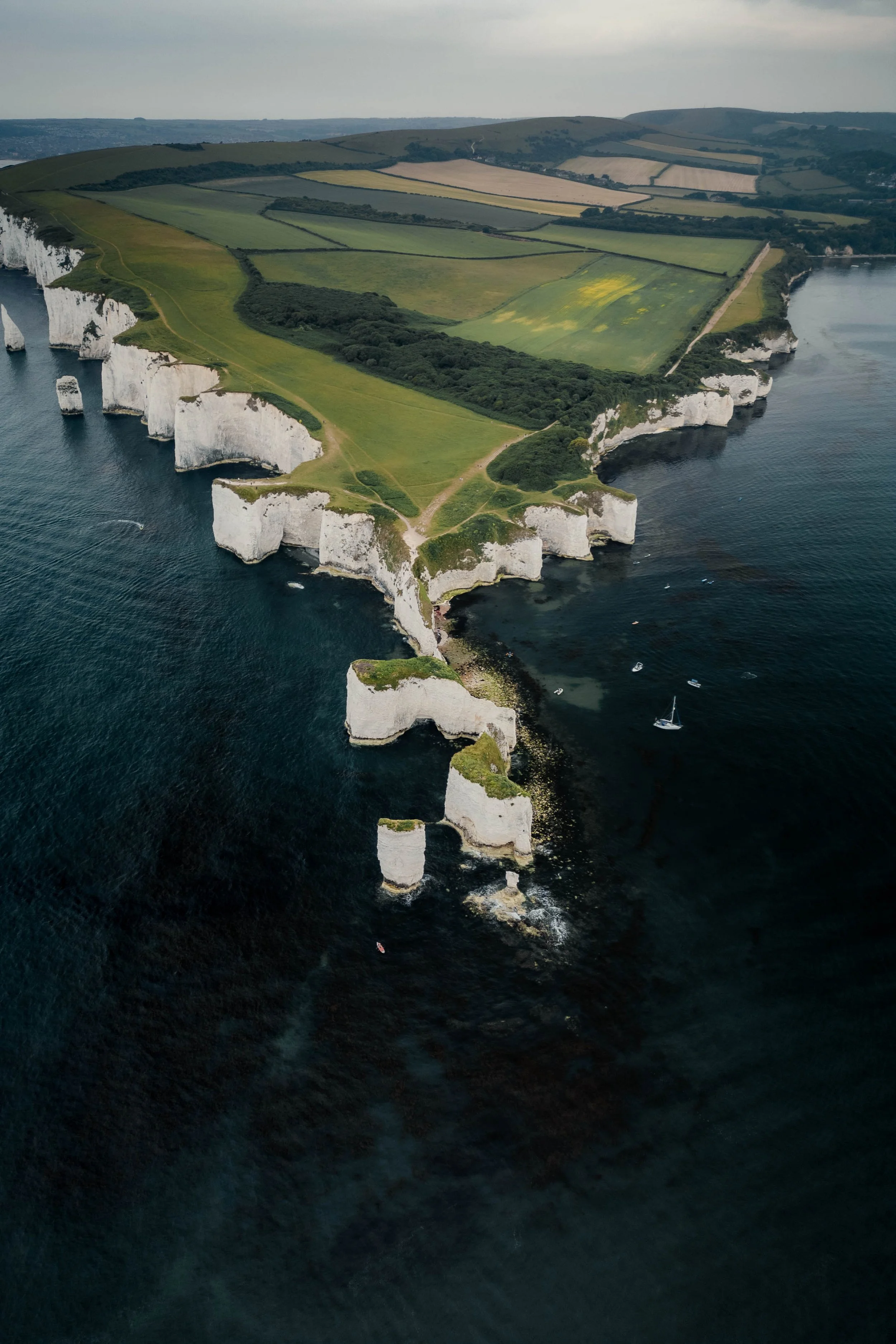
RAW Photo. Lightroom Edit is shown below at the end of the article.
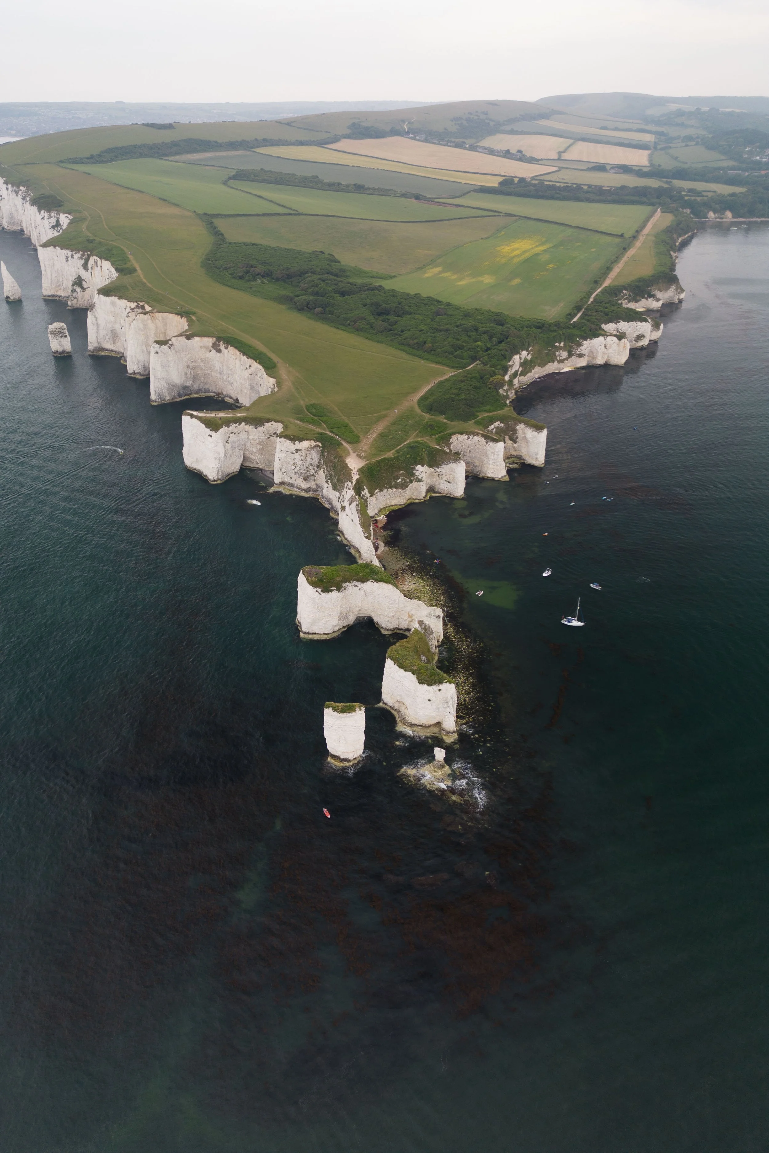
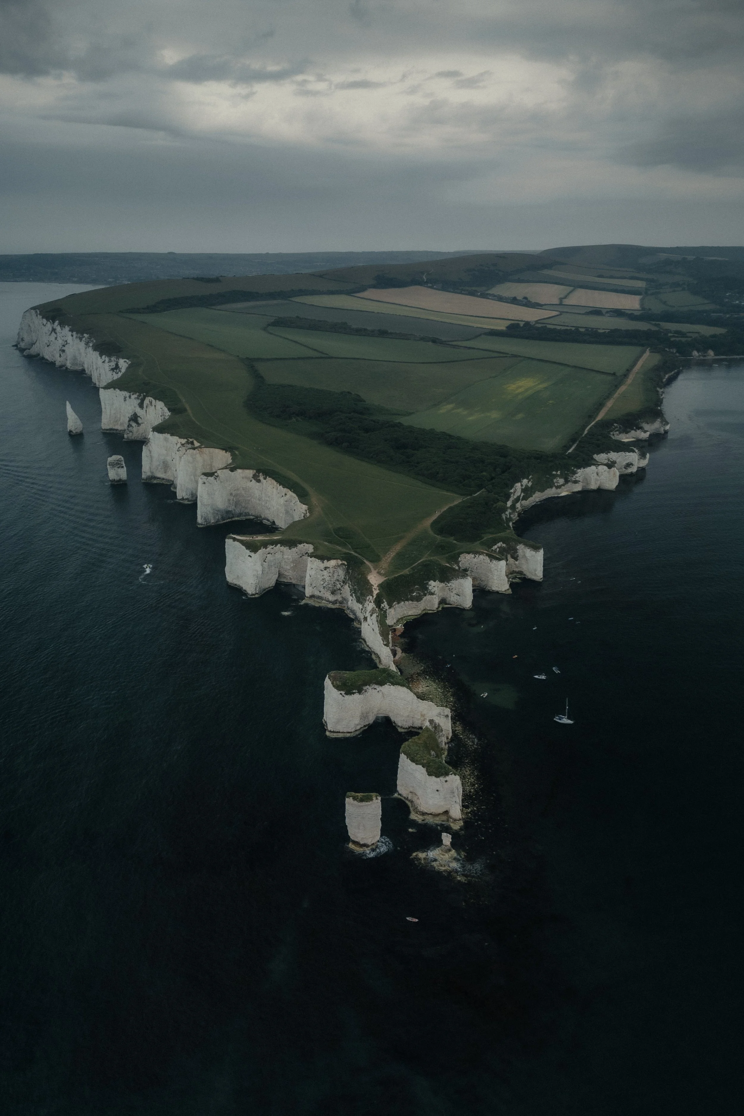
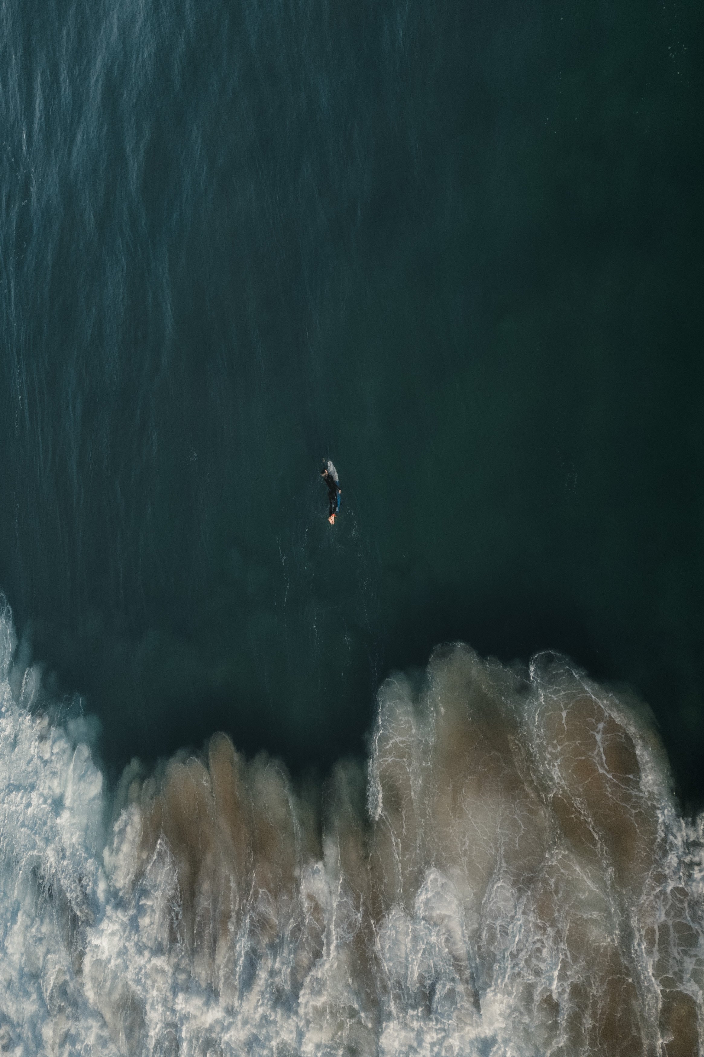
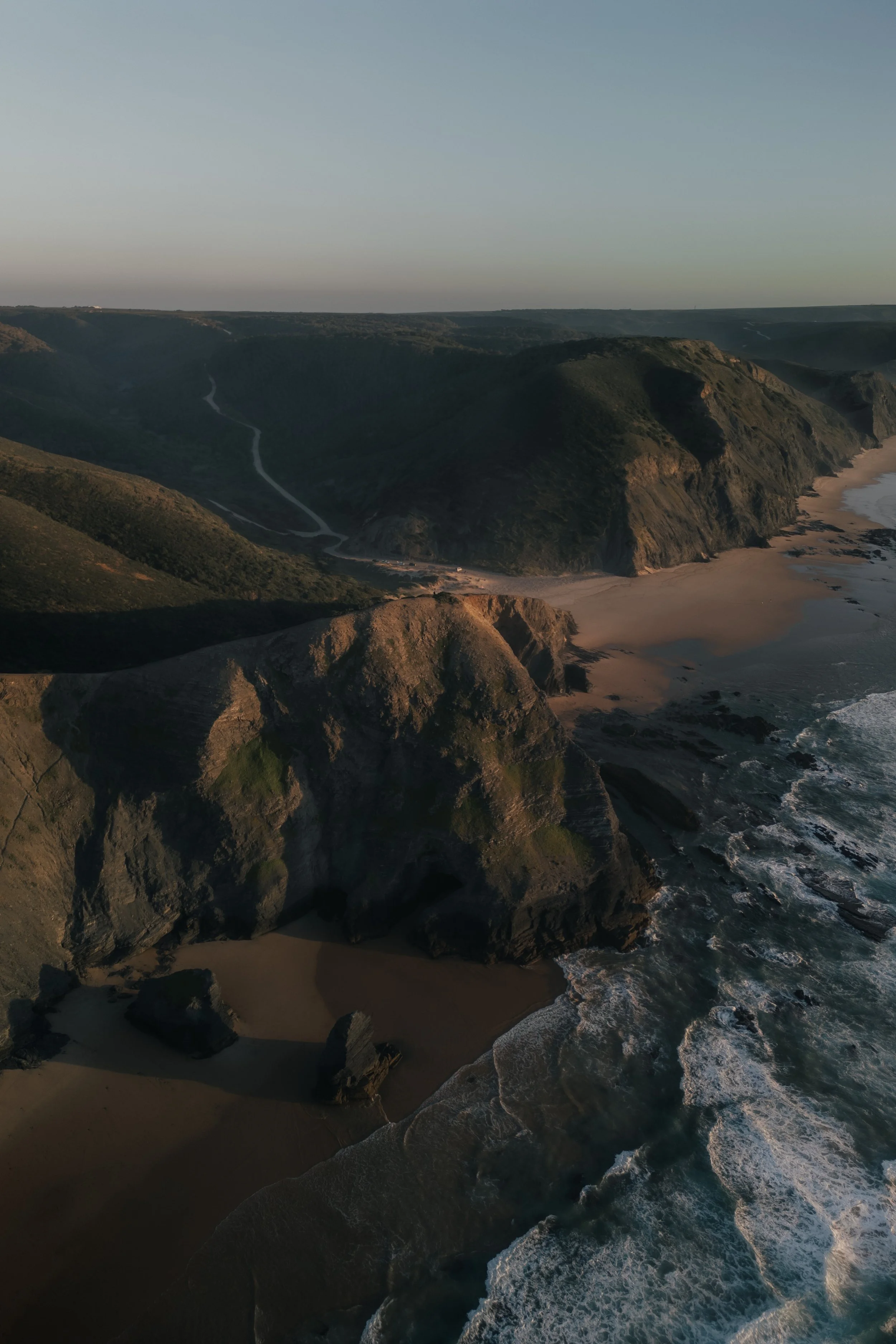
This image was taken at Old Harry Rocks on the south coast of England. From above, the white cliffs and green fields form a natural rhythm — soft shapes meeting the deep blue sea. In the unedited photo, though, everything felt too bright and washed out. The cliffs lacked texture, the water seemed pale, and the light didn’t convey the calm mood of that coastline. My goal was to bring back the quiet strength of this landscape: fresh air, soft contrast, and a slightly cinematic depth.
Basic adjustments - building the foundation
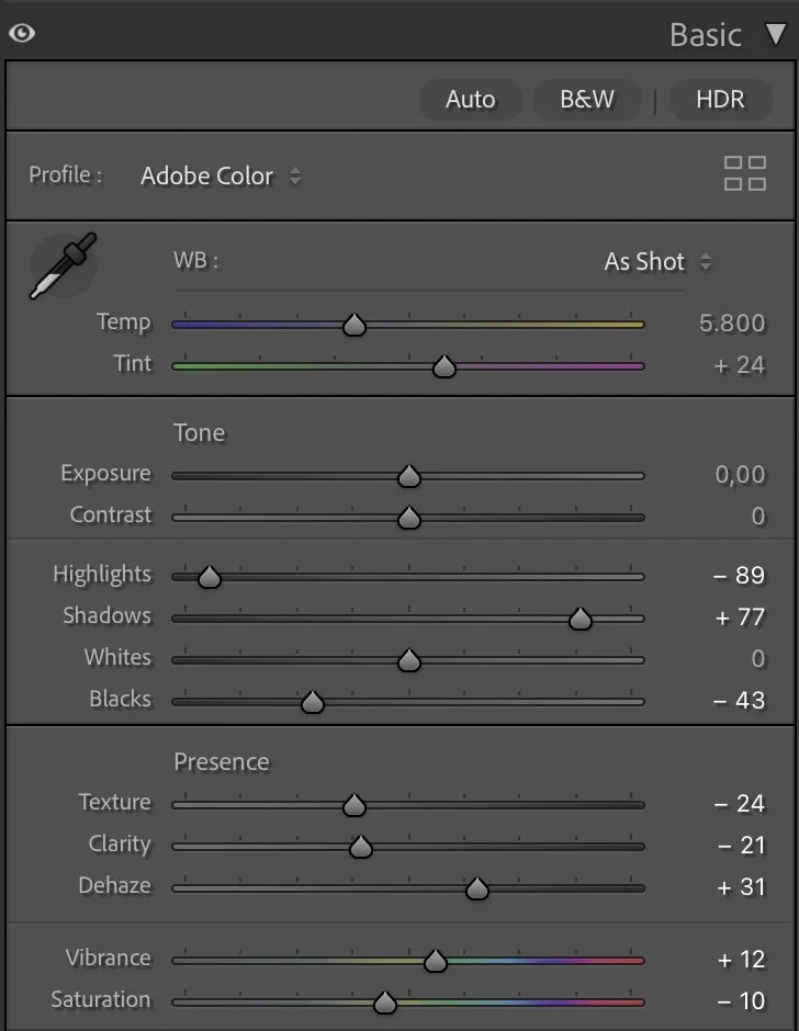
Basic Adjustments in Lightroom
The overall exposure stayed neutral, but the light balance was carefully shaped through contrast and tone. I reduced the Highlights (-89) and lifted the Shadows (+77) to recover the structure in both the bright cliffs and the darker sea. Then I deepened the Blacks (-43) to ground the image and give it a stronger base.
The Texture (-24) and Clarity (-21) sliders were pulled back to avoid too much sharpness in the grass and rocks, helping the image feel smoother and more natural. A slight increase in Dehaze (+31) added the sense of clear coastal air.
Finally, I adjusted Vibrance (+12) and Saturation (-10) — a combination that keeps the greens and blues alive, but removes any artificial intensity.
Tone curve in Lightroom
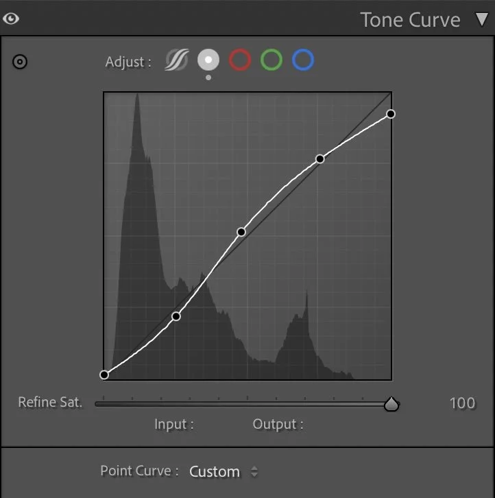
Tone curve — adding depth and contrast
The tone curve follows a gentle S-shape to enhance the natural contrast between sea and land. Shadows were lifted just enough to keep detail in the darker areas, while midtones were slightly brightened. The highlights remain soft — the cliffs should appear illuminated by diffused light, not by harsh sun. This creates that subtle separation between the land, the cliffs, and the sea that makes the image feel three-dimensional.
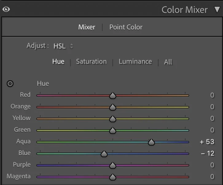
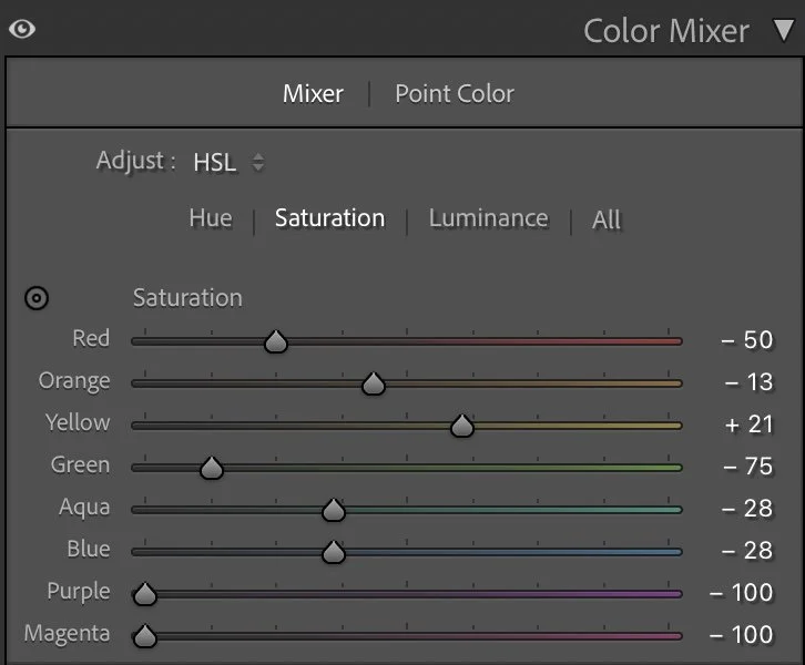
HSL Adjustments – refining the colors
In the HSL panel, I shifted the Aqua hue (+53) and Blue hue (-12) to refine the sea’s color — moving it slightly toward teal rather than pure blue. This creates a more natural, North Atlantic look.
In Saturation, I reduced Red (-50) and Green (-75) to mute the warm tones and keep the grass from overpowering the cliffs. The Yellow (+21) adjustment brightened the fields subtly, keeping them lively but still gentle. The blues and aquas were also desaturated slightly (-28), making the ocean feel deep rather than tropical.
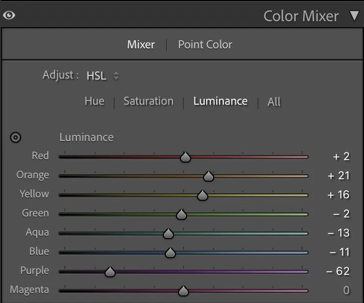
For Luminance, I lifted Orange (+21) and Yellow (+16) to open up the lighter grass tones, while slightly darkening Blue (-13) and Aqua (-11) to give the water more weight and contrast. These small changes bring harmony between the bright cliffs and the dark sea — one of the key aspects of this image’s calm energy.
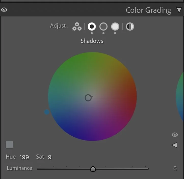
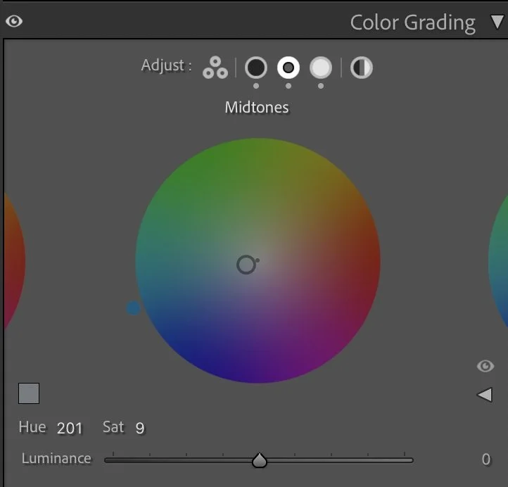
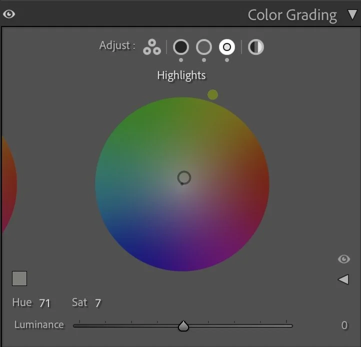
Color Grading – the finishing touch
The color grading adds a cool, atmospheric balance.
The Shadows (Hue 199 / Sat 9) introduce a soft blue tone that defines the mood of the sea and sky.
The Midtones (Hue 201 / Sat 9) carry a similar hue to maintain consistency, giving the entire image a fresh, maritime feeling.
The Highlights (Hue 71 / Sat 7) bring in a hint of warm light — a subtle contrast that suggests late afternoon sun breaking through thin clouds.
Together, these tones make the image feel clean and quiet — almost minimalistic, but full of air and presence.
Conclusion
This photo reminds me why easy changes matter in editing. The cliffs didn’t need drama; they just needed balance. By reducing saturation, softening texture, and working mainly with light, the image finds its rhythm between calm and depth. It’s a good example of how a simple color shift can completely change the mood — from flat and overexposed to grounded and timeless.
This is the essence of my process: understanding light first, shaping structure second, and using color only to support the atmosphere you want to express. Further Before and After Articles can be found here.
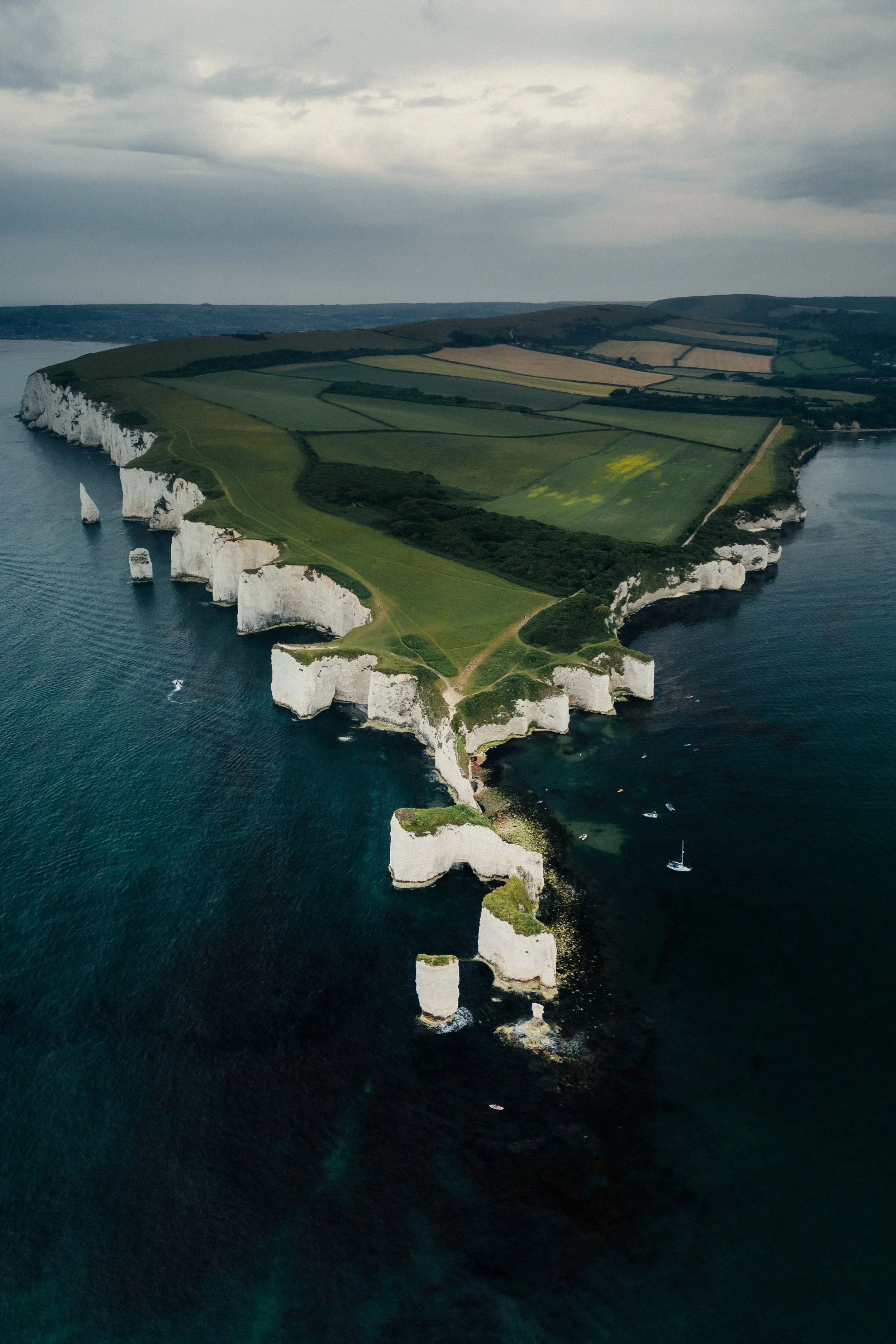
Creating more depth through natural contrast
In the earlier version of this image, my goal was to make the landscape appear brighter and clearer. The fields, the cliffs, and the ocean were lifted slightly so that more details became visible across the entire scene.
While this made the image feel open and easy to read, it also reduced some of the natural depth of the landscape.
In the current version, I allowed the darker tones of the ocean to remain deeper and kept the natural contrast between land, cliffs, and water. This creates a stronger visual separation between the different elements of the scene.
The coastline now guides the viewer’s eye more naturally through the image, while the bright cliffs stand out more clearly against the darker ocean.
Instead of brightening every part of the landscape, the edit now follows the natural structure of the scene and the existing light.
For me, this version feels calmer and closer to the atmosphere of the moment when the photo was taken.
Develop your own style
If you want to build your own Lightroom workflow step by step — not based on presets, but on a conscious and individual editing approach — take a look at my course.
In the course, I explain how photographers can develop their own editing style and gradually build a consistent visual look.
Further Articles you might like
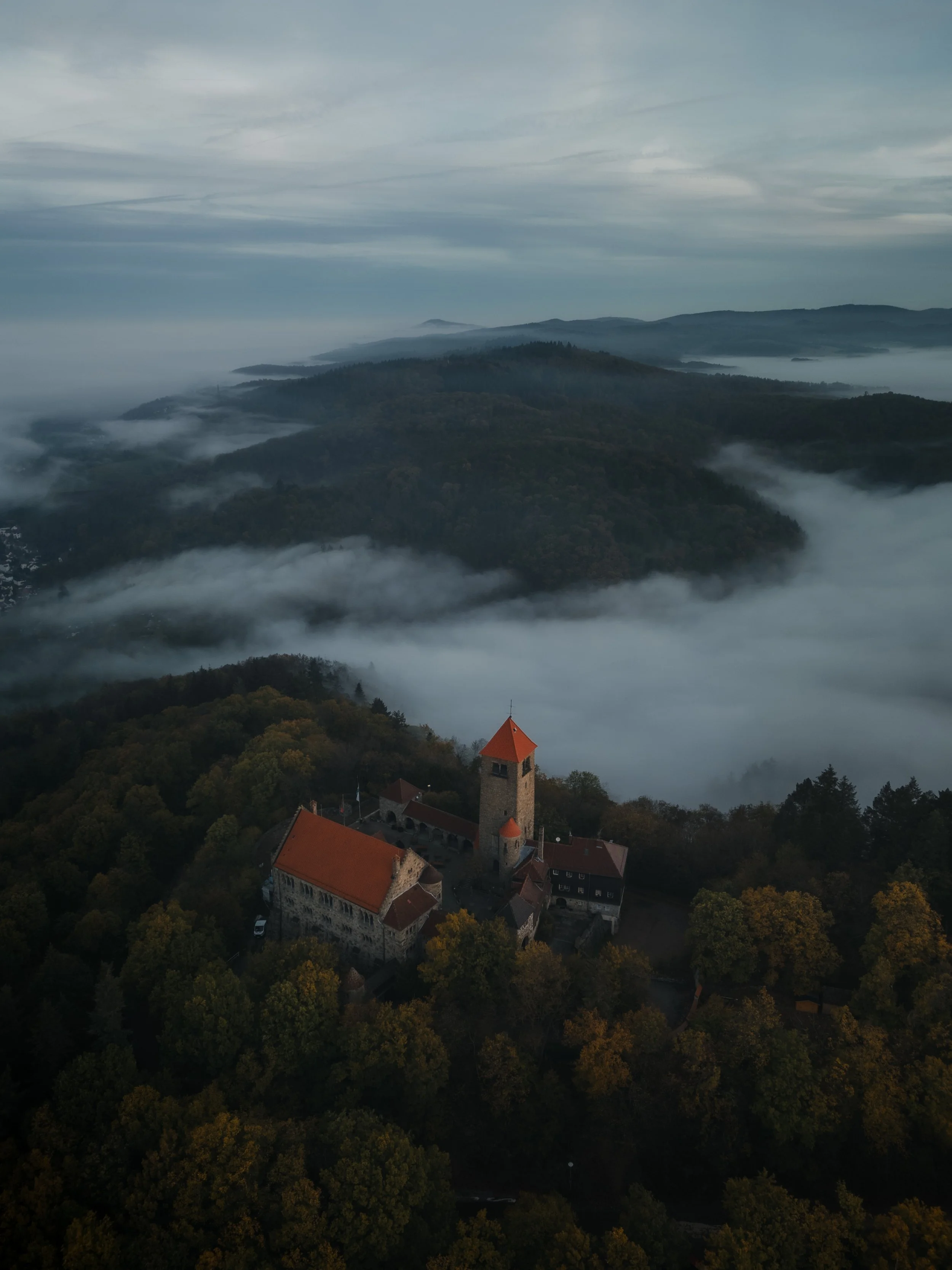
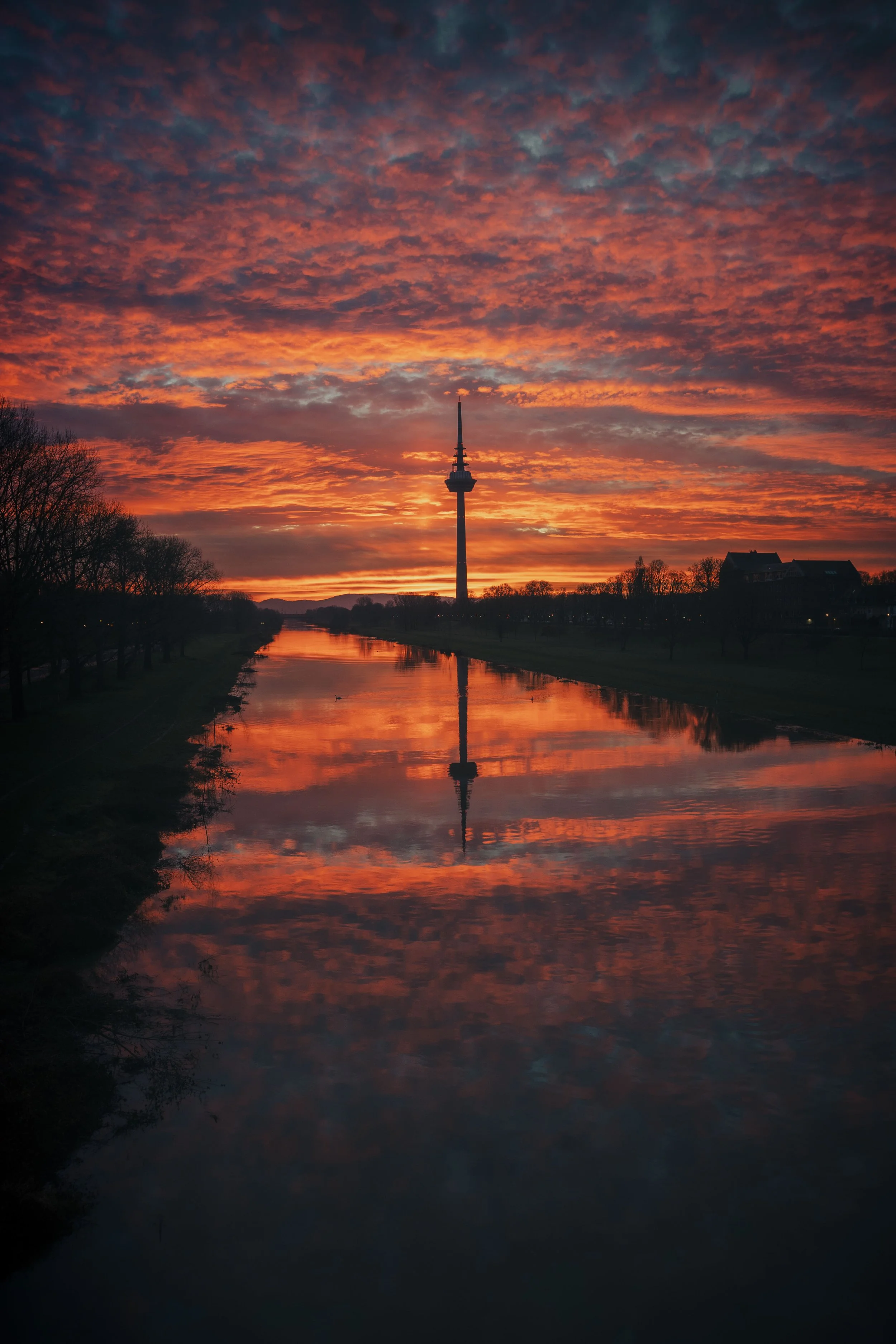
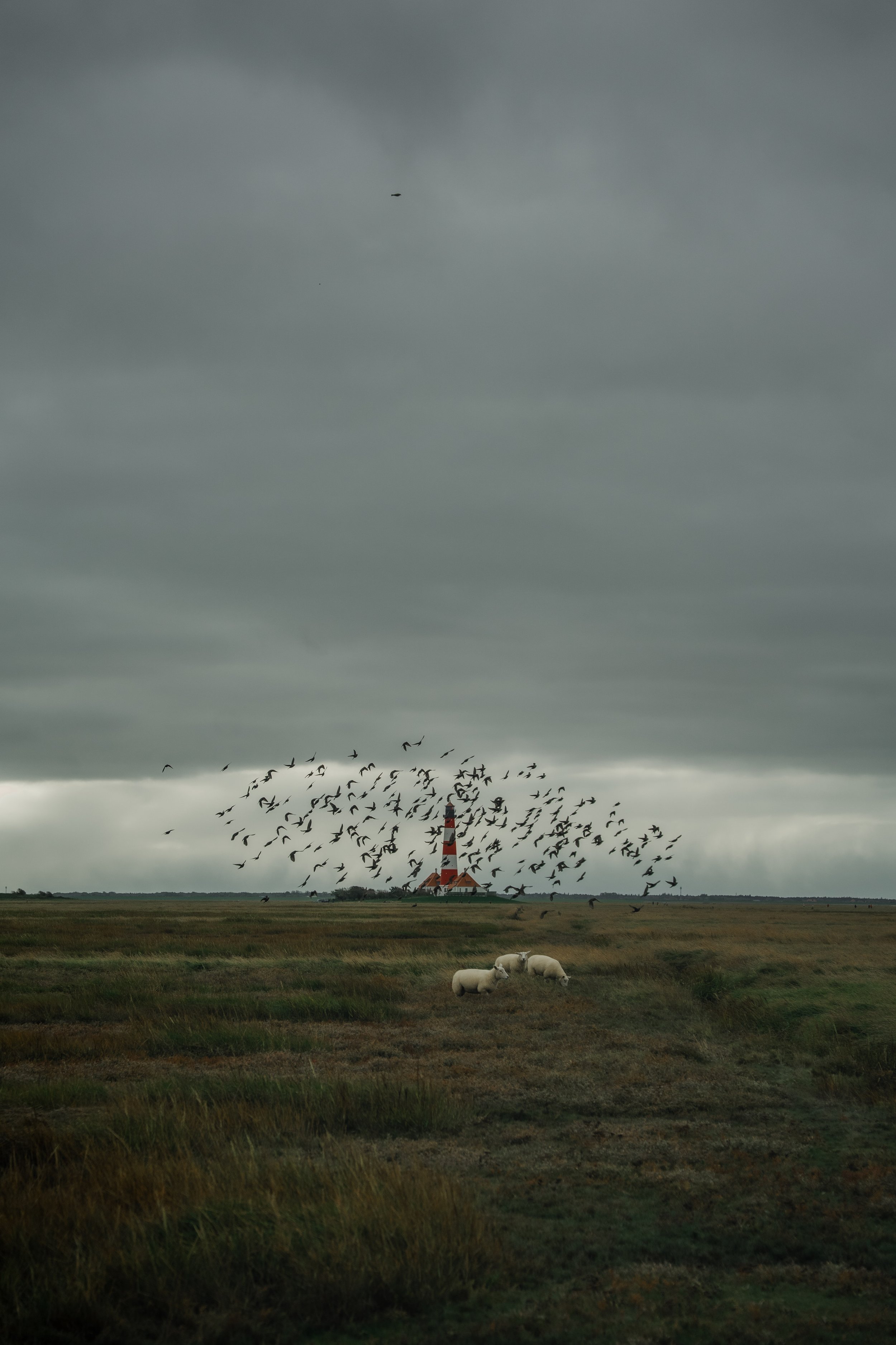
Some photographs immediately grab our attention. Others stay with us long after we have seen them. For years, I believed that stronger colors, more contrast and more dramatic edits would make my images better. Over time, I realised that attention and atmosphere are not the same thing. In this article, I explore the difference between editing for reactions and editing for connection, and how this shift completely changed the way I approach photography and Lightroom.