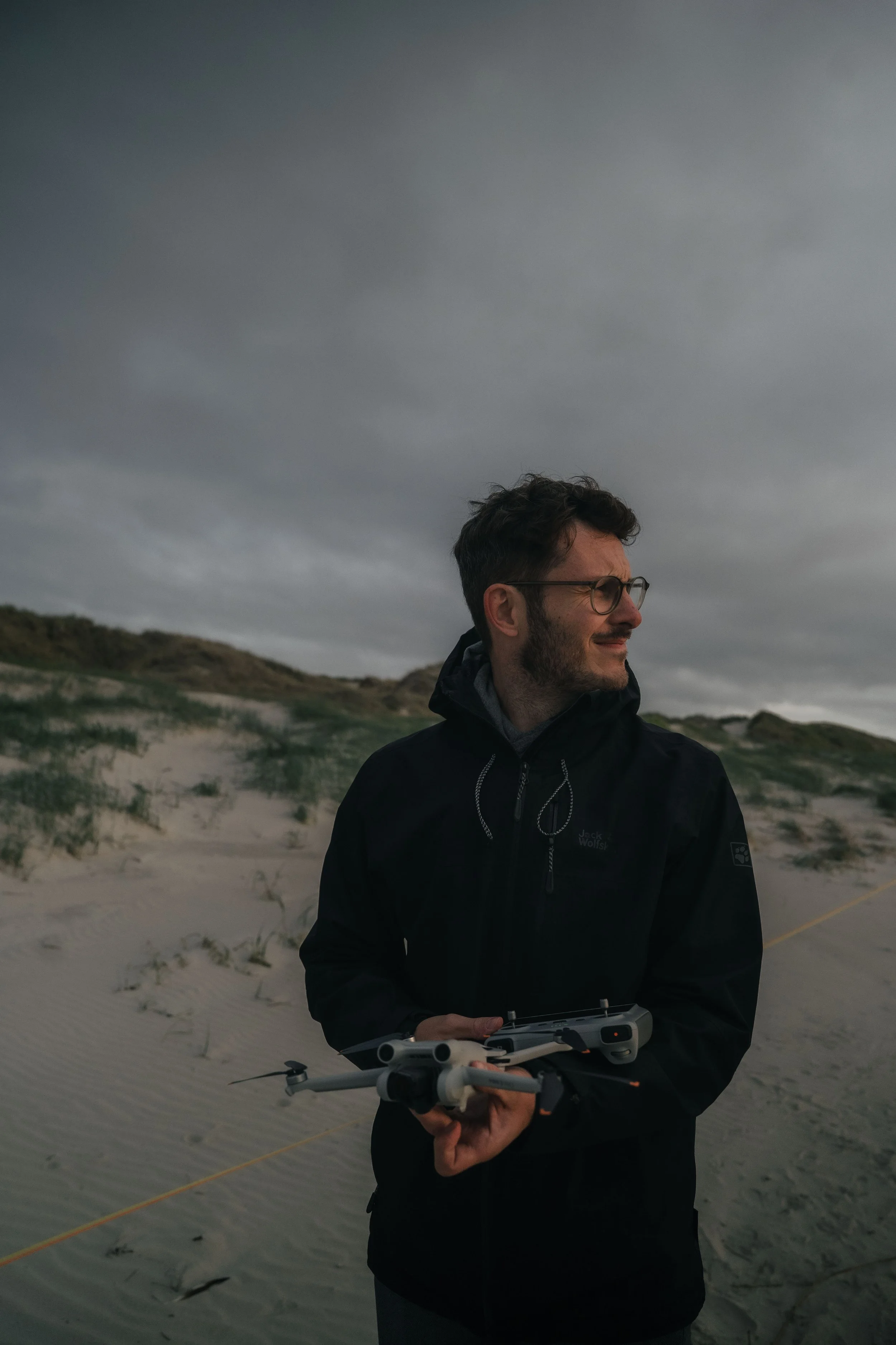
Lightroom Editing: Before and After: Piazza dell’Anfiteatro, Lucca

RAW Photo. Lightroom Edit is shown below at the end of the article.
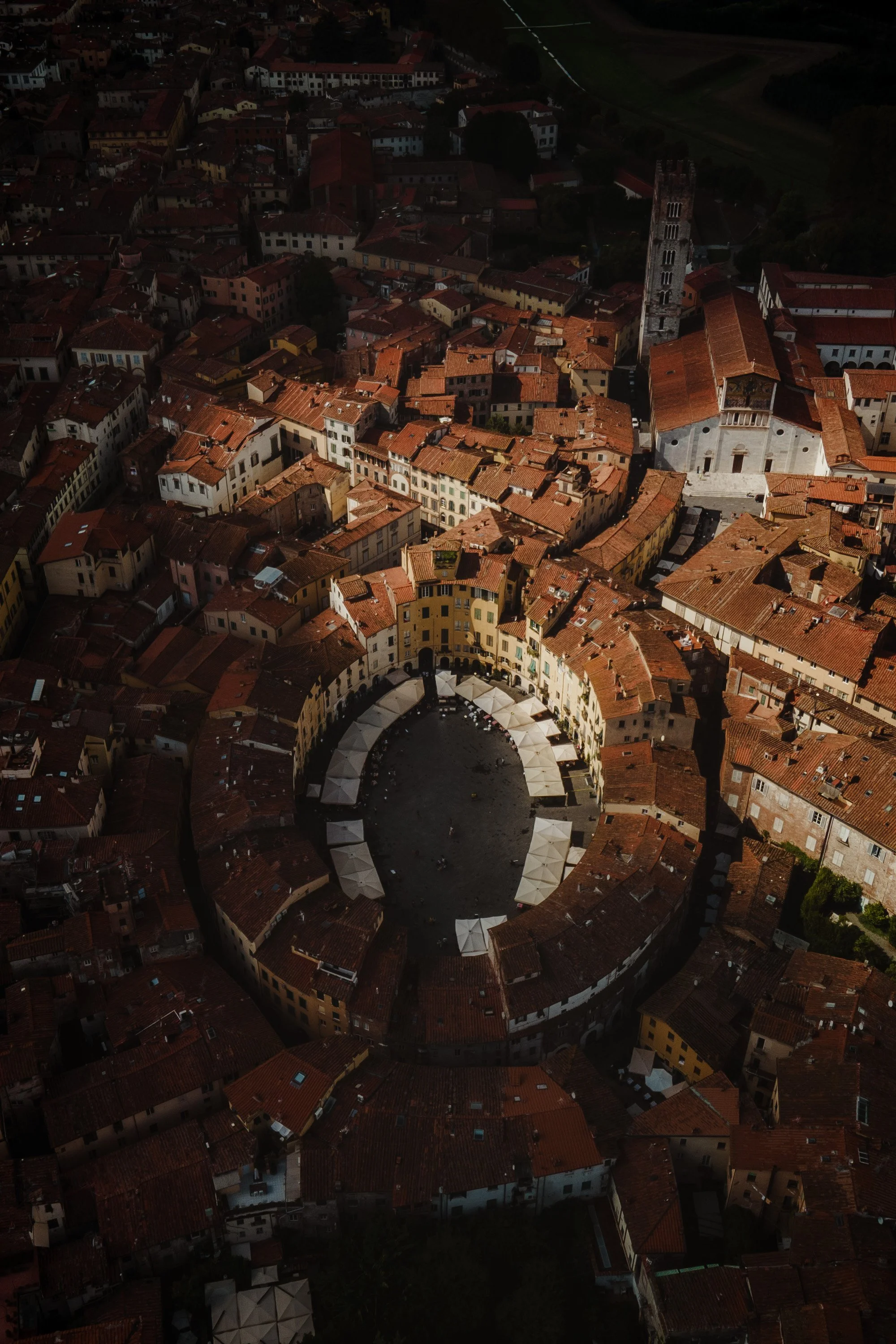
This drone photo shows the Piazza dell’Anfiteatro in Lucca – one of the most fascinating architectural shapes in Italy. The oval square looks almost like an eye watching over the city.
In the unedited RAW file, the structure was already impressive, but the light was flat and the colors too even. My goal was to bring back the depth and rhythm of this shape – to guide the viewer’s eye toward the center while keeping the natural calmness of the scene.
Basic adjustments - building the foundation
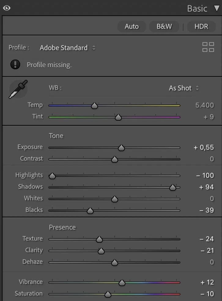
Basic Adjustments in Lightroom
I slightly increased the Exposure (+0.55) to bring out more detail in the darker areas without overexposing the rooftops.
At the same time, I reduced the Highlights (-100) and raised the Shadows (+94) to even out the lighting and soften strong contrasts. This balance is the foundation for a more refined tonal curve later.
To give the image more depth again, I darkened the Blacks (-39), which helps to frame the Piazza and lead the eye naturally inward.
Since drone photos often have too much micro-detail, I lowered Texture (-24) and Clarity (-21). This smooths the rooftops and gives the scene a calmer, more natural look.
Finally, I adjusted the color balance slightly with Vibrance (+12) and Saturation (-10) to keep the tones vivid but not too bright – alive, but still soft.
Tone curve in Lightroom
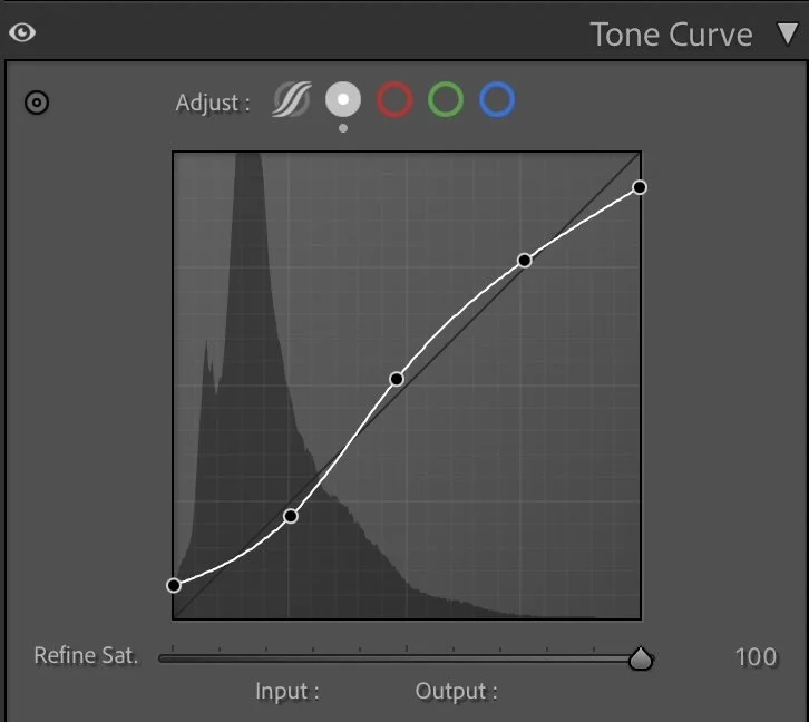
Tone curve — adding depth and contrast
The tone curve adds gentle contrast without destroying the soft light feeling.
I used a smooth S-shape that slightly lifts the shadows and emphasizes the highlights. This brings more dimension and structure while keeping transitions natural and pleasant. Especially in architectural scenes, such soft contrast helps the viewer feel the shape rather than just see it.
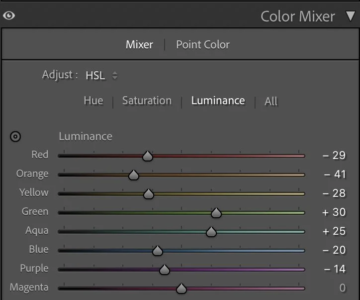
HSL Adjustments – refining the colors
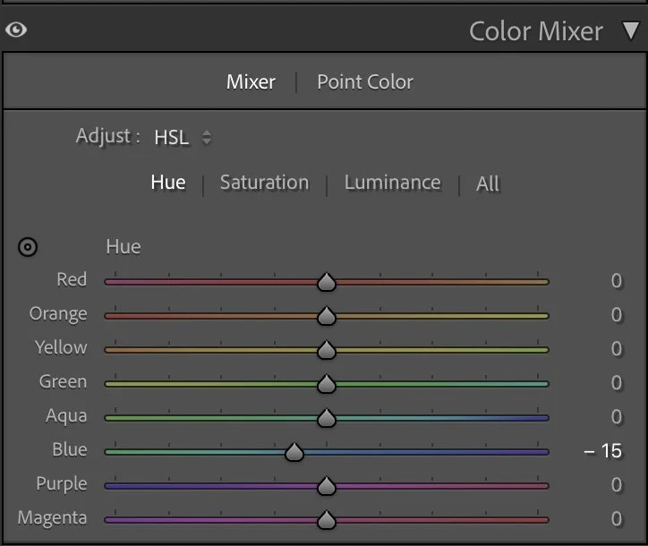
In the HSL section, I mainly reduced the warm tones to make the rooftops look more natural and less saturated.
Reds (-42) and Oranges (-26) were too dominant, so lowering them created a more authentic terracotta tone that feels timeless.
I also reduced Blues (-43) and Magenta (-100) to remove unwanted color casts in the shadows.
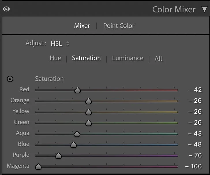
For Luminance, I darkened the warm tones (Red -29, Orange -41) to add depth, while slightly brightening the cooler tones (Yellow, Green, Aqua).
This creates a balanced look where warm and cool areas softly blend together. The result is a calm, harmonious palette with gentle terracotta and earthy tones – true to the atmosphere of Lucca.
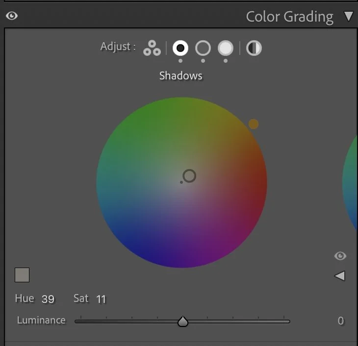
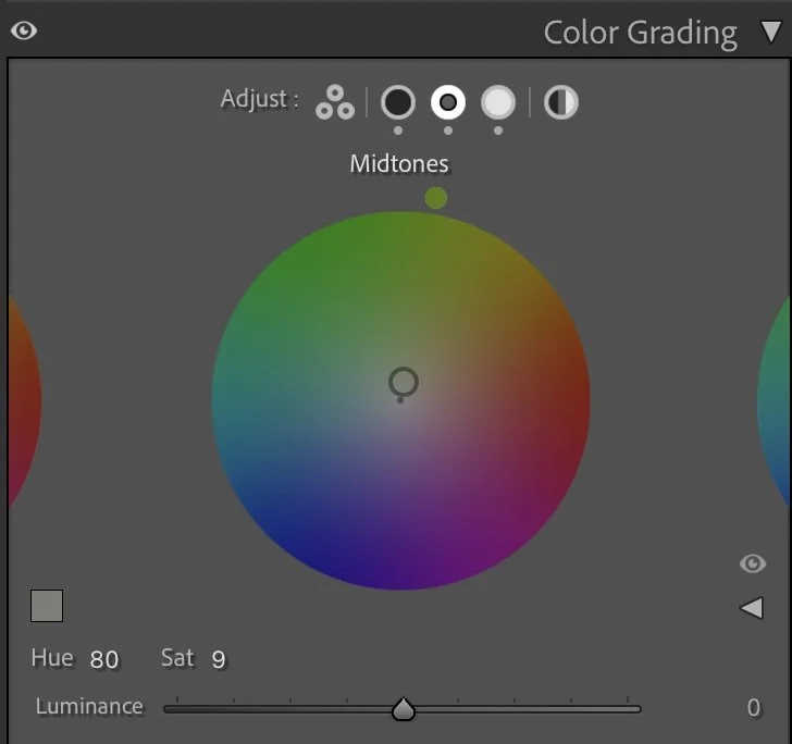
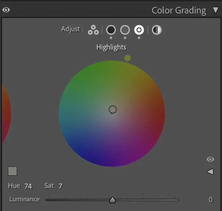
Color Grading – the finishing touch
In color grading, I defined the overall mood more precisely.
The Shadows (Hue 39 / Sat 11) carry a warm tone that reminds of late afternoon sunlight.
The Midtones (Hue 80 / Sat 9) add a subtle cool balance to keep the warmth under control.
The Highlights (Hue 74 / Sat 7) stay neutral, keeping the bright parts of the Piazza natural and realistic.
Together, these tones create a peaceful, balanced color atmosphere – warm but not golden, calm but still alive.
Conclusion
The final image feels calm, focused, and alive at the same time. Through soft contrast, muted colors, and intentional light shaping, the photo captures the quiet structure of the place – not through color intensity, but through light and depth. This edit is a clear example of my method: first shape the light and structure, then bring back color intentionally. The result isn’t loud or showy; it’s a balanced expression of form and atmosphere – exactly how the Piazza felt in that moment. Further Before and After Articles can be found here.

Focusing more on light and structure
When I edited this image earlier, my goal was mainly to brighten the scene and reveal more of the town’s details. The rooftops, streets and buildings became more visible, which made the image feel clearer and easier to read.
Over time, my editing approach has changed.
In the current version, I allowed the surrounding areas to remain darker and focused more on the natural light that falls onto the central square. The illuminated buildings now stand out more clearly against the darker parts of the town. This creates a stronger visual structure in the image. The viewer’s attention is naturally drawn toward the circular piazza and the church tower, while the surrounding rooftops form a darker frame around the scene.
Instead of revealing every detail, the image now relies more on contrast between light and shadow. For me, this makes the photograph feel more atmospheric and closer to the way the moment actually looked from above.
Develop your own editing lightroom style
If you want to build your own Lightroom workflow step by step — not based on presets, but on a conscious and individual editing approach — take a look at my course.
In the course, I explain how photographers can develop their own editing style and gradually build a consistent visual look.
Weitere Artikel, die dir gefallen könnten
Some photographs immediately grab our attention. Others stay with us long after we have seen them. For years, I believed that stronger colors, more contrast and more dramatic edits would make my images better. Over time, I realised that attention and atmosphere are not the same thing. In this article, I explore the difference between editing for reactions and editing for connection, and how this shift completely changed the way I approach photography and Lightroom.