Lightroom Editing: Yoga in Tuscany – Before and After
Lightroom · Before and After
Lightroom Editing: Yoga in Tuscany – Before and After
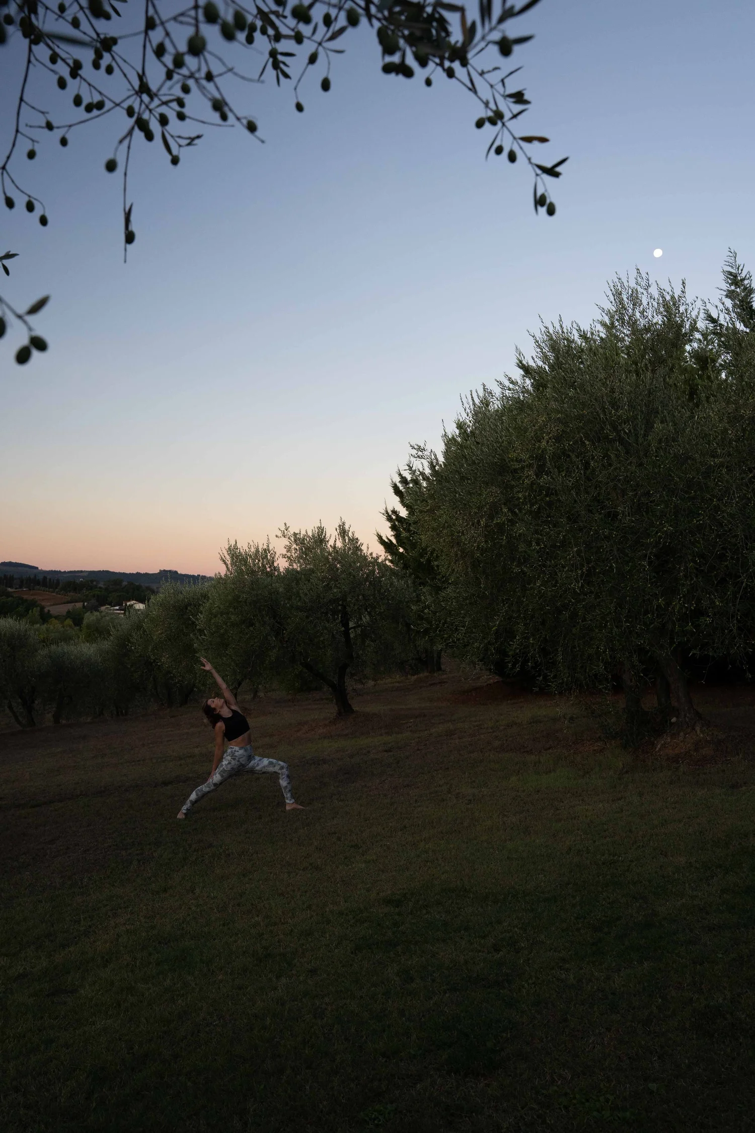
At first glance, the RAW file of this photo looked flat and dark. But the scene itself was beautiful: a yoga pose among olive trees, the moon rising above, and the warm Tuscan evening light.
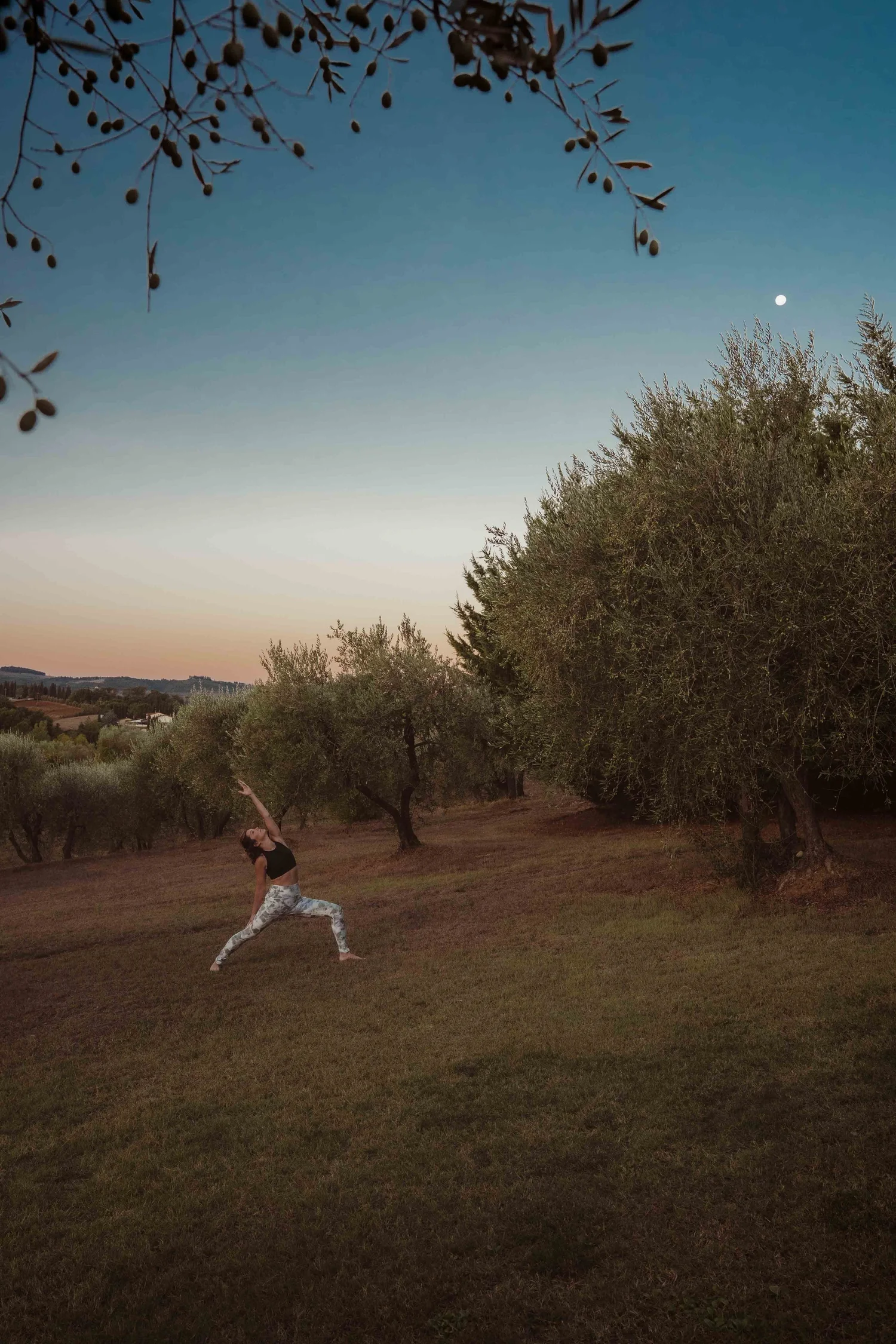
The direct comparison
From RAW to final edit.
With my editing in Lightroom, I wanted to bring back exactly that atmosphere – warm, clear, and full of depth.
Step 01
Basic adjustments - building the foundation
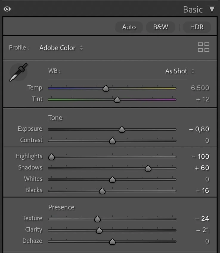
I started by slightly increasing the exposure (+0.80) to brighten the overall scene. At the same time, I pulled the highlights all the way down (–100) to preserve the subtle tones in the sky. The shadows were lifted (+60) so that the olive trees and foreground details became visible.
What this step changes
To add more depth, I pushed the blacks slightly darker (–16). Texture (–24) and clarity (–21) were reduced to give the image a softer, calmer look.
Step 02
Tone curve — adding depth and contrast
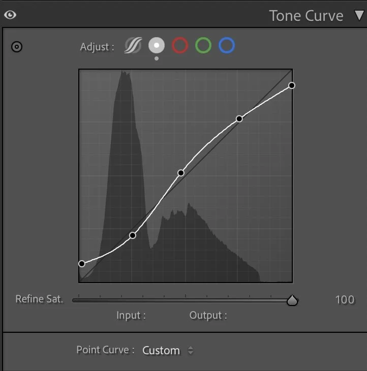
The tone curve gave the image subtle contrast and three-dimensionality. With a gentle S-curve, I darkened the shadows, brightened the midtones, and slightly lifted the highlights. The result is a more dynamic scene without losing its natural feel.
What this step changes
The tone curve gave the image subtle contrast and three-dimensionality. With a gentle S-curve, I darkened the shadows, brightened the midtones, and slightly lifted the highlights. The result is a more dynamic scene without losing its natural feel.
Step 03
HSL Adjustments – refining the colors
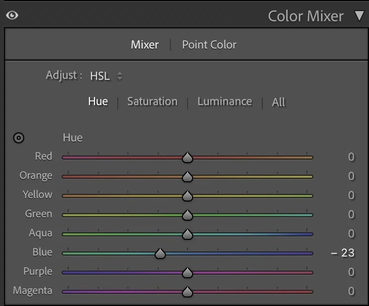
The most important shift was in the sky: I pushed the blue slightly towards aqua (–23) to enhance the evening mood.
Hue
The most important shift was in the sky: I pushed the blue slightly towards aqua (–23) to enhance the evening mood.
Saturation
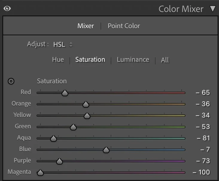
I lowered the saturation of many colors – red (–65), orange (–36), yellow (–34), green (–53), and especially blue (–81). This removed distracting tones and kept the focus on the sky and warm horizon.
Luminance
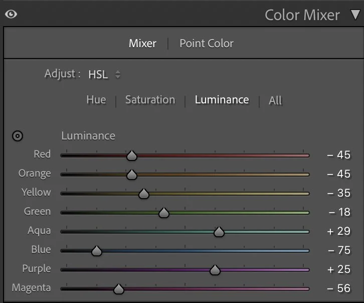
Orange (+29) and yellow (+25) were brightened to emphasize the warm glow at the horizon. Blue (–73) and green (–18) were darkened for more depth in the sky and foreground. Aqua (+29) and magenta (+56) helped balance the overall look.
Step 04
Color Grading – the finishing touch
Finally, color grading added the last bit of atmosphere:
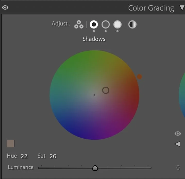
Image 02.10.25 at 14.31
Finally, color grading added the last bit of atmosphere:
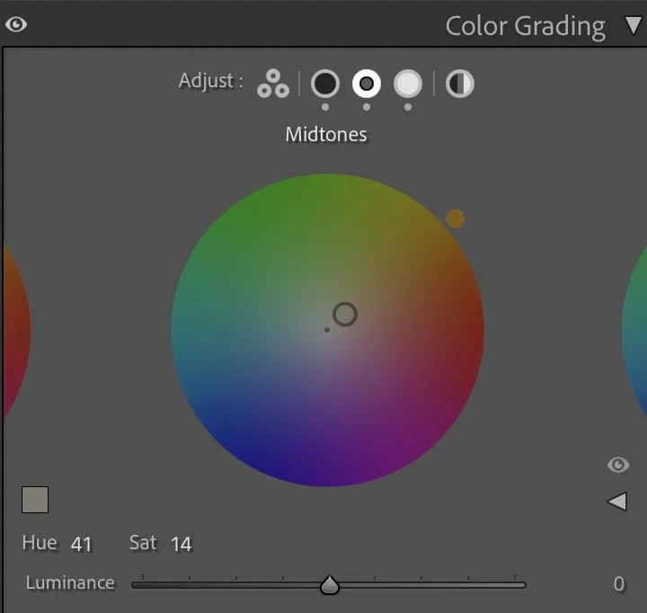
Image 02.10.25 at 14.31 (1)
Shadows were given a warm orange tone (Hue 22, Sat 26).
Highlights
Midtones shifted slightly towards warm hues (Hue 41, Sat 14) to support skin tones and the landscape.
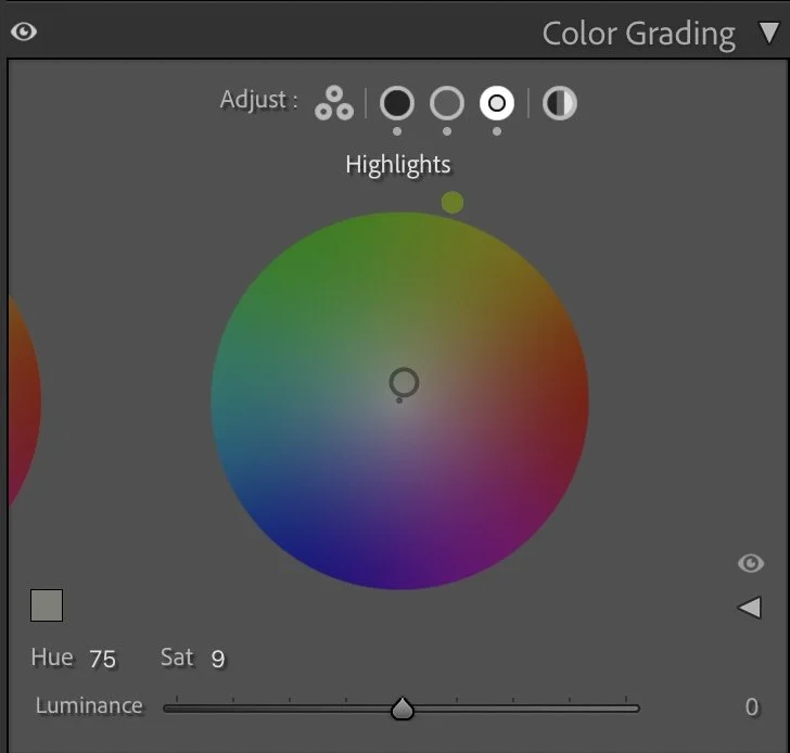
Highlights received a subtle green-yellow tint (Hue 75, Sat 9), which gave the sky a natural balance.
Step 05
Conclusion
The final image reflects exactly what I experienced on location: a calm evening, warm tones, and clear structures. From a flat RAW file, Lightroom helped me create a photo that conveys depth, harmony, and atmosphere – without looking artificial.
The evolution of the edit
Preserving the quiet mood of the evening
When I edited this image earlier, I mainly tried to brighten the scene and bring out more of the landscape. The ground and the surrounding olive trees became more visible, which made the photograph feel lighter and easier to read. Over time, my editing approach has changed.
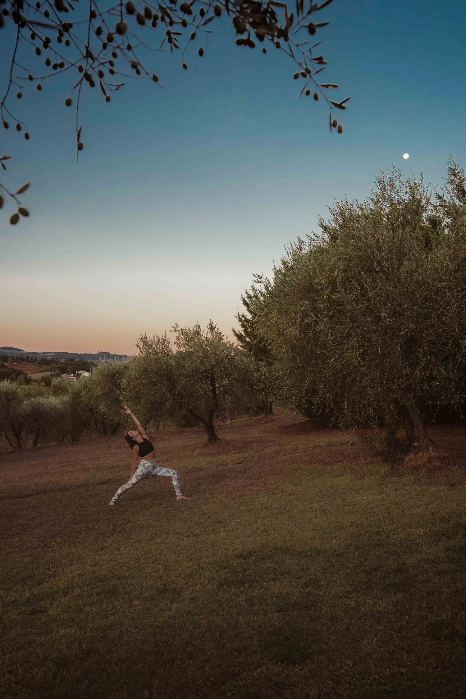
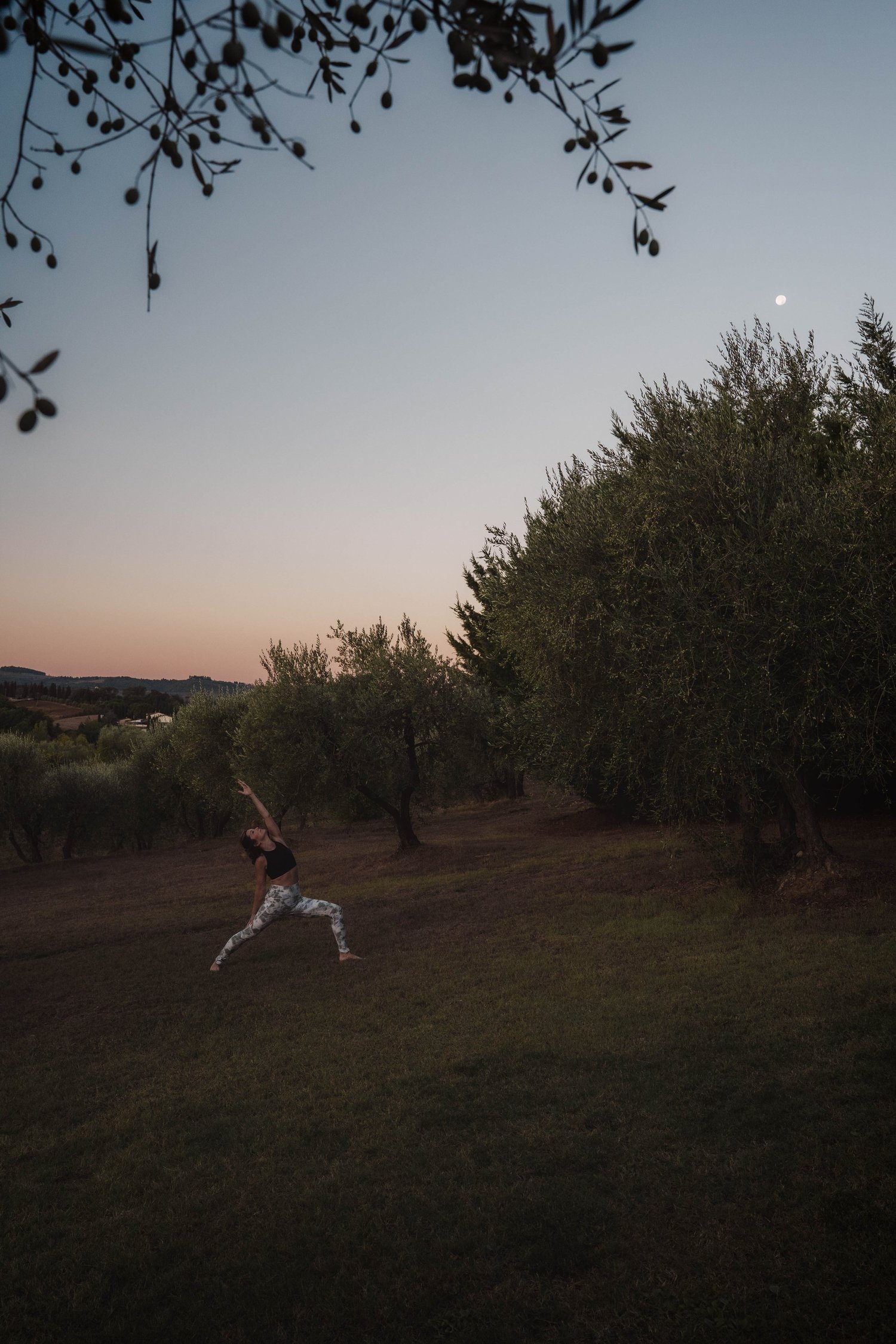
In the current version, I allowed the darker tones of the landscape to remain deeper and kept the light in the sky softer. This creates a clearer separation between the fading evening light and the darker foreground.
The scene now feels calmer and closer to the atmosphere of the moment. Instead of revealing every detail in the ground and the trees, the image focuses more on the quiet transition between day and night.
For me, this interpretation better reflects the peaceful mood of the landscape and the movement within the scene.